Richard Bruning has never really come to terms with the DC Bullet. The Milton Glaser-designed logo, debuted by DC comics alongside their official name change in 1976, has long been regarded as a classic of comic book design, but to hear Bruning tell it, it’s nothing but a sum of its errors: it’s too unbalanced, too loud, and above all it positively reeks of the 1970s. That sort of opinionated iconoclasm was once a defining characteristic of Bruning and it was, ironically enough, the thing that got him hired as the Design Director of DC Comics about a decade after the bullet made its debut. Bruning had come out of the graphic design world in the college town of Madison, Wisconsin, where he came to the attention of local comic distributors-turned-publishers Capital Comics, who soon enough hired him on as both Editor-in-Chief and Art Director of the nascent (and relatively short-lived) comic line. It was there, in the first years of the 1980s, that Bruning helped to pioneer a new aesthetic for comic design: unapologetically modern, disdainful of the old tropes of floppy issue packaging, and aiming for an aesthetic and an audience apart from hermetic world of devoted superhero readers....
“Don’t remind people what you aren’t”: DC’s Richard Bruning on prestige, Vertigo, and why Paul Levitz wouldn’t buy a Mac, Part 1
 1 month ago
35
1 month ago
35
Related

Anh In Time Out
6 hours ago
5

Daredevil by Tim Sale (2006)
7 hours ago
6
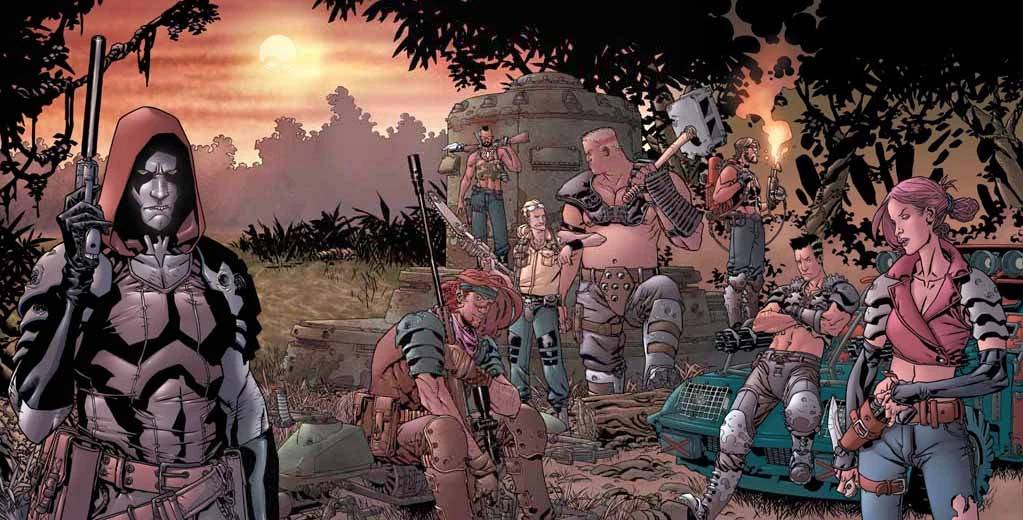



Crystal by Bruce Timm
11 hours ago
5

Popular
Dungeon Crawler Carl Announces Free Limited-Edition Release
2 weeks ago
123



Power Rangers Confirms Two Fan-Favorite Eras Are Returning
3 weeks ago
87




Prime Video Just Made An Announcement That Takes On Netflix
3 weeks ago
64
 English (US) ·
 © Clint's Comics 2026. All rights are reserved
