I’m waiting for my computer to finish slogging through over 54 million voter roll records. As I wait, I have a slight headache making it difficult to concentrate on what I am supposed to be doing: finishing a graphic novel I started last year.
For the first 2 years I spent doing voter roll research I was a volunteer. Because I spent 80-100 hours a week on it, there was no time to make an income while I was giving all my time away to figure out what happened in the 2020 election. Then, I took a little break, illustrated a few comics for writer Chuck Dixon and the US Army, and then agreed to do a graphic novel for Nexus creator Mike Baron. However, almost as soon as I started, election research came calling again.
It was too important to ignore, and this time I occasionally earned a few fees. Not as much as a real job, but much better than before. I told Mike and he was cool with a delay. He cares about elections also, as anyone can tell by looking at his recent work, like Thin Blue Line and Private American. Mike, like Chuck and many other comic artists and writers I know, is a patriot.
That said, I try to squeeze in some work whenever I can. Right now, I should be finishing the layout for page 32, but my head hurts too much to concentrate on that. Instead, I’ve decided to show some other pages from different things I’ve done, to show how the process works.
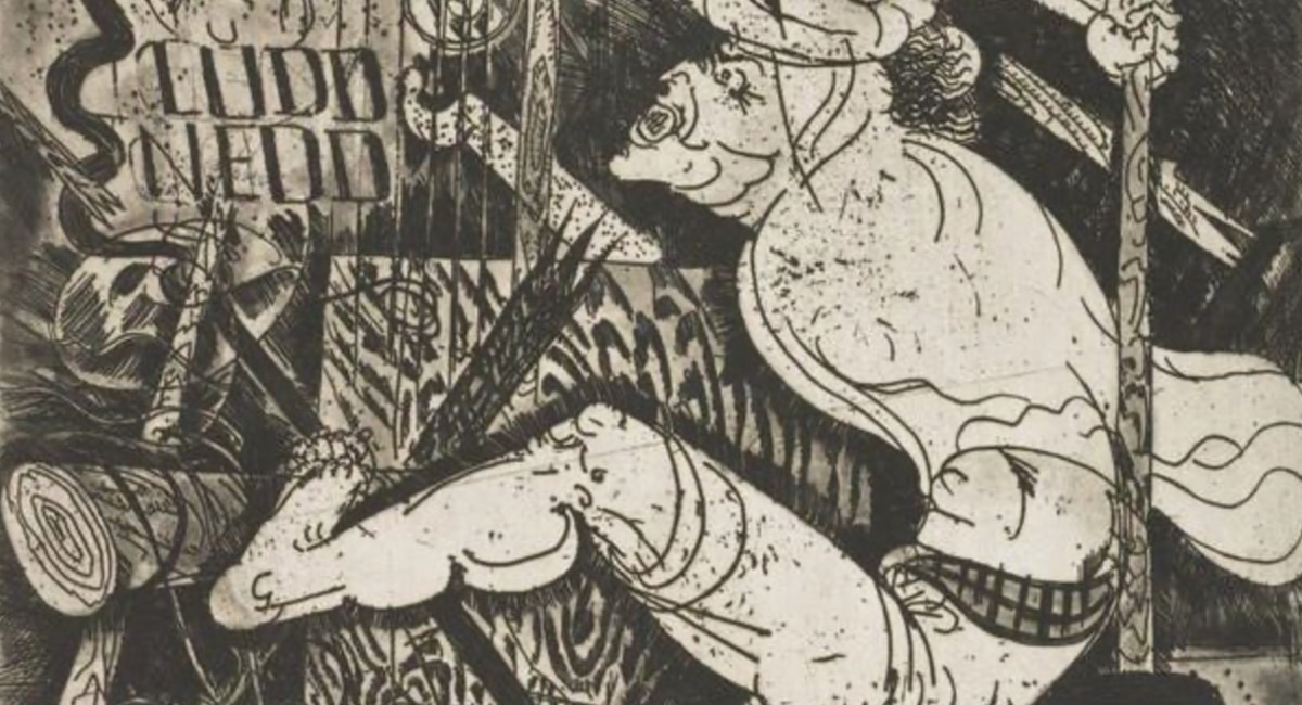
This character, in case you are curious, is the precursor to the Dr. Zark character sometimes seen in my posts here. This page is from a comic I wrote and illustrated but didn’t quite finish, partly due to election research, partly because it was originally designed for another artist to work from my layouts.
All a page like this does is determine how the panels will be broken up, their sizes, where the dialog baloons belong, and a rough idea of camera angle and what is happening in front of the camera. I’ve made roughs more complicated than this and much simpler. This is on the simple side of that range, but the really simple ones are just triangles to represent people, and squares and circles for everything else. I do them that way when I have to be very fast.

I made these layouts with what is called a “witch pen”. These are sections of bamboo, with one end sharpened into a blunt nib, for dipping in ink. They are very crude, and incapable of making fine lines. I used it to avoid the temptation of drawing too much detail. One of the writers (Beau) said he thought it looked “almost” like finished inks. He was being generous, but that’s what he said.

This, admittedly, is different from what most comic book artists would call a rough thanks to the color. Personally, I prefer to put color in the roughs, or even to draw it in color first without any lines, and put the lines in afterward. That is because color can do a lot of work that other artists use lines or areas of solid black for. I like color better than black, so it often becomes part of my layouts. However, not if I have a tight deadline.

This is to prove I do it this way sometimes. In this case, it was for something I intend to self-publish, so I didn’t have to show anything to anyone that would look like what they expect. Hence, no lines!

I could ink from this page, but some inkers might complain. That’s why you sometimes have to put in more detail. Personally, I prefer to add the detail when inking, because it looks more natural than tracing pencil lines.

This job was only the second time I’d inked my own pencils. I did three stories for this series on Medal of Honor recipients, all for the US Army with writer Chuck Dixon. The pencils look approximately like what I would give any other inker to work from, though lately, when pencilling for myself, they are much looser.

The page on the left is digital, on right it is ink on paper (traditional). I prefer drawing and inking on paper, but these days use digital almost exclusively because it is easier to fix errors and to color on a computer. That said, I often fantasize about moving my computer to my basement near my drawing table, so I can go back to drawing on paper. The reason I still need a computer is for reference. In the old days, I’d go to the library and check out books full of photography, or buy discount books at book stores. Now, the Internet is the place to go for most reference.
As black and white drawings, I prefer the traditional version on the right, but for coloring, the digital inks on left are easier to work with.

This is a panel from the graphic novel I’m working on now. It is an amazing story that goes amazing places, one of which is Griffith Observatory, as shown here. A couple decades ago, I made a huge watercolor of Century City while standing at an easel I set up in a spot just in front of where these cars are parked. It was very smoggy that day.

Originally published here.


 English (US) ·