This week’s main review is Exorcism at 1600 Penn #1, a horror story in the White House. Plus, the Wednesday Comics Team has its usual rundown of the new #1s, finales and other notable issues from non-Big 2 publishers, all of which you can find below … enjoy!
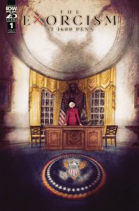
 The Exorcism at 1600 Penn #1
Writer: Hannah Rose May
Artist: Vanesa Del Rey
Colorist: Jordie Bellaire
Letterer: Hassan Otsmane-Elhaou
Publisher: IDW Publishing
Review by Jared Bird
In this new horror comic from IDW Publishing, Kelly Doyle, recently elected President of the United States of America, is stretched thin. Attempting to balance raising two teenage daughters, preventing global conflict and tackling the ever-shifting media battleground is already a lot to deal with, but when debatably the most famous house in the world becomes the center of a demonic battle between good and evil, Doyle will have to fight to make it all work and keep her world intact.
As you can imagine from the premise, this is an incredibly timely book. It tackles very modern problems like social media harassment and climate change doom scrolling. Some of the best horror elements have very little supernatural influence, particularly the incredibly vivid sequence of Mara falling down a dark internet rabbit hole. Across 46 pages, this comic tackles a lot. Not all of it gets fleshed out fully in this issue, but will presumably get elaborated on more as the series goes on. It’s a narratively dense first issue, with lots of moving parts and things going on. At times it can definitely feel too much, but that almost feels like an intentional creative decision rather than a flaw.
Written by Hanna Rose May (Rogues’ Gallery), the dialogue in this issue is intense and snappy. It often reminds me of the work of Brian Michael Bendis, where characters are speaking about plot important information in a casual, almost unnoticeable manner unless you really read closely and pick up on all the details. It’s not a style that works for everyone, but I think it works here. The glimpses into the more traditional horror elements are the best part of the issue, because of the harsh break with the real world politics and issues, making them stand out and really come across as intense and shocking.
Illustrated by Vanesa Del Rey (Haha), the art is moody and atmospheric. With a more expressionistic style, it contrasts well with the dense narrative and dialogue, feeling more loose and focused on creating emotionally moving images. The colors by Jordie Bellaire compliment this feeling well, and the art feels gothic even in scenes of sleek, modern environments. Hassan Otsmane-Elhaou continues to shine in every book he does, and proves yet again he’s one of the best letterers working in the business today.
Overall, Exorcism at 1600 Pen #1 is a dense but rewarding read. I’m looking forward to seeing how it evolves across the rest of its four issue run, because I think this book is timely and will connect with a lot of readers wanting to see the real world reflected more accurately in the comic book space. It’s a good read for the autumn season, both unique and compelling.
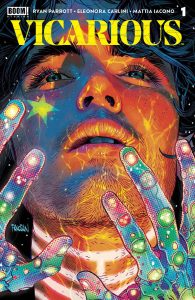
 Vicarious #1
Writer: Ryan Parrott
Artist: Eleonora Carlini
Colorist: Mattia Iacono with assistance by Luca Mattioni
Letterer: Becca Carey
Publisher: BOOM! Studios
Review by Jordan Jennings
In the not-so-distant future, Mind-walking has become the hottest underground trend. To Mind-walk or Proxy means to inhabit a person’s mind to feel the sensations and emotions they feel without being able to control them. In Vicarious #1, we meet Justin Bright, who seems to be down on his luck but thanks to a chance encounter can become a Proxy himself. Though, things are not what it seems in Justin’s life.
Ryan Parrott’s new series is off to an interesting start. The premise of Vicarious #1 isn’t exactly a new concept. The act of living someone else’s life has been explored in other media like the comic series The Surrogate or the film Being John Malkovich. What sets Vicarious apart is a couple things. First, it really leans into the concept of streaming (especially the life streaming people) that we see in pop-culture today. This is less like The Surrogate, which featured the wealthy living their lives in perfect robot proxies. This is more like modern streaming, and how the series title implies, living vicariously through others. The second thing that sets it apart is the twist ending. I will not give that away in this review, but the final few pages turn the story on its head and makes me curious for more.
That said the issue is dense with exposition at times that, while necessary, kind of detract from the comic reading experience as there isn’t much action happening at those times. Parrott plays around with narrative structure thought including repeating the opening narration but from the main character. While it does sound repetitive, it is clear that Parrott intended for this to come off far more sinister given the reveal on the final page. It is effective, but it doesn’t help the comic’s pacing issues.
Eleonora Carlini’s art is a wonderful style that allows for the characters to be dynamic and expressive. There is a sense of energy on the page that really helps sell the story early one as it is definitely a comic that hits with the exposition heavy at times to help set up this world. One standout series is a moment where the main character Justin Bright is being proxied for the first time and goes through an extreme parkour moment to cross rooftops. The panel layouts that Carlini uses are frantic and help sell the dynamic action on the page.
There are moments where it isn’t exactly clear what is happening on the page. The panel transitions and character designs kind of muddle together at times. One example of the panel transitions being messy, there is a page showing Bright trying to get a job through interviews and each panel is intended to represent a different interview, but the effectiveness is undercut by the homogenous designs of the backgrounds, and it presents an earlier stumbling block in the comic. As for an example of character designs being an issue, the big reveal at the end of the issue loses some of its impact because it isn’t clear who that character exactly is. I believe it is to be a character we haven’t seen before, but they bear a strong resemblance to another character from earlier in the book. It is probably intended for us to not know the character, but it left me scratching my head and double checking.
Overall, Vicarious #1 starts off with a strong and interesting premise that is hindered by its execution at times. The writing is solid but has trouble relaying essential information in an engaging way. The art is stunning but stumbles at times when it comes to clarity for the reader. I think there is something here especially given the twist, but this may be a series best to wait for the trade on.
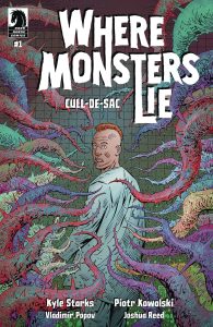
 Where Monsters Lie: Cull-De-Sac #1
Writer: Kyle Starks
Art: Piotr Kowalski
Colors: Vladimir Popov
Letters: Joshua Reed
Publisher: Dark Horse Comics
Review by Clyde Hall
The first volume of Where Monsters Lie was a Kyle Starks pop culture horror bonanza filled with his hallmark humor and a collection of slasher film analogs. In short form, think of a HOA for a community of cinematic serial killers and supernatural predators. Mix in a variation Final Girl protagonist plus twisty deviations from the usual gore film formulas, and it was exactly the storytelling treat Starks fans have been accustomed to since Six Sidekicks of Trigger Keaton.
That said, the wrap of the series tolled an uncharacteristically hollow note, one that my horror comics friends discussed. Great concepts and execution, sticky landing an additional issue may have smoothed. That’s why seeing Where Monsters Lie: Cull-De-Sac #1 solicitations came with a surge of Monster Kid joy. The journey of Connor Hayes continues.
The story takes up without much prelude, so reading the first volume is highly recommended. Also, spoilers regarding Volume One lie ahead.
In that initial volume we met Special Agent Hayes, lone survivor of an encounter with a puzzle-using psychopath as a teen. Ever since, he prepared, trained, and established a law enforcement unit for waging war against such mad butchers. Quint had his sharks, Ripley had her xenomorphs, Mulder had his UFOs, and Connor had his slashers.
By the end of the first series, many residents of the serial killing gated community called Wilmhurst are dealt with while others flee. In true Nietzsche fashion, the special agent sending them to flight himself becomes an abyss-dweller staring back. As the story continues here, this scattered community takes refuge in a second site. Yes, the killers have backup neighborhoods where they can safely hide between sprees. Zel, HOA head from the eradicated Wilmhurst site, has to balance leadership roles with Barry, the manager of Site B. Together they must oversee the killing efforts of all their charges and satisfy ‘Corporate’ by maintaining its blood flow quota.
Along with the task of co-managing such a cobbled group of rugged individualistic murder machines, Zel and Barry must assess new member Connor Hayes and where he fits into the skein of their ongoing legacy of lethality. Meantime, apart from his new community standing while safeguarding his wife and unborn child, Connor has an agenda of his own.
Starks‘ strength as a character creator and custodian is on display here. Getting reacquainted with Zel and the Holiday Killer, meeting new characters Vilmos, Barry, and Barry’s zwife (zombie wife) Karla, is a perfect Starks collage of horrific and hilarious. The plot continuation as presented feels like a B-movie sequel setup. The good kind where problematic elements from the first film are summarily handled and make you say, “Well, of course the story goes on!”
Reference the character work, and as much as Starks makes them glow with madness and menace, credit is shared with artist Piotr Kowalski. Reading this premiere, fans of the first series may experience what I did: A mental parade of devilishly deviant character portraits as drafted by Kowalski, the sort not seen since childhood nightmares after eating an entire bucket of Halloween candy. His style for this series always evokes the film Nightbreed as well, which I’d call as appropriate as the Shape clutching a butcher knife.
With lots of spooky and spoopy reads available this Samhain season, give yourself a wickedly twisted treat. Read the first series of Where Monsters Lie. Follow that with Where Monsters Lie: Cull-De-Sac #1 for what opens as a promising next chapter.
The Prog Report
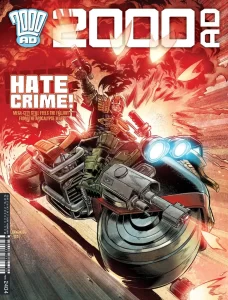
2000 AD 2403 (Rebellion Publishing): I’m writing this on the eve of my annual train journey to New York Comic Con, and so it feels fitting me to check in with a strip this week titled Nightmare New York. This one is written by Kek-W, with art by John Burns, and letters by Annie Parkhouse. Now on part four, it is essentially historical fiction, set in the earliest days of New York City (think top hats, muddy roads, street urchins, etc.). The heart of this thing has been tough to pin down so far, but we have been following the vulnerable members of a city experiencing a growth cycle. This is, of course, timely, and it has involved rats and sewers and fleeing from a street gang and getting stuck beneath a collapsed building. This is a comic between a sort of Dickensian historical urban survival narrative and secret society-driven horror. The story here has unfurled slowly, to be certain, but I’ve found it to be a satisfying narrative. In this week’s fourth chapter, we get our clearest glimpse yet of what this really wants to be about, and it’s certainly intriguing. The artwork has been fantastic from the start, though, a sort of skewed take on the imagery one might associate with that time period. Burns character work is also emotive, and he doesn’t avoid drawing hectic crowds or squalid backgrounds, both of which have really been adding to the immersion of this story. Overall, I’ve found Nightmare New York to so far been a strong strip, a thematically-understated comic that is nonetheless suspenseful. As always, you can nab a digital copy of this week’s Prog here. —Zack Quaintance
Read more entries in the weekly Wednesday Comics reviews series!




 English (US) ·