This week’s main review is Godzilla’s Monsterpiece Theatre #1, an absurdist combination of Godzilla and the literate of the late 19th/early 20th centuries. Plus, the Wednesday Comics Team has its usual rundown of the new #1s, finales and other notable issues from non-Big 2 publishers, all of which you can find below … enjoy!
 Godzilla’s Monsterpiece Theatre #1
Writer/Artist/Letterer: Tom Scioli
Publisher: IDW Publishing
Review by Zack Quaintance
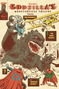
Godzilla’s Monsterpiece Theatre #1 is, simply put, one of the best comics of the year. Tom Scioli is a top-tier cartoonist, so it’s no surprise, but even so, this first of three parts exceeded my lofty expectations. The concept for the book is that it’s essentially a Godzilla, The Great Gatsyby mash-up, and this concept is executed by Scioli with a giggling sense of absurdity and self-awareness that elevates it to the utmost peaks of comics excellence. You can on nearly every page feel the creator having just the best time with this one, and it’s a feeling that also finds you as a reader.
The book starts out as a pretty straight-forward alternate take on The Great Gatsby told, of course, in comics. As such, there’s a Gatsby origin. We see him doing things that are only suggested in the book, like meeting Daisy, going to war, etc. From there, the comic plays with the well-known novel a bit, throws in some of F. Scott Fitzegerald’s gorgeous prose, and starts to unfurl something new with its story.
As a straight up Gatsby comic, this one probably could have worked just fine. Scioli does an excellent job cribbing quick, illustrative excerpts from the novel and using them as his captioning. And he also hones in on the visuals that work best in this medium. Right up front, we get an absolutely killer splash of one of Gatsby’s parties, which then segues into arguably the most famous imagery in the book, the green light on the pier, shining from forlorn Gatsby across the water to his lost love, Daisy Buchanan.
But then comes a definite pivot in the book. Godzilla shows the #&@^ up and starts breathing blue lightning into one of Gatsby’s parties. It’s all very absurd and hilarious and inevitable, given the title of this one and the cover. We knew it was coming, but the comic plays the first few pages so straight, that Godzilla still arrives with maximum outrageous effect. Soon, our protagonists are in a literal boat, beating on, borne back ceaselessly into the past…as they try to get the hell away from God-freaking-zilla.
In other words, this comic is great. So great. A prime example of how the medium can move unfettered between serious ideas and prose, right to the pulpiest most outrageous visuals and characters our fictions can muster.
I won’t keep dissecting the book. But I will note that there’s quite a bit to enjoy here. Scioli’s cartooning is always excellent, and this comic is no exception. He does the flapper-era clothing well, he nails Godzilla, and he leans into fun takes on many other famous literary figures that have endured for 100-some years. I won’t spoilt too much of that, but will note that Jules Verne: Cyborg is a favorite.
I also really like the way this comic uses prose. It’s deployed sort of loosely, not insisting on really mirroring the line placement in the book or even its general structure. I also couldn’t entirely tell when/if Scioli had tweaked the excerpts from the book or if he had added anything new in Fitzgerald’s voice, which I’d say is to his credit as a writer.
Overall, as is quite clear by this point, I absolutely loved this comic. Godzilla’s Monsterpiece Theatre is exactly my type of comic, one that takes its absurd ideas seriously to great effect. Do not miss this book, it just might be the comic of the year.
 Hack / Slash: Body Bags #1
Writer: Tim Seeley
Artist: Stefano Caselli and Steve Kurth
Colorist: Kurt Michael Russell
Letterer: Crank!
Publisher: Image Comics
Review by Jared Bird
I don’t think a lot of people saw this miniseries coming. With the 2022 passing of legendary writer / artist Jason Pearson, many people, including myself, thought we’d seen the last of Body Bags. The series was so intrinsically his, it would seem like a foolhardy task to try and imitate him. This is not an imitation of Pearson’s work and style. This issue is a full-blown love-letter to one of the most underrated creators in comics, dedicated to him from the very first page – ‘Draw in peace; At least in heaven, there are no erasers or deadlines.’
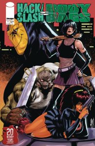
Following on the one shot Hack / Slash: Kill Your Idols, Cassie Hack and Vlad’s travels bring them to Terminus, Georgia, the home of bodybaggers Mack Delgado and his daughter Panda. Approved by Pearson’s estate, this is hardly the first crossover Hack / Slash has had, and creator, writer and artist Tim Seeley has proved again and again that he can make them work. There’s a somewhat special feeling to this specific crossover though, because both works feel in tandem with each other. Seeley has called Pearson an influence, and I think the worlds of Hack / Slash and Body Bags flow into each other incredibly well. All the regulars from Body Bags are here, and written seamlessly well by Seeley. In general, Seeley is held in well regard in the horror comics community and for good reason. His understanding of dialogue, serialized storytelling, and how to excite, titillate and scare remain impeccable. I am entirely here for the resurgence of Hack / Slash, and I love how it continues to be the ultimate horror playground for creatives.
The artwork by Stefano Caselli and Steve Kurth is great. The two styles seamlessly intertwine with each other, thanks to the help of incredible colorist Kurt Michael Russell bringing it to life. Both are great fits for both franchises, and the artwork is fantastic. It has that 90s, electric energy that defined Body Bags, with a touch of 2000s angst and Y2K stylings. As someone whose childhood was spent obsessed with those particular styles and time periods, it’s an incredible welcome sight. It’s hardly simple nostalgia though. It gives the issue a visual style somewhat equidistant to both comics crossing over, allowing it to feel all the more effortless in its execution.
Given the nature of the material, as a crossover between two well-known horror comic series, this miniseries is not entirely beginner friendly. That’s not to say a newbie to Body Bags can’t pick it up – Seeley and company do an incredible job at giving a beginner all the important they might need – but to enjoy it to its fullest, you probably need at least a basic understanding of both series. As a long-term fan of both, it’s like getting a Michelin star meal – while part of me is still saddened by the lack of Pearson at the helm, Seeley and company completely understand these characters and this world, and it’s about the best substitute we could ever get. This is ultimately the re-introduction of Body Bags into the world, and I can imagine no one better a fit to bring it back to life than Seeley, Caselli and Kurth.
Overall, Hack / Slash: Body Bags is about as perfect a crossover between these two series as you could imagine given the circumstances. It’s a love letter to the crass, violent world of Pearson’s comic, made with nothing but respect and understanding. It re-introduces these characters and settings to a potentially new audience, whilst telling a fun serialized story sure to bring joy to fans of horror comics.
 The Powerpuff Girls Halloween Special
Writer: Amanda Deibert
Artist: Cat Staggs
Letterer: Jeff Eckleberry
Packager/Editor: Nate Crosby
Publisher: Dynamite Entertainment
Review by Jordan Jennings
Synopsis: In an extended The Shining-riff, Buttercup sequesters herself and the rest of the Powerpuff Girls in a haunted hotel for Halloween as she seeks to create the perfect Halloween comic. However, are they alone or is there something lurking in the shadows.
Amanda Deibert and Cat Staggs are obviously having fun with this Shining riff. There are numerous references and callbacks to the film such as the carpet-pattern, the twins, and (surprisingly) the bear costume. You know, the one from that one scene in the movie. The references are not the driver of this comic, though. Instead, it is lampshading the framing device for this comic. The comic isn’t jabbing you in the ribs and demanding you to acknowledge the references. It’s defter and more tongue-in-cheek about the gags than that.
Deibert’s choice of a framing device harkens back to classic, time-tested horror anthologies, but especially reminiscent of older Treehouse of Horror episodes of the Simpsons (back when the series went through the effort to frame the shorts into some sort of narrative.) This format does present challenges for the story, though. The transition between framing device and short stories is a bit clunky. The issue only being a standard-length comic is not doing it any favors as most the shorts are 2-3 pages long. It creates a pacing that is frantic, and I don’t think that was the intent. While most of the stories are just riffs and meta jokes, nothing really gets the time to breathe that you would like to see. While the framing device doesn’t work as well as you want, it is still a lot of fun.
Deibert does have a good command of the character voices, which can be challenging in this scenario as they must feel like the Powerpuff Girls from the show, but also feel like Buttercup’s interpretation of her sisters. It is an intriguing dichotomy on display. Deibert does a great job overall with the gags and characters. I do wish the pacing and framing was better, but it doesn’t hinder my enjoyment of the story.
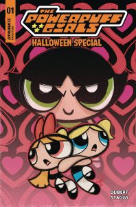
The artistic range on display from Staggs is astounding. She changes art styles a few times throughout the comic to sell the tone of the story Buttercup is trying craft. It creates this vibe that the issue is being done by a cadre of artist, but instead its just one artist flexing. This gives the comic sense of uniformity that I appreciate. Additionally, Staggs creates this crayon/colored pencil look to the comic that runs throughout the issue that gives the book and unique, textured look. I am not talking about a few spots here or there either. I am talking full on crayons with bleed overs and texture. It doesn’t look like any other comic on the stands today.
Overall, Powerpuff Girls: Halloween Special is an enjoyable read that is suitable for all ages, but easily appreciated by adult fans of the series with the silly refences and novel art. While I had issues with the format and pacing of the story, I cannot deny having fun reading the comic. It’s worth checking out.
 Rook Exodus #6
Writer: Geoff Johns
Art: Jason Fabok
Colors: Brad Anderson
Letters: Rob Leigh
Publisher: Image Comics / Ghost Machine
Review by Clyde Hall
Rook Exodus was an afterthought for me. It lacks the checker board topper of other Ghost Machine covers and thus isn’t (so far as we know) connected directly with their shared Unnamed Universe books like Geiger, Redcoat, and Junkyard Joe. The first issue was picked up as a way of supporting the imprint and also owing to the detailed excellence of its Jason Fabok art. I didn’t plan on keeping it on my pull list.
But here we art at issue 6, the end of the first story arc, and Geoff Johns scripts combined with Fabok imagery has kept me fully invested in this combination mystery/science fiction adventure. We’ve been introduced to Exodus, a distant planet where the Better-World corporation has settled humans and advanced terraforming tech in an effort to begin a new location for human habitation given damage our civilizations have wrecked on Earth.
Selected members of these settlers are granted biocontrol helmets linking them to animal life that’s also been relocated as part of the terraforming process. Rook, a farmer, has an advanced helmet for communicating with and directing avians, the division of wildlife with the most potential impact on his crops. He and other Wardens like Dire Wolf, Swine, and Carapace work together with their charges so that lupine, porcine, and chelonian animals will thrive and coexist in harmony with both their surroundings and the human settlements.
When Better-Worlds stops sending parts, supplies, and support to Exodus, their world engine fails and settlers there are left to extremely uncertain fates. They’re divided between the ones who can afford passage and with a means of returning home, and those determined to remain and continue what they’ve started by weathering Exodus’s environmental conditions as they stand.
The first issues chart where different characters’ loyalties lie in this regard, and parts of their backstories. As the series continued, a Warden called Ursaw rose up, intent on claiming all the other Warden helmets and redistributing them to individuals loyal to his regime. Backing up his power play were the ursine creatures of Exodus under his direction. Add a lethal maul of bears makes a good argument for submitting to Ursaw’s will.
But not all do, and some survive to resist another day. Including Rook. As this issue begins, we pick up on his quest for finding Ursaw, defeating him, and rescuing other Wardens held in his bloody claws. Over the series we’ve seen Rook’s connection to his avians undergoing redefinition. We’ve also seen how other Wardens relate to their charges, and in some cases fully embrace them while distancing elements of their human natures.
Rook’s connections to his portion of the animal kingdom as well as to his fellow Wardens evolve within this installment. Once determined enough to build his own rocket for abandoning Exodus, the farmer who emerges from the forge of Ursaw’s merciless violence is tempered from a plowshare into a sword. One backed by airborne allies in multitudes.
In the showdown, parts of the Better-Worlds mystery is solved. Portions concern the dangers to individuals when business philosophies and corporate focuses shift. In the future reality of Rook, one consistency with modern day comes from mission statements found among the gritty worlds of Tyrell, Wallace, Omni Consumer Products, and Weyland-Yutani Corporations. But, as with answers regarding the hanging fate of Exodus and its inhabitants from previous issues, solutions come with more concerns raised and more goals established for continuing the colony.
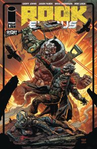
This is layered and stylish storytelling from Johns, no surprise there. But every step of the Rook journey, nearly every panel, has had the meticulous Fabok artwork selling the tech elements and making them work. One of the easiest comic book genres for me to lose interest in is science fiction. Yet, the first volume of this title has remained a monthly high point of excitement alongside the other Ghost Mahine books.
Rook Exodus #6 continues the trend. The second volume is coming in 2025, and readers get a tantalizing introduction for what that next phase of the Wardens’ adventures will include. Settlers may be abandoning Exodus, but most of us will be returning to its alien landscape for what comes next. Join us by scooping up this issue and the previous five back issues, or by getting the trade when it drops next April.
Wednesday Comics Reviews
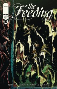
The Feeding #1 (Image Comics/Sygyzy Publishing): Nolan Ward was many things and most of all, he was haunted. In the one-shot The Feeding, we are introduced to frankly, a sleaze of a character, one who buries his hurt and his trauma in his vices, feeding his worst impulses, feeding an insatiable void, running from the monsters that haunt him. I really have to give the writer David M. Booher his flowers on the strong use of metaphor here. With lettering by Andworld Design, reading about Nolan’s first monster honestly floored me; that is equally a credit to the strong visuals that artist Drew Zucker and colorist Vittorio Astone create to reinforce that metaphor. Sometimes Zucker’s anatomy and facial drawings can be a bit off, but he makes up for that in tone, the strength of the environments and compositions. When he’s playing up the horror on the page, it’s wonderful and haunting to look at. When the team shows their hand, the book sings; I could nearly hear a horror score in my head in the final sequence, and it’s pitch perfect. The visual and literary metaphors of monsters feeding and monsters creating more monsters are strong throughlines, and demonstrates the strength of good horror both in messaging and in how it delivers its message. —Khalid Johnson
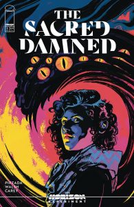
The Horizon Experiment: The Sacred Damned #1 (Image Comics): The Horizon Experiment is an inherently risky proposition. It’s a series of one-shots by promising but less-known creators, with each issue acting as a pilot for a potential ongoing. It’s a tough thing to produce a first issue that sells a reader on the concept of your book while also telling a complete story. In The Sacred Damned, writer Sabir Pirzada and artist Michael Walsh pull together an effective little horror procedural — think X-Files or Evil, with a tough Muslim lady as the protagonist. Some awkward pacing in the first half of the book aside, this is a solid done-in-one story, and I could see it producing more haunting and compelling stories. Inayah Jibril, a professor of the occult and rough-and-tumble magician, is our “hero,” though the term is a loose descriptor. What initially seems like a pretty straight forward character is turned on its head with more layers and complications. By placing a Muslim in the center of this story, Pirzada allows the story to tap into less trodden territory in American supernatural stories, which helps the familiar procedural trappings feel fresh. There is a humanizing angle to the monsters too, and the script tangles with some environmental and religious themes that add depth beyond simple good vs. evil, man vs. demon. Walsh’s layouts are superb, and his economical storytelling makes the clunky divide between setup for the “mystery of the week” and the larger narrative about Jibril work. He also has a great ability to make frightening, gory imagery, raising suspense through dynamic use of size and composition. Peppered into the issue are data pages that add exposition and also flesh out the world and our main character in disturbing fashion. Walsh is assisted on the colors by Toni Marie Griffin, and the use of blue and red to add mood and contrast between the supernatural elements and the human is well done. Becca Carey provides the lettering, doing just enough to bring the dialogue to life with SFX and balloon choices without veering into distraction. Hard to say how well this formula could work long-term, but the final pages at least made me want to learn more about Inayah Jibril and her dark past. —Tim Rooney
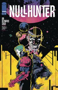
Nullhunter #1 (Image Comics): Nullhunter is essentially a rehashing of The Twelve Labors of Heracles, mixed with a bit of Bloodshot in premise and aesthetic. Where Clay, our bionic commando protagonist, retains no memories of his past save for the war and murdering his family. Imprisoned for life, seemingly, Clay is battle-upgraded. He drives to a planet, and almost immediately kills a giant robot lion. Michael Walsh is writing a this 12-issue maxiseries, and I think this issue will read as a brave breeze of a first chapter when it’s collected in trade, but as a single issue here, it does acutely feel like 1/12th of a story. The big fight doesn’t have two sides that both want something, so it reads like action happening instead of stakes being raised. Similarly, Gustaffo Vargas‘ art makes use of challenging color palettes and visually distinct panel layouts, but the shot selection and pacing between panels suffers from it rather than succeeds. It is at times difficult to tell what is happening spatially or how it’s happening. Featuring some stylistically dope hand-lettering from Vargas, the real standout is letterer/designer Becca Carey’s take on bold emphasizing words of importance. She uses a bold face so thick it distorts the visual wordbath in a way that must be revered. Pair the font with tails that explode at the sentence end to indicate rising inflection or tiny, incomplete caption boxes that imply halves of truths, and this dialogue hits different than anything else on the shelves right now. —Beau Q.
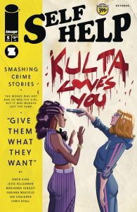
Self-Help #1 (Image Comics/Sygyzy Publishing): Self-Help #5 wraps up the story arc, promising an eventual return in early 2025. This west coast neo-noir is a good wrap up, while leaving the most interesting story beats for its comeback, including whatever is going on with the real Darren Hart and how will he react to some scam artist stealing his life. Writing team Owen King and Jesse Kellerman seem to be keeping a lot of the mystery secret, carefully doling out clues and bits of action to keep readers interested. For an arc wrap-up, there are some moments I wish would have surfaced a bit more, but I also think this was all done for a reason. It is a plot they have clearly thought through very intensely. Regarding the art, Marianna Ignazzi continues to dazzle with detailed backgrounds, excellent facial acting, and a sense of movement you love to see in modern comics. Her style fits the book so perfectly. With stellar colors from Fabiana Mascolo, Ignazzi’s art is elevated further with a palette that fits neo noir as well as the glitz, glamor, and grime of LA. Lettering and design by Ian Chalgren brings everything together with well-placed bubbles on Ignazzi’s and Mascolo’s work, detailed sound effects, and design/supplemental pages that add to the cinematic nature of this story. As far as first arcs go, Self-Help’s has delivered, and here it leaves readers wanting more. More action, more art, more story. It has the makings of a great neo noir comic. —Bryan Reheil
The Prog Report
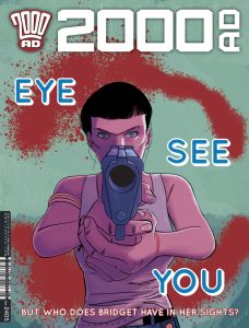
2000 AD 2405 (Rebellion Publishing): This week’s Prog gives us an ending of sorts for the three-part story, Judge Dredd: Hater, by writer Ken Niemand, artist Silvia Califano, colorist Giulia Brusco, and letterer Annie Parkhouse. This story (as I’ve written about in this space) draws heavily from the classic Apocalypse War comics. Really, in this finale chapter it reveals itself to be (perhaps predictably) a treatise on the generational trauma sown by large-scale war between nations. My favorite part of this story was the pressure cooker feel to it, the way the tension builds and builds. The conclusion (which I won’t spoil here) was probably always inevitable, but the strip made you hope there was some other (indeed, any other) way it could go. The fact that it plays out as it does makes the story all the more poignant. The end also makes it seem as if this is a seed for another story to come. As always, you can nab a digital copy of this week’s Prog here. —Zack Quaintance
Read more entries in the weekly Wednesday Comics reviews series!




 English (US) ·