Tegan O'Neil | July 1, 2025
To begin, a story. A familiar anecdote, circulated freely for years and repeated by many. It’s credited to Andrew Helfer, longtime DC editor reaching back to the early '80s. Where Helfer originally recounted the anecdote appears lost to the mists of social media, at least according to the Google of 2025. So far as I know he’s the only living witness to the exchange, but this is the version that has made the rounds on social media for many years, recounted by multiple creators as according to Helfer:
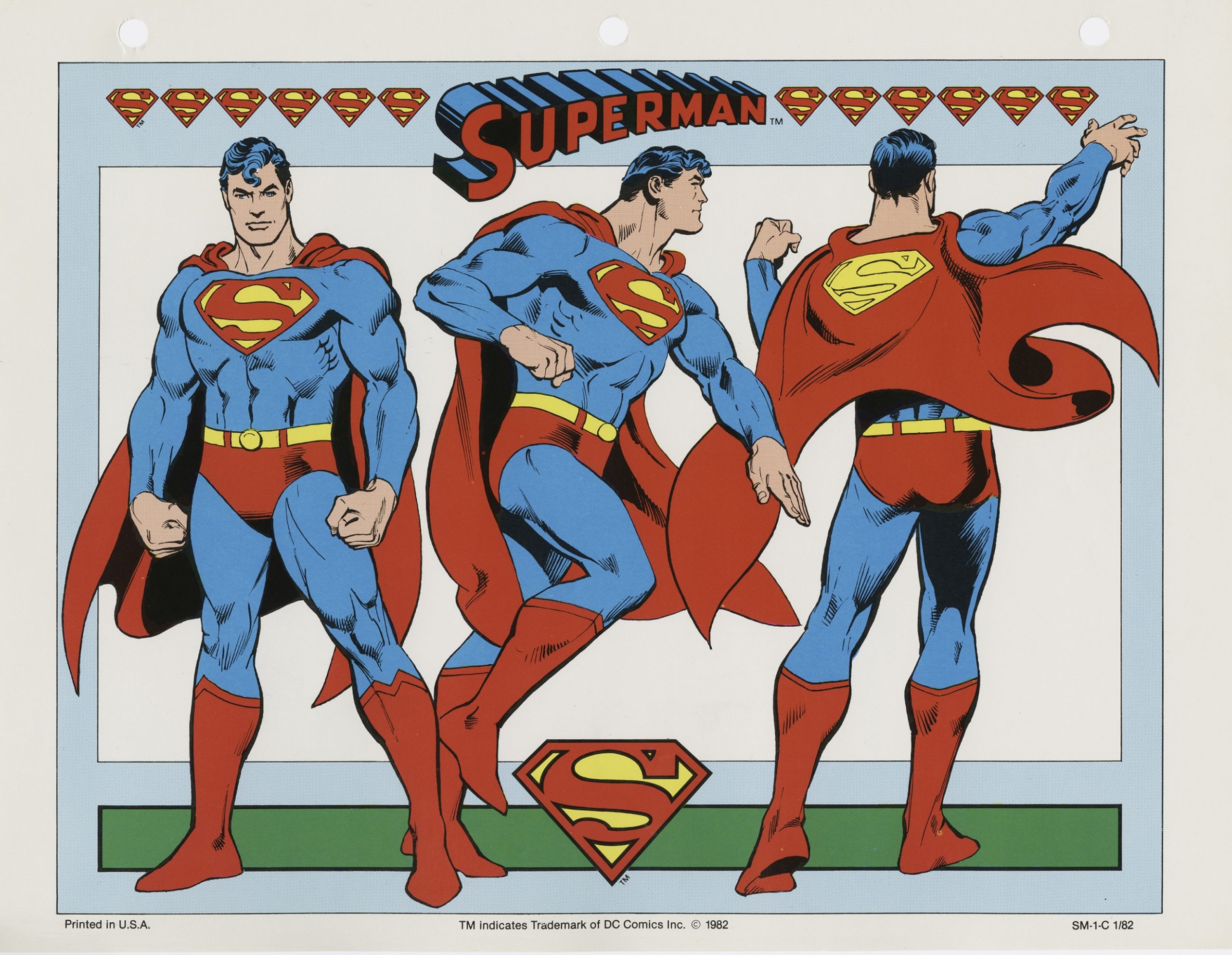
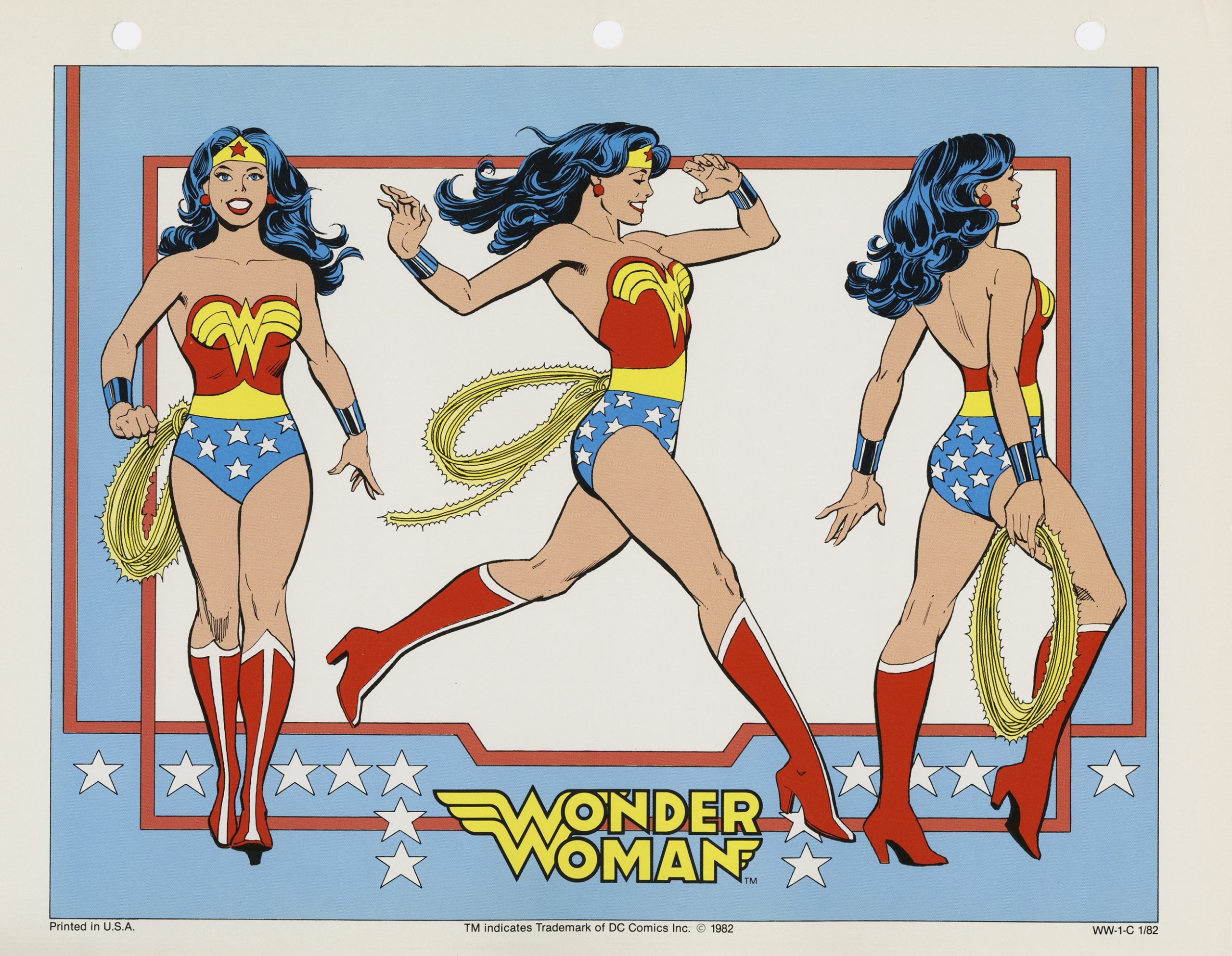
As I sat in my office one day, a man stepped into my doorway and stared at a point on the wall behind me and just above my head. Although I'd never met the man, I knew his distinctive face. It was Jean Giraud, a.k.a., Moebius, and he was staring at a drawing of Wonder Woman by José Luis García-López.
Without acknowledging me, he inched his way into my office and behind my desk until he was just in front of the drawing. He shifted his glasses down off his nose to get a better look at the drawing. After a moment, he turned to me.
"This García-López," he asked in a heavy French
accent. "He uses models, no?"
"No," I answered, smiling.
"Son of a bitch!" Moebius hissed.
Apocryphal or not, you want it to be true. It makes sense. A snap assessment, a simple question that reveals the fundamental strength of an artist, plain to the educated eye: Does García-López use models? No, of course not. You can tell at a glance. He just knows.
José Luis García-López is not perhaps your favorite Superman artist. In that context the artist seems uniquely vulnerable to posterity. His high tide at DC spanned the 1970s and early '80s, a particularly weak time in the company’s output. Over the course of his career García-López drew just about every character in the company’s stable, but became especially associated with Superman and his family. Possibly his most renowned work apart from Superman is a book called Atari Force. If you weren’t alive and buying comics in 1983-84 there’s a good chance you’ve never seen Atari Force, possibly never even heard of it. It’s never been reprinted, will likely never be reprinted, owing to the vagaries of it belonging to Atari (yes, the video game company). Every previous attempt to license the material has been scuppered by legal morass.
Of course, it must be said: Marvel recently reprinted the Micronauts and ROM, so anything is possible in this world. A reprint of García-López and Gerry Conway’s Atari Force probably wouldn’t rewrite history but it would certainly provide the best possible one-volume compendium of García-López’s great talent. The early '80s was a good time for space opera in comics — spurred by the success of Star Wars, certainly. Atari Force was one of the better books on the stands in that mold.
If you’re looking for a good one-stop-shop for García-López, I recommend a recent release, possibly still available on the shelves of a well-stocked comic book store. They’ve been reissuing old Treasury editions in Facsimile form, and I admit I’m an absolute sucker for the format. Giant-sized comic books are a blessing in these turbulent times. A little while ago they reprinted the Superman vs Wonder Woman Treasury Edition, an original 72-page epic, drawn by García-López and written, again, by Gerry Conway. Originally published in 1977, it promises an actual slobberknocker between the two heroes, and actually delivers. At least for a few pages, before they have to go back to being friends and stop the villains who’ve taken advantage of their temporary private war. It’s a World War II story, to boot, a tale of Earth 2, so you get to see Superman and FDR palling around.
It’s a gorgeous book, in other words, save for the inking. Dan Adkins doesn’t work for me on García-López, but then, I’m picky. I like Ricardo Villagran over García-López on Atari Force. You need to have someone with a supple line.
Superman vs Wonder Woman is a great comic. Looks like a million bucks, even if it only costs $14.99 American. The story has a good hook: what if Wonder Woman found out about the Manhattan Project? If your answer is that Wonder Woman probably wouldn’t like that very much, you’re precisely right. Hence the fight. It’s a decent way to while away forty minutes or so, but still a Bronze Age Earth 2 story. There’s a hard floor and a hard ceiling to the experience. It’s fun. García-López drew a lot of fun comics.
As a talent he was so much better than the vast majority of his material, it should hardly bear repeating. There’s the rub. Atari Force is a great book and definitely deserves to be in print. But it’s great in the same way that Mantlo & Golden’s Micronauts is great — another reading situation defined by a hard floor and a hard ceiling. Satisfying to read, possessed by moments of sheer virtuosity - but at the end of the month someone is cutting a check to a toy company to make it happen.
In fairness, toy companies keep the lights on. DC entered the 1980s as defeated and chastened as any organization in comics. Marvel was on an upswing, without question. DC had to change or they would have faded away. To their credit the company was able to reinvent itself rather thoroughly over the course of the next decade. That was not by chance or coincidence, although it didn’t hurt that Marvel imploded rather spectacularly in the middle of the decade. In the wake of a hellacious and demoralizing late 1970s DC was blessed in the early '80s with a group of executives and editors who could see the scope of the problem and act accordingly, and who could even capitalize on Marvel’s growing instability as the later years of the Shooter regime bore down.
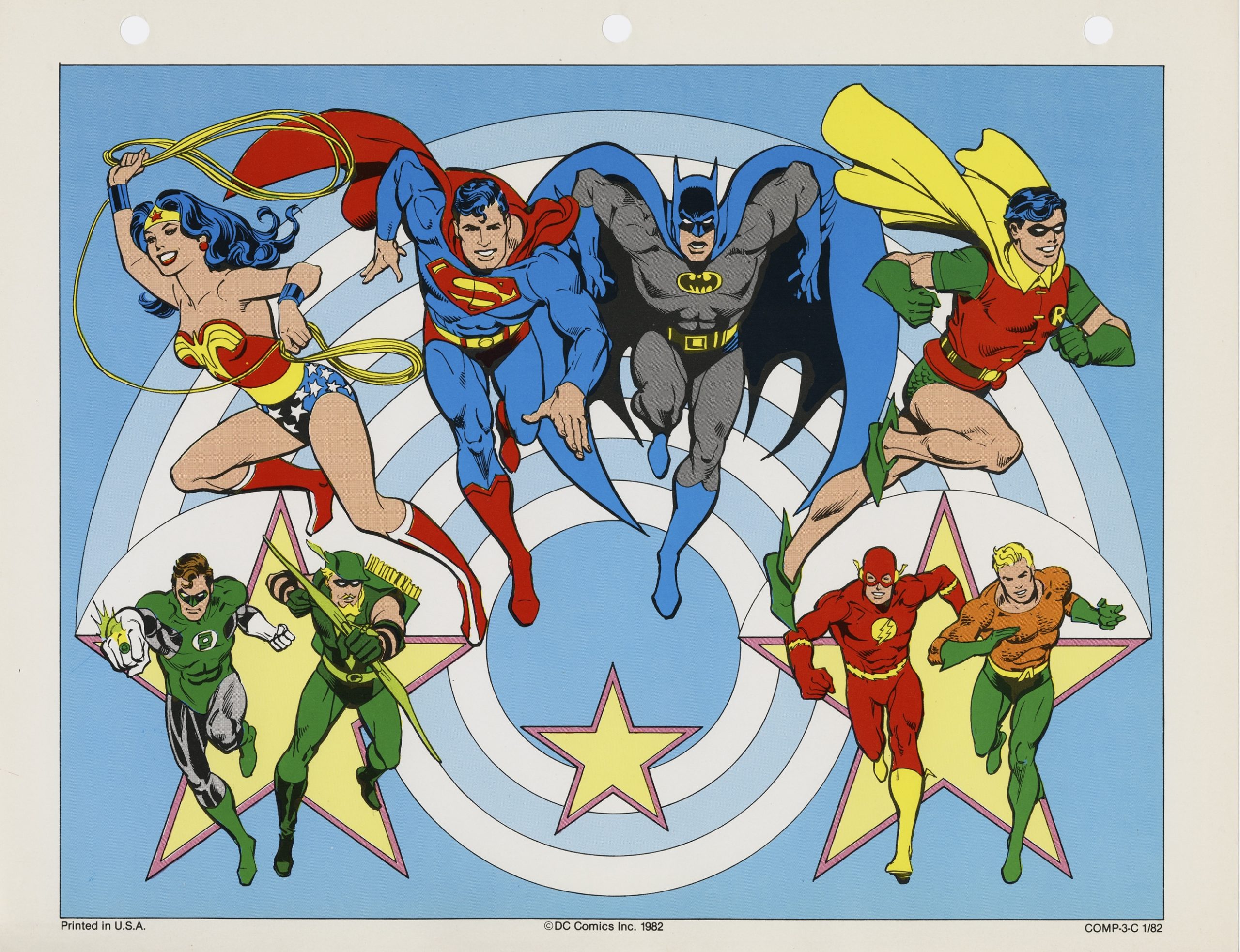
The DC Comics Style Guide is a product of a period of great innovation at the company, much of which wouldn’t even begin to bear fruit for half a decade or more after its initial launch. It wasn’t created to be printed and put in stores. It’s a behind-the-scenes document, produced for the purpose of streamlining the company’s presence in the world of licensing. The DC Guide was a forward-thinking document, one of the first style guides to circulate the licensing industry as a deliberate package, and thereby influential in form as well as function. A visual cornucopia taken from the breadth of the company’s character library, all illustrated by the one man judged best to approximate the mean room temperature of DC Comics circa 1982: José Luis García-López.
To which one can only say, why yes, of course.
The book was spearheaded — this is according to Paul Levitz, who provides a historical introduction for the present reissue — by Joe Orlando, Neal Pozner, and Mary Moebus. Orlando’s vision of DC would emerge dominant in the following decades, influenced by a succession of editorial successors (specifically Len Wein, and through him, Karen Berger) trained in the science of how to make comics by someone who remembered EC first-hand. Pozner was the company’s Creative Director, a position taken after being lured away from a job designing record covers. He was one of four DC staffers to die of AIDS over the worst years of that plague, in 1994. An underexplored aspect of comics history that perhaps deserves a great airing than mere mention in articles such as these. Moebius was the company’s first dedicated hire for their newly-formed licensing division — a forward-thinking decision in itself. The three of them put the book together, placing García-López with Dick Giordano as an inker. Giordano was working as the company’s Editorial Director at the time, and so intimately familiar with how everything was supposed to look.
If this book has a guiding ethos, it is just that: how everything was supposed to look. These collected illustrations were printed alongside color guides (themselves fascinating documents, invaluable for process junkies), and brief promotional blurbs, and sent to licensors across the spectrum. The people making shirts, toys, fast food tie-ins, and cartoons were all singing from the same hymnal after decades of catch-as-catch-can, imagery taken freely and without compensation for the artist. This Style Guide was designed to remedy every part of the problem, not merely by providing stability and consistency across multiple licensees but by hiring a specific artist and paying them well to draw images that were going to be reproduced and referenced an untold number of times. And what’s more, sending them additional payments after the material continued to be used for decades. Paul Levitz was good about that.
The Style Guide was emblematic of the company across the early 1980s, a time of modernization within the organization. They had to rebuild editorial capacity withered by decades of the same people being in charge, and having run the whole enterprise into a ditch by the mid-70s. The contractions ultimately entailed losing a generation of up-and-coming editors to Marvel — both Al Milgrom and Larry Hama, to name two people who moved from DC to Marvel following the implosion. This was the context for Janette Khan’s critical pretensions, hiring Frank Miller to do whatever the hell he wanted and giving up the store for the privilege with Ronin. This is the context for Alan Moore’s Swamp Thing, Crisis on Infinite Earths, Dark Knight Returns and, down the line, Vertigo.
All that success arose from out of the early 1980s, when the company got its act together. The Style Guide exists because there came to be a critical mass of people within the company who were willing to do the hard work of rebuilding. So, yes, it’s a document for the toy company, a symbol of a period notable for the comic book companies just beginning to recognize the significance of licensing to their bottom lines, a transformative understanding that redefined the business heading into the twenty-first century. You don’t get Vertigo in the '90s, or even Ronin in the '80s, without doing the necessary legwork to right the course of the ship listing under everyone’s feet. And for DC, righting the ship meant taking a more commanding position in regard to their licensees.
Which certainly sounds like precisely the kind of thing we’re supposed to celebrate in 2025! Everyone’s making big-budget movies to celebrate the creation of products, very much a symptom of consumer society. There is a perversity in foisting such a laurel on the brow of a book of Underoos drawings, and yet: friend, I assure you, as magnificent an achievement as this book is, that is ultimately what we’re talking about. This is a compendium of drawings, top-shelf work by the absolutely integral José Luis García-López, intended for use on Underoos.
And fast food promotions, TV shows, third party publishers, toy companies, advertisers, amusement parks — all the above. Everyone working with the DC characters for any reason in any medium would know what they were supposed to look like along with the most basic understanding of what they’re about. The book also works as a catalogue. An organizing principle for the company’s streamlined intellectual property.
I’m interrupted by a knock on the door. To my great surprise it’s Theodor Adorno, noted critic and leading member of the Frankfurt School! Sensing no ruse I opened the door and welcomed him.
“My god!” said I, “Theodor Adorno! What are you doing, here in A Place?”
“Take my name out of your mouth,” he said.
“What?” I motioned for him to come inside, he steadfastly refused.
“No, I’m not going in there. You take my name out of your mouth in all your future endeavors. I can’t be a party to any of this.”
“Well, it’s not like you’re wrong,” I hedge. “It rather puts the whole endeavor into perspective to realize that these merchandising images would go on to be by far the most popular and enduring versions of all these characters. Far more influential than Crisis, or Dark Knight Returns, or Tim Burton in terms of steering towards future creative directions. This was ground zero going forward, and this is definitely a commercial document.”
“Aren’t they all?” Adorno asked. “You’ve succeeded in lauding the Platonic form of an IP. Listen to yourself. Get help.”
“You sure listened to a whole lot of jazz records for someone who hated jazz so much.”
“That is certainly a more legible cultural type in 2025, isn’t it?”
I conceded Theodor Adorno’s point.
 “No, it’s good work,” Theodor Adorno sighed, conceding that point, “for an Underoos book. Iconic.” He pronounced the word like he was chewing glass. “Anyway. Fuck off, asshole. Have a big fun paying those student loans.” I flipped him off as he did a double backflip into the drivers seat of his Camaro, prior to peeling out of the parking lot. In the passenger seat, I believe, a woman familiar from coffee advertisements.
That’s part and parcel of the package, though, and not just for García-López. For every artist who did, and does work of value in those fields. It’s a real bitch. I wish Atari Force were in print — sorry to beat the dead horse, but Atari Force should be in print. It’s gorgeous work. It just happens to be a tie-in to a brand that had nothing to do with any version of these characters other than owning the nominal trademark. It’s just a fluke of the universe that DC’s best comic in the vein of late-Bronze Age Star Wars-influenced space fantasy — and some of the best work of García-López’s career — is owned by someone else. A real bitch.
The existence of the Style Guide is wholly a testament to the skill of José Luis García-López. They picked him to be the one guy in the whole world ultimately qualified to say what Superman looks like. Superman looks like this, because this is how García-López drew him here. Is García-López your favorite Superman artist? He’s not mine, I’ll say that. Maybe he’s not even yours. But no one draws the character more precisely, and they can prove it with science.
You might not know him from anything but the Underoos, is the thing. If you’re just a little bit younger than me you might not know him as anything but the images on commercial products, and too much younger, not even that. Although, it must be said, these versions of the characters still get action in the world of merchandise. They’re old but not archaic, not in the same way a Boring or a Swan would be on a t-shirt. Nor as historically specific as a Byrne or a Quitely. They simply are the characters, generic to a fully intentional degree. This book went on to be tremendously successful at its stated purpose. Updated and consulted across multiple decades. Eventually supplanted by online materials, as is the nature of things. But still: one of the most influential pieces of comic book-related art that has ever been published, for better or for worse. Its echoes still felt today.
And the guy they picked to draw it? Why yes, of course. Who else? Other people draw versions of Superman, García-López draws Superman. That was DC’s intention and they succeeded to a remarkable degree.
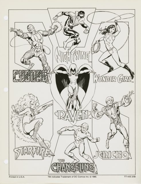
Other artists are present on these pages, certainly. The New Teen Titans were just a few years into their ascent at the hands of Wolfman and Perez but already that specific version of that team is considered sufficiently prominent to rate a decent spread in the licensing catalogue. García-López draws Perez’s meticulous designs with exacting discipline, precise enough to conjure the spirit of the original. The Fourth World characters are included as well. Darkseid was the bad guy for one of the later seasons of Super Friends, and a player in the Super Powers toy line. García-López sands the edges off Kirby to bring those rather eclectic designs into line with the rest of the merchandise. Plastic Man and the Shazam family rate significant spreads, based on their fading sparks of notoriety, alongside Aquaman and the Flash and the rest of the menagerie. The main players in the Justice League — Hawkman, Zatanna, and the like — all receive token coverage. Nothing outside the strictly determined realm of merchandisable, Happy Meal-ready super-heroes is included: Swamp Thing, Sgt Rock, Warlord, and Jonah Hex would have to fend for themselves among the licensors.
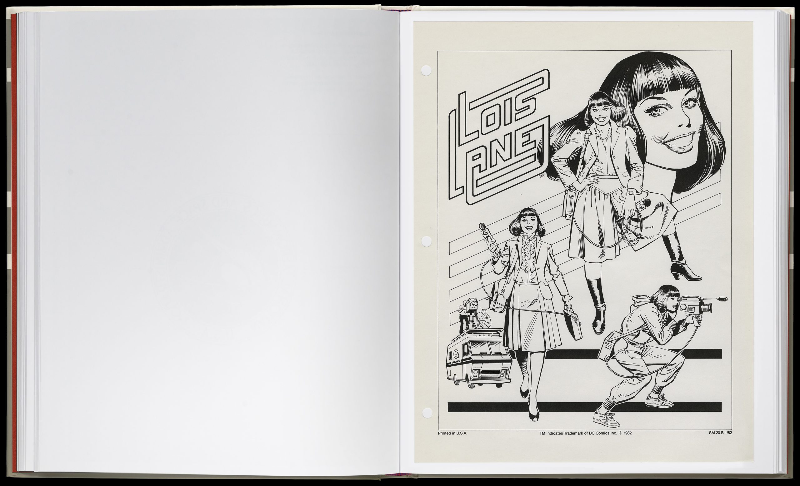
García-López draws everything with aplomb, but he seems to enjoy drawing Lois Lane more than anything else. Unless I’m mistaken. His Lois carries every ounce of the vitality you’d hope to see from the character. Giordano’s line adds a unity, leveling perhaps, but never heavy-handed. He works hard not to maintain the natural sensuousness of García-López’s line. Even on Underoos, that line remains distinctive. "Son of a bitch!"
The present volume, produced by Standards Manual, is perhaps the nicest possible presentation this material could ask for. A peculiar publishing house, to judge from their output. The DC Style Guide goes on the shelf next to their printings of the NASA Graphics Standards Manual and the 1970s New York City Transit Authority Graphic Standards Manual, to give you the idea. Fascinating stuff, for true sickos. They’ve gone all out in presenting the material in as close to the original context as possible.
DC is, however, missing a bet thinking this material is only of interest to — sorry — design nerds willing to fork over a c-note for the privilege. This is the most popular and well-loved version of these characters that have ever existed, not merely the ur-forms, but also the specific version of these characters as recognized by a solid generation of fans. A slightly less archival presentation of José Luis García-López’s most definitive DC art seems like it could do good business on its lonesome, but what do I know. I’m just a sucker who owns multiple books of He-Man toy art. Maybe it just didn’t occur to them to slap this material in a coffee table book and ship 100,000 copies to Barnes & Noble. As the great Theodor Adorno once said, some people are just allergic to making money.


 English (US) ·