Why does the promo art for Fantastic Four First Steps look so odd? The movie is clearly trying to set a retro-future vibe, so some of the awkwardness is deliberate, but some of it is downright weird.
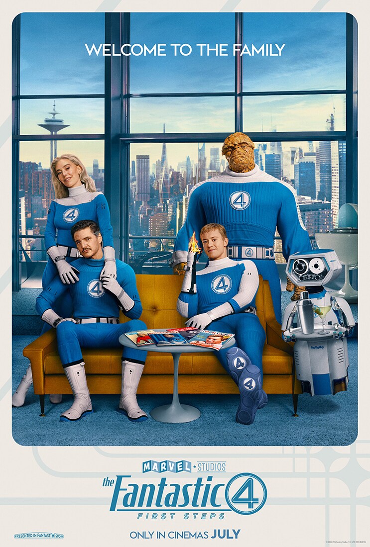
I was thinking that when I saw this official Marvel promo going out of a mocked up magazine cover, a staple of every superhero movie to show the acceptance and cultural significance of the superhero in question:

There’s also a version without type floating around:

There is so much wrong with this. Leaving aside the matter of what is happening in Johnny’s pants, this blatant return of the Brokeback Pose is quite shocking. Lest we forget, the Brokeback is a pose where (almost always) a woman is facing the viewer with both her face and butt. It’s mostly used for cheesecake and the idea of a People Magazine cover promoting family using a Brokeback is deeply troubling. As you can see from this People magazine cover gallery, the kind of cuddly pose Reed and Sue have is indeed quite common, but then using it to show off a pert bum is unlikely. (BTW People Magazine did not exist until 1974.) Even Jennifer Aniston stayed in two dimensions:

I’ve already written one post about the FFFS poster campaign: four retro posters showing crowds to evoke a warm old timey feeling were released along with the first teaser trailer, and they were immediately pegged as being done by AI. A defense came quickly; no AI, just bad photoshop. Well then.
It’s a little hard to winnow actual studio released promo art from fan made posters, but I believe these are all official releases:


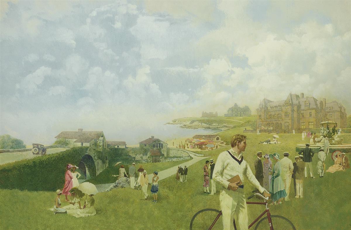
The presale poster above, came in for online criticism from people who think it’s woke or something. I will admit, it is odd. Reed with that “bold first step” pose is right on brand, but all of the posters are trying really hard to look like Alex Ross painted Tomorrowland, and Alex Ross did not paint them. While the posters are trying to be sincerely fake, they just come off as fake fake to me.
Those of us who don’t scour spoiler sites don’t know too much about the movie, or at least, I don’t, as I try to view films with a fresh eye. We do know that it’s set in an alternate past and director Matt Shakman did sincerely fake retro really well in WandaVision, one of the few post-Endgame MCU projects that was actually worth watching – I’d rank it right up there with the very best of the MCU. The ending of Thunderbolts (SPOILER) suggested that the FF will make their way to Earth-199999 – all the references to time in the trailer and the promo art are foreshadowing, people! Wandavision had the same arch, deliberately stilted sitcom approach that we’ve seen in a lot of the FFFS material. It’s a bold, risky take, but a risk worth taking for bringing the 60+ year old FF concept up to date. A little retro fun, a little time travel and you have a catchy remix. But in Wandavision, this approach was the deep denial of a grieving woman. Here, it’s deliberate.
If the above posters don’t quite land for me, this one does, which was for Showcase Cinemas advance sales.

This FF just looks better in action. Notably, this provides one of the few instances of Reed stretching that we’ve seen. It’s been speculated that stretching powers don’t translate well to film – while the idea of an extendable Pedro Pascal is appealing, it might be hard to make plausible. By contrast, the Human Torch is an 11, and The Thing is hard to mess up – unless you give him a beard.

I’m not sure this is an official poster but it brings up something else – all these promos are trying to tribute very famous art styles, but the end effect is often wooden.
For instance, the above poster seems to be referencing the work of the late, great Robert McGinnis. McGinnis mostly specialized in beautiful women, but he also did some James Bond posters.

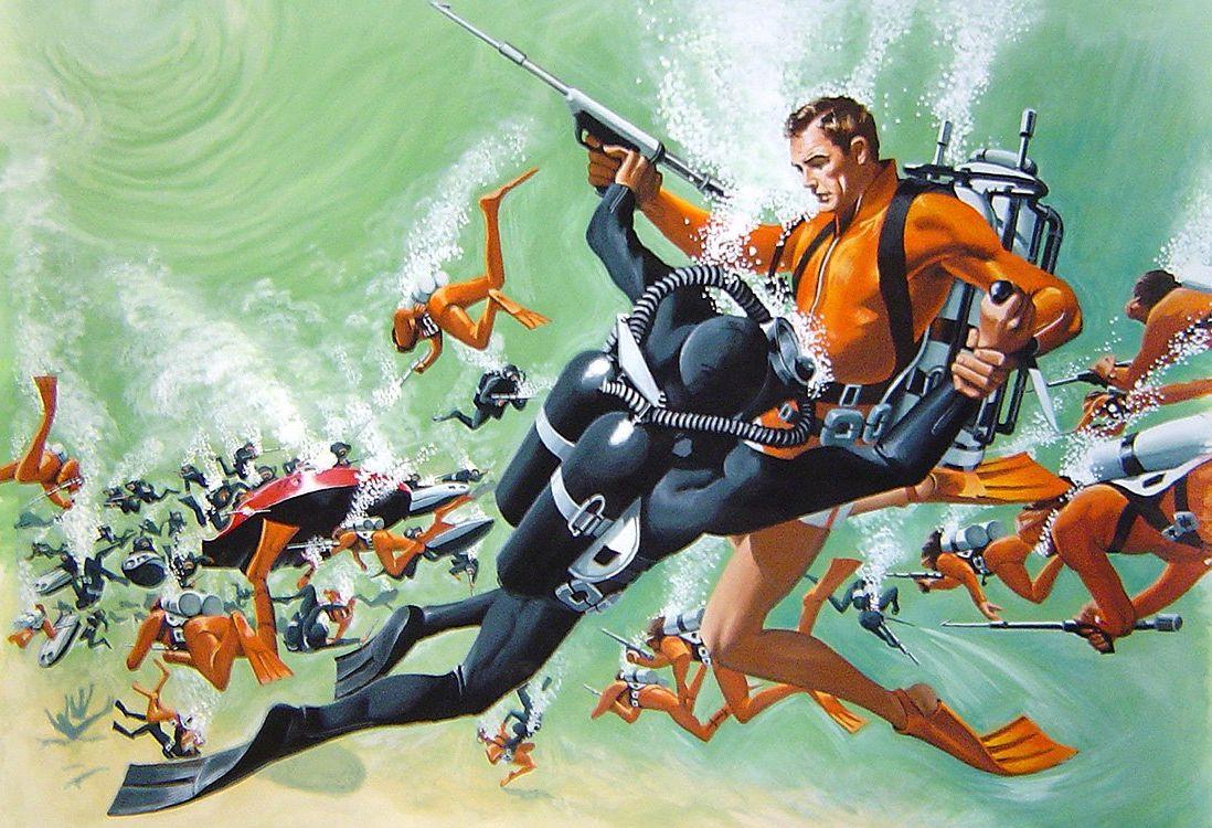
The textured background in the FFFS poster was a feature of art of the 60s, and McGinnis used it a lot as well.
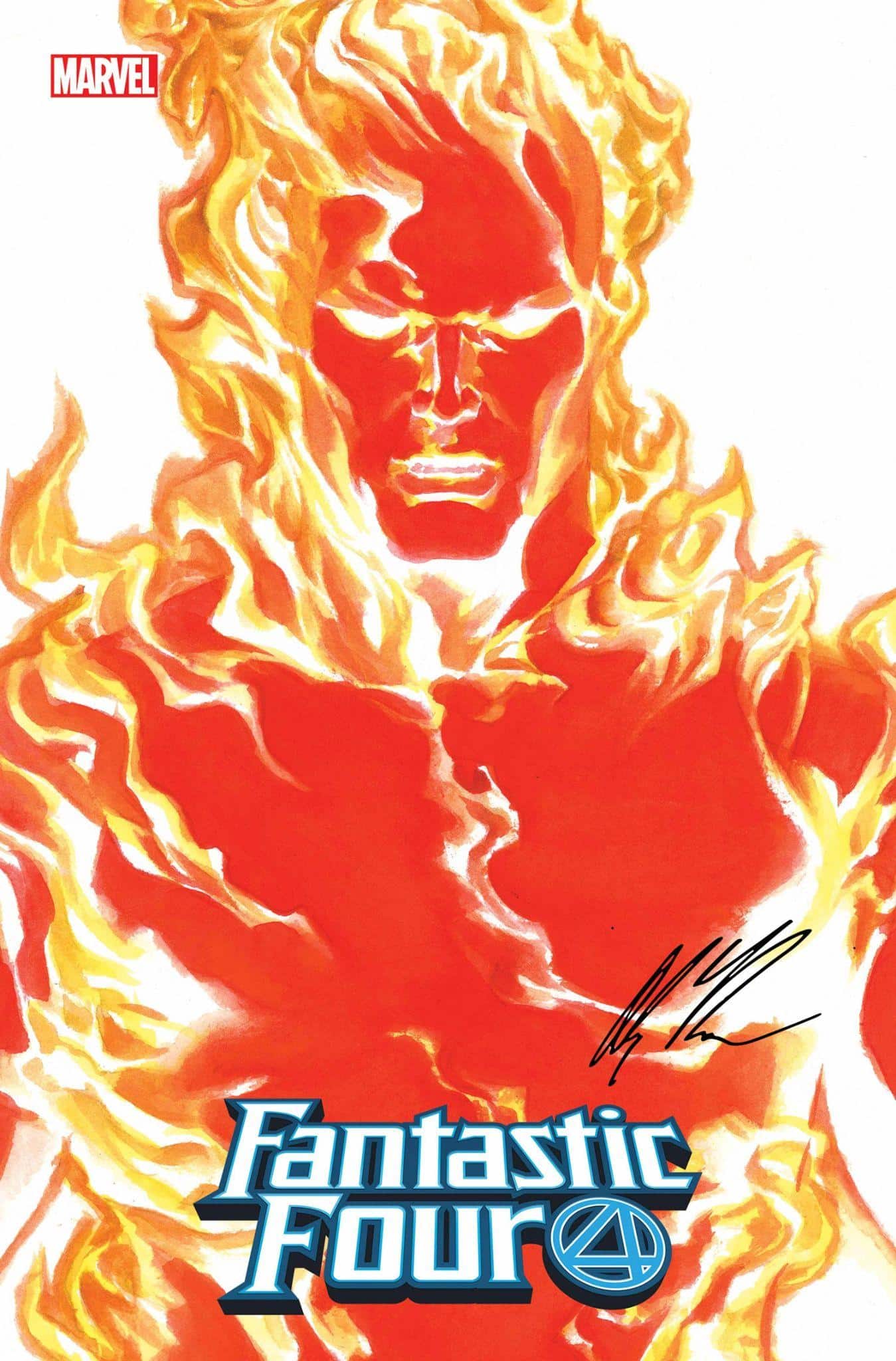
Alex Ross is another touchpoint. Ross has a strong history of working with the FF in the comics, and you can see how dramatic and intriguing his takes are:


That Sideshow poster is everything you could want in a teaser image: fire, rock, forcefield and stretching all dynamically showcased, and the horizontal faces at the bottom capturing the danger and intensity of the original FF’s ill-fated space journey. In Fantastic Four First Steps, they’re skipping the origin because it’s too dated – and really you don’t need any more than this poster to tell you the whole story.

Another element this campaign is trying to evoke is Tomorrowland, Disneyland’s immediately dated take on the future. A few parts of Tomorrowland (Space Mountain) tried to look futuristic, but they already knew it was going to look like Yesterdayland very quickly, so they went for the whole retro-future look. You might say it was invented in Tomorrowland.
Thinking about this caused me to do a deep dive into Tomorrowland concept art, and there wasn’t much I could find online. One of Tomorrowland’s chief designers was the legendary Imagineer John Hench, who also worked on the Enchanted Tiki Room, and the 1964 World’s Fair, the latter being another strong influence in the FF stuff, and something constantly referenced in film.
While I couldn’t find art specifically by him, here’s a post of Tomorrowland concept art and some samples.


Syd Mead, the great futurist and designer best known for Blade Runner, didn’t work on Tomorrowland the theme park, but he DID create a promo poster for the Brad Bird movie called Tomorrowland.

(Hm I’m a big Brad Bird fan but never saw it…was it that bad?)
Finally my googling found some odds and ends that are worth noting. A Marvel Studios concept artist named Mushk Rizvi accidentally posted some of her concept art to the cloud, and Reddit and everyone else found it. I hope she didn’t get fired because these are pretty good. Lots of spoilers in the link.


The FF family dinner one actually has more charm than some of the stuff that was released.
I also found this Fantastic Four First Steps 2026 calendar that has lots of images most likely from the style guide.


I’ll leave it to you to decide whether this is something you would like to hang on your wall.
I also found this fan poster by Mickael Journou – this is NOT official art, but given the People magazine cover for a moment I thought it was. And that’s a problem.

So to sum it all up: I’m not an MCU hater, but I am a Phase Six skeptic. Most crucially, the MCU movies, as beloved and successful as they were, are not known for their amazing concept art or visuals. It’s pretty well known that the movies are planned in PreViz, which has given them a fairly uniform look, but also a bland one. Everyone keeps wanting the MCU to break loose and try something new. With the exception of the Guardians of the Galaxy trilogy, which had baby steps, they haven’t really done it. With Fantastic Four First Steps, the MCU is really trying something different, and the promotional campaign has been all in on that: there has never been an MCU movie that looked like this. And after 18 years and 36 years, it’s about time! But the execution here doesn’t inspire a lot of confidence.
For me, anyway. I’m a big fan of movie concept art! I guess a shorter version of this entire essay could be “They should have gotten Alex Ross to do these!” As I pointed out before, Ross probably was too expensive or uninterested. No one should be criticized for not being Alex Ross. He’s a singular talent who really is the modern version of Norman Rockwell. But for a campaign that should have been fun and playful, these come across as trying too hard. The bottom line is that a LOT is riding on Fantastic Four First Steps for Marvel and Disney. And it shows.
Footnotes: Interview with John Hench. This contains a shocking passage about Pirates of the Caribbean that I should probably put in a separate post.
And finally, in the “It could have been worse!” category, here are posters for the previous two versions of the FF on screen.


 English (US) ·