
In this week’s Wednesday Comics Reviews, the team reviews the cosmic horror of Event Horizon: Dark Descent, the new Rick Remender comic Escape, some old school Teenage Mutant Ninja Turtles, a Godzilla reprint, and more! Plus, as always … The Prog Report!
 Event Horizon: Dark Descent #1
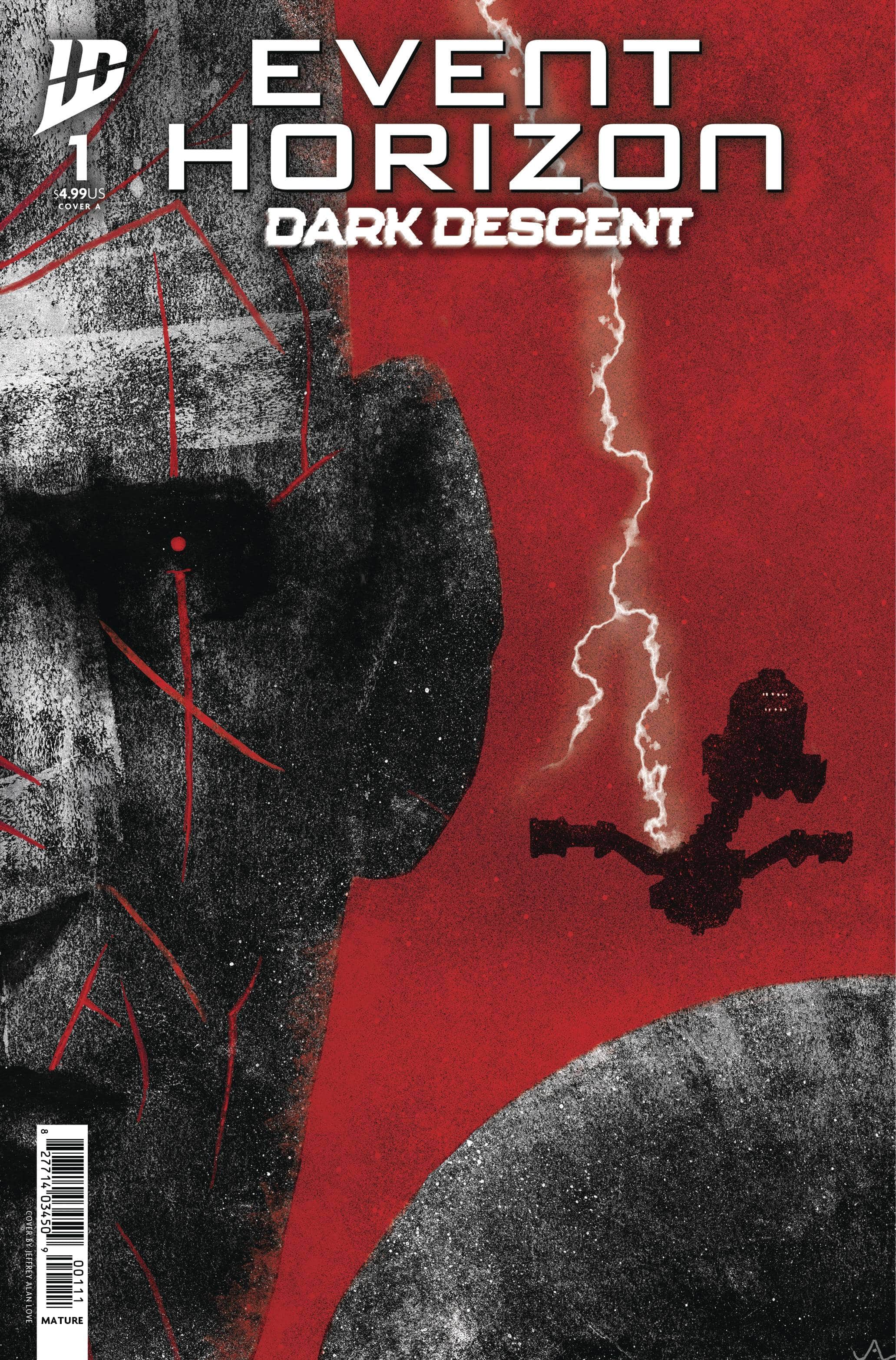
Writer: Christian Ward
Artist: Tristan Jones
Colorist: Pip Martin
Letterer: Alex Ray
Publisher: IDW Publishing
Review by Jared Bird
‘I was always a man of science, and now… I find myself consumed by hell.’ Doctor William Weir has lost his wife. His dreams are filled with dark, vivid hellscapes beyond what you can imagine. Eyeless entities call to him – a siren song to the void. Inspired by the 1997 cult classic sci-fi horror film Event Horizon, this prequel comic kicks off strong, knocking the door down and validating its own existence with effortless ease.
Set in 2040, this comic explores what happened to the crew of the Event Horizon itself, long before its appearance in the film of the same name. Led by the enigmatic Captain Kilpack, a believer in old faiths in a world far removed from them, the ship begins a perilous journey into the unknown. Every member of the crew has their secrets, be it fleeing abusive husbands or dying of cancer. What no one knows, however, is that Weir has designed the ship based on a single command from a haunting vision of his wife, with no eyes and no skin – ‘Come find me’. Across this first issue, a nightmarish sense of tension and atmosphere builds, standing out as one of the most compelling issues of a horror comic I’ve read all year. Balancing out tremendous character work with just the right amount of cosmic horror infesting every page, this book absolutely shines, exploding off the page and making an impression straight into your mind.
The scripting by Christian Ward (Two-Face, Batman: City of Madness) is excellent throughout. He has an excellent understanding of the film’s language and style, but uses that to make it his own, allowing the book to stand out and not cheaply recycle any of the film’s dialogue. With even the smallest moment, he puts in the work to establish characters well, their motivations, and hint at some of the troubles that they might get into due to these motivations. The standout character is William Weir, whose narration is spine-chilling and knocked my socks off. It’s a fantastic showing from Ward, who continues to prove he’s just as excellent a writer as he is an artist, one of the best in the industry today.
Tristan Jones (Aliens, Batman) does a fantastic job with the artwork. His artwork has a realistic quality to it, without coming across as cold or lifeless, and he knows when to emphasize the horror of certain sequences, with an excellent understanding of page layouts and how to flow and structure any given scene or moment. He’s great at capturing the film’s very memorable horror visual style, whilst also not simply copying it in a cheap or meaningless way. Colorist Pip Martin is also a huge part of what makes the book work, infusing it with the same cold, rusted and dirty look that the film has which makes the sequences of nightmarish, hell-scape driven horror stand out even more.
Overall, Event Horizon: Dark Descent #1 is an excellent debut issue, a haunting cosmic horror that slowly unfurls across the course of its first issue and sets up a terrifying and exhilarating story to come. With incredible artwork and bold, harrowing writing, this book proves it’s no mere cheap media tie-in, instead using its source material to tell a story that might become even more compelling than the original in the process. A must-read for fans of the film and horror comics in general, and a series to keep an eye on as it continues.
 Escape #1

Writer: Rick Remender
Art and Colors: Daniel Acuña
Letters: Rus Wooton
Publisher: Image Comics
Review by Clyde Hall
Each of us live with the notion, usually stuffed in some shadowy, out-of-the-way corner of our minds, that today could be our last. But depending on myriad factors, like age, environment, or health issues, it may not be something we cope with daily. Unlike soldiers in a shooting war, or the noncombatants in their wake, we can acknowledge mortality but not dwell on it.
Those participants, though…active or passive, they struggle with it constantly. Seeking a foothold against the Reaper, an edge, or even just a way to make sense of the conflict they’re steeped in. And should they survive in a post-war future, many still navigate the aftermath of shattered lives and homelands littered with shiny medals and silent, cold gravestones.
It’s this sort of coping, viewed from the perspective of a flight crew on a bombing run, that’s brought into sharp focus with the first issue of Escape, Image’s ongoing title by scripter Rick Remender, artist Daniel Acuña, and letterer Rus Wooton. In an anthropomorphic conflict very reminiscent of our own World War II, Captain Milton Shaw and his airborne brothers-in-arms are on a mission to take out a Titan Cannon operated by their Narenian enemies. En route, they talk about their methods and outlooks coping. Coping with the risks, the lethal situations they endure, and with their consciences regarding the inhuman destruction they are preparing to unleash.
Copilot Lt. Flynn maintains that the enemy leader and his elite are evil, but not everyone he’s forced into this conflict are any different than Milton’s crew. He sees most Narenian soldiers fighting for their country, and with little choice given the draconian regime they’re living under. Milton holds all of them accountable for not stopping the demagogue’s rise to power before it led to warfare. And his bombardiers and gunners chime in with their own take on such matters until the mission enters its critical and most perilous stage.
The result is Milton and members of his crew shot down over enemy territory that they just bombed to cinders. Now they must evade capture while making a perilous escape back to their own frontlines if possible. Because for these soldiers, the mission may be changed to one of escape, but their duty continues.
Remender’s dialogue pulls no punches, opining on matters relevant in current conflicts. It’s easy imagining the debate of the crew as a debate that’s waged ever since warriors started forming into armies. It delves deeper into the psyche of combat than most war comics happy with merely scratching the surface of conflict for excitement’s sake. Our time with the crew is brief, yet we share Milton’s feelings about his own band of brothers, tail gunner Magoo being my favorite.
For my own writing projects, I watch a lot of WWII documentaries. Acuña’s artwork brings the smoking ruins of bombed cities and the details of his machines of warfare into the panels with a cinematic style which is still firmly grounded in real combat footage. It’s as exciting as it is harrowing, and his depictions of the bomber crew’s individual fates is apt follow-through on the foundation Remender’s built.
With this kind of crisp writing and vivid illustration, the question remains why the creative team’s made the title anthropomorphic and in a different reality setting from our own. Perhaps future installments will show the power in doing so, or the need to distance the topic of such war apart from historical accounting. But given the use of our-world references like the ‘goosestepping’ of the Narenian bat people and ironic nicknaming of an eagle-eyed tail gunner ‘Magoo’, the anthropomorphic and other-reality elements in the first issue struck me as unnecessary. Reader mileages may vary.
The only negative I came away with from a premiere with many positives was a devilishly puzzling one tucked into the details. Milton’s plane appears modeled after the B-25 Mitchell medium bomber. It’s a twin engine model and considered one of the better, more reliable bombers used by the Allies in WWII. Several times, however, the crew mentions engine Three dying, being hit, or crapping out, while in the following panels both of the engines seem to be functioning well.
With the number of heavy four-engine bombers used by the Allies, it seems likely the script originally envisioned Milton’s plane as one with four engines, each one suffering damage and eventually being taken out before leading to the crash in enemy territory. The rendering, though, is clearly a twin engine model. The talk of a third engine and the on-again, off-again conditions depicted of engines One and Two did pull me out of the story on the first read through.
Despite that rough patch bringing the first issue of Escape in with a hard landing, it certainly doesn’t crash. In fact, Milton’s downed bomber in the story only sets up much more anticipation and tension for the second issue as our main character is hunted by enemy forces amidst the hellscape he’s brought to the doorsteps of their civilian population. For those who want war stories reflected in complex and prismatic points of view, told in unapologetic terms borne of actual conflict, it’s a title which belongs on your pull list.
Godzilla 70th Anniversary Foil Classics: Godzilla In Hell #1
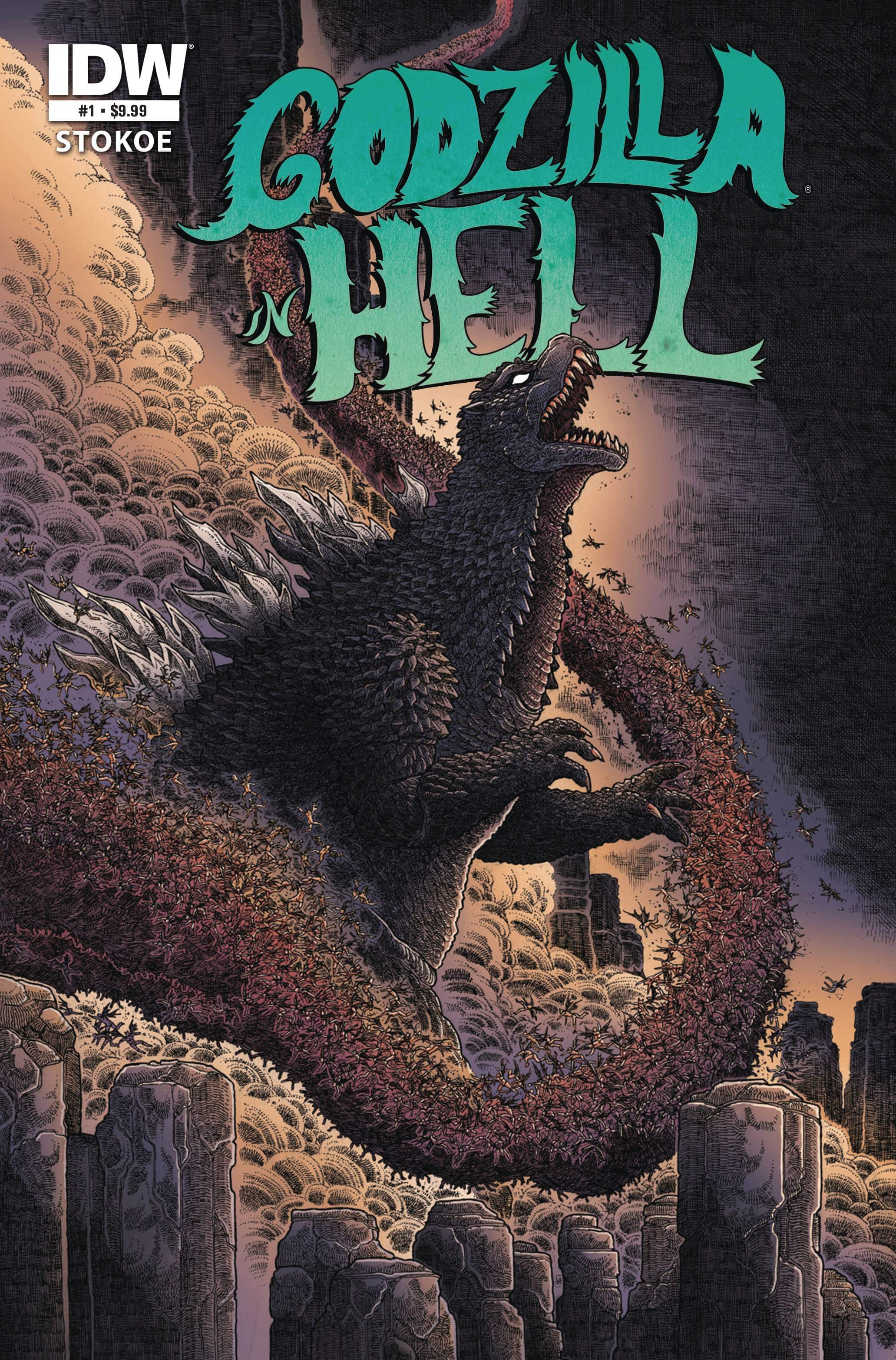
Writer and Artist: James Stokoe
Publisher: IDW Publishing
Review by Jordan Jennings
In honor of Godzilla’s 70th Anniversary, IDW is publishing reprints of notable IDW Godzilla first issues with a foil cover treatment. While I still haven’t had the chance to see these foil covers in the shops myself just yet, I am always eager to review a James Stokoe Godzilla comic and let me just say this one is a wild trip because, well, Godzilla goes to hell. So, “abandon all hope, ye who enter here.”
Godzilla in Hell #1 is an interesting comic to review because there’s functionally no dialog, or even sound effects, whatsoever. All we the readers know is that Godzilla is in Hell and based on some of the few bits of text in the book, it is Hell as envisioned in Dante’s Divine Comedy. This really isn’t that important to the first issue of the series as it’s just Stokoe putting in some serious work with Godzilla wandering the wasteland of the first circle of Hell and battling the souls of the people he has killed and the demonic manifestation of Godzilla’s own destruction.
This comic is straight up a Stokoe artist showcase as we see the writer/artist successfully tell a Godzilla story without any real sense of narration, direction, or explanation of what is going on. This issue is one of the few exceptions to my Unified Theory of Good Godzilla stories, the human interaction is key. There’s no humans to save or flee. It’s just Godzilla facing eldritch demonic horrors.
The visual storytelling is still spectacular all these years after Godzilla in Hell’s initial release. Stokoe has a knack for conveying Godzilla’s body language that few other artists can even hope to achieve. The sheer amount of expression from Godzilla in this issue will astound you and why it’s so successful without really having much of an anchor point.
The only thing that weakens the issue is the color palette, which is too focused on drab earth tones and could use a brighter pop of color at times to help contrast Godzilla from the background. The colors are not bad by any means, but a couple pops of saturated colors would make the issue pop.
Godzilla in Hell #1 is a story that has been reprinted dozens of times in various Godzilla collections. Oddly enough, often on its own since IDW loves to include it with Half-Century War to create a James Stokoe Collection. I personally prefer the Half-Century War as the human story alongside the more vibrant colors really elevates it. However, Godzilla in Hell #1 stands on its own for what it does and it’s a great time and worth checking out.
Teenage Mutant Ninja Turtles: Journeys #1
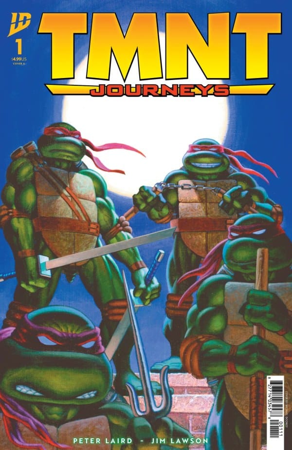
Writer/Inker/Letterer: Peter Laird
Penciler: Jim Lawson
Publisher: IDW Publishing
Review by Tim Rooney
The early aughts are something of a lost era for the Ninja Turtles despite a cartoon that, while successful, never tapped into the cultural zeitgeist and new comics written by franchise cocreator Peter Laird, and drawn by longtime Mirage Studios artist Jim Lawson. Laird carved out permission to continue publishing his own TMNT Comics when he sold the franchise rights in 2009, but those mostly did not materialize except two issues published online years apart. After 32 issues, the original Ninja Turtles unceremoniously disappeared. The final volume of Mirage TMNT has never been collected or reprinted, and the last two never made it to physical print at all. Until this month’s TMNT Journeys.
Journeys is a strange, pensive series full of wild ideas that took the aged turtles (having aged in real time from 1984 to 2000) and their supporting cast to unexpected places as the adult brothers grow distant. But this first issue is a straightforward reintroduction to the Ninja Turtles, evoking the original 1984 debut to show how much the characters have changed. The Turtles are more confident, less grim, but also more tired and dealing with new aches and pains. In the background, other plots are introduced–a mysterious Utrom encampment on the surface of the moon, the married April O’Neil and Casey Jones concerned over the health of a potential baby, and Casey’s adoptive daughter Shadow (whom he met in the original 90s City at War storyline) is training with Master Splinter.
It’s a small, quiet issue. Jim Lawon’s art is gangly and angular, almost cubist. It takes getting used to. His faces in particular can be off putting in the way they refuse to conform to typical comic book styles that invoke depth or perspective. Like a Picasso painting, both eyes, nose, mouth, ears, can be visible from any angle. As a young reader it was challenging, as someone who has spent his life reading comics and writing about them, it’s refreshingly idiosyncratic.
Figures aside, Lawson is a talented layout artist. His panel work is percussive, a staccato rhythm of interlocking vertical and horizontal panels that lead into a big half-page or two-page splash. Laird inks the story, but his hand is a bit heavy here. The art truly sings when he allows Lawson’s dynamic layouts to embrace the penciler’s use of negative space. Laird’s lettering, however, is immaculate and precise, like his plotting.
As comfortingly familiar as most of this first issue is, Laird and Lawson quickly sweep the rug out from under readers, as the group is split apart in sudden, anticlimactic fashion. The effect is intentionally disorienting and completely unconcerned with how it might play to readers awaiting an exciting return. Years later, it is sure to have the same impact on fans anticipating their first reading of a lost final work by the franchise creator.
Journeys is not really for casual Turtles fans mostly familiar with the cartoons. There are characters and concepts that Laird is fundamentally uninterested in explaining. There is a less manic energy to the work than the anarchic days of Eastman and Laird’s early collaboration. But it is a fascinating glimpse into a creators’ relationship to their creation, and the ways a concept can be transformed and grow with its creators when they have the ownership and economic freedom to follow their own muse. In this case, Laird, past middle age, reflects on his youthful creations as they enter their own adulthood and navigate questions of mortality and loss. It’s an artifact of a kind of comics storytelling and industry that is all but extinct.
Rapid Wednesday Comics Reviews
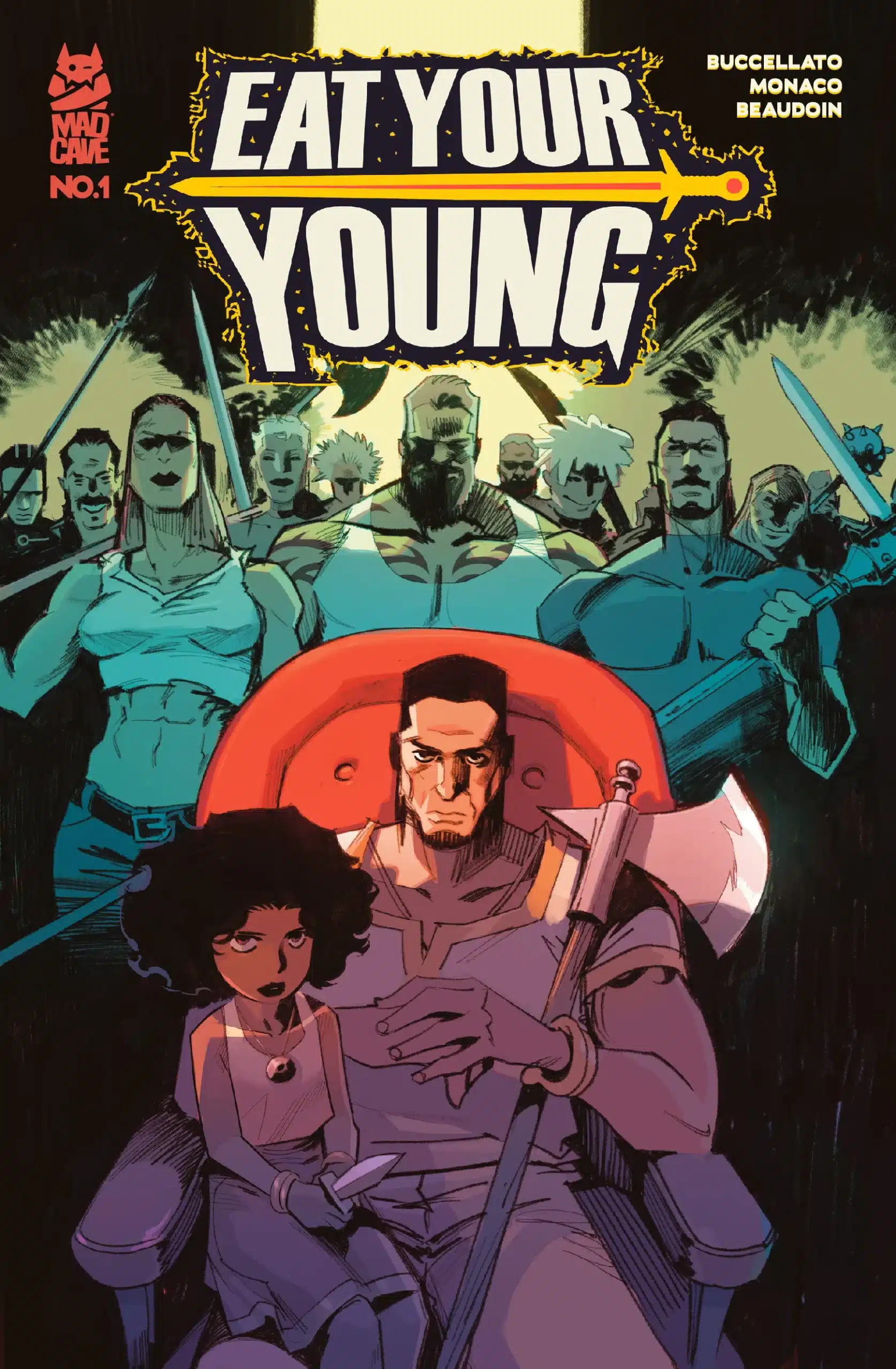
 Eat Your Young #1 (Mad Cave): Kicking things off with a bang (literally in the first couple of pages), Eat Your Young #1 shoots to kill. This is a gorgeous first issue, written by Brian Buccelato with art by Mattia Monaco and letters by Buddy Beaudoin. The shocking introduction had me immediately hooked, and the presentation of it, wow, am I a sucker for using sound effects as the panel! The art is gorgeous from panel to panel, page to page; there’s a spread that establishes a glimpse at how large this family is in an elegant dinner setting where my eye could land anywhere and be wowed at the varied designs of the characters and the details of the room. From there the book sits in the silence, juggling exposition and meeting the characters but never in a way that feels slow. The issue holds you in suspense as news moves slowly while would-be heirs plot on the murder of their father to gain his immortality all for themselves. It is grand in premise and natural in how the characters interact, all aiming to covet the immortality for themselves and rendering their siblings mortal in the process. Bickering, estrangement and entitlement weave their way through our characters and when things hit the fan, bang! And the issue closes out. I strongly recommend this first issue and cannot wait to read more. —Khalid Johnson
The Prog Report
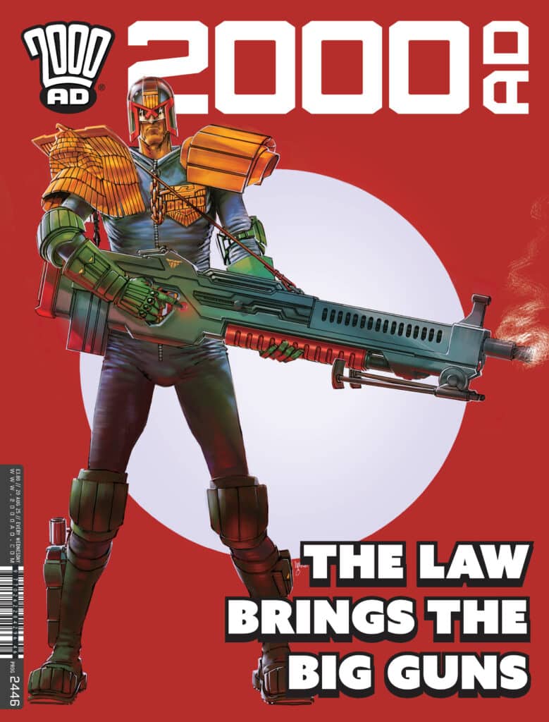
 2000AD 2446 (Rebellion Publishing): First off, little disappointed this week to not get the finale chapter of the excellent Judge Dredd: Tunnels, but hey, with comics deadlines sometimes these things happen. And I certainly won’t complain about the standalone Judge Dredd: The Double story from the team of writer Karl Stock, artist John McCrea, colorist Mike Spicer, and letterer Annie Parkhouse. And I’ve written about both Ravilious Pact and Azimuth of late in this space, both of which remain strong this week. All of that is to say that it felt like this week’s Future Shocks: Emmett’s Girl was the standout strip. It stems from the publisher’s newcomer contest at last year’s Thought Bubble, and it features the team of writer Eve Roebuck and artist Lucas McCoy. It’s one of those comics you just have to glance at once to know it’s worth reading. McCoy’s artwork is packed, detailed, and kinetic. And this story is good fun, with a nice setup and an even better ending twist. It’s basically everything you want from Future Shocks, a surprising story combined with an exciting new creative team. Good stuff. This week’s cover (above) is by Jake Lynch. As always, you can pick up a digital copy of The Prog here. —Zack Quaintance
Column edited by The Beat’s reviews editor, Zack Quaintance. Read past entries in the weekly Wednesday Comics reviews series!


!["Superman" (2025) Brings Heart, High Stakes, and Surprising Twists [SPOILER-FILLED REVIEW]](https://www.supermansupersite.com/Superman_2025_Retro_Poster.jpg)

 English (US) ·