
In this week’s Wednesday Comics Reviews, the team reviews the finale issue of I Was a Fashion School Serial Killer, the start of a new arc with Cemetery Kids Run Rabid, a Power Rangers/Teenage Mutant Ninja Turtles crossover, and more! We also have Avery Kaplan’s Star Trek comics Ensign’s Log, plus as always … The Prog Report!
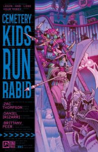 Cemetery Kids Run Rabid #1

Writer: Zac Thompson
Artist: Daniel Irizarri
Colorist: Brittany Peer
Letterer: Andworld Design
Publisher: Oni Press
Review by Jared Bird
What if a game console had you play entirely as you slept? You might lose track of countless hours inside the Dreamwave, and might even get consumed by it. Following up from Zac Thompson and Daniel Irizarri’s 2024 series Cemetery Kids Don’t Die, we once again follow four friends, who barely escaped the terrifying thrills of the video game Nightmare Cemetery in a desperate attempt to save one of their own. When a new DLC, The Blighted Sprawl, suddenly appears with a promise to reveal the truths at the centre of the game, our group of cemetery kids once again have to enter the Dreamwave, and fight against the effects of the game as it bleeds into the real world.
Set in the near future, where Cronenbergian, ExistenZ-like biotechnology is a regular part of society, Birdie, Wilson, and Pik recover from their traumatic experience in the world of Nightmare Cemetery, which left all of them emotionally and physically scarred. Joined by new member Maddy, they venture back into the world of Nightmare Cemetery, but things aren’t quite the same. Guided by a great, gnarly cyberpunk aesthetic that utilises body horror to great effect, the style of this book is one of the best things going for it. It has a fantastic and fascinating world, expertly crafted by the creative team to be unique and exciting. Cyberpunk may be having a resurgence in recent years, but this is a unique take on the genre that isn’t afraid to go into dark, gross spaces with it, even if the protagonists of the book are young.
Thompson does an excellent job with the script. He rides the precarious balance of both making the series feel like an understandable continuation of the story as well as a worthy story in its own right, even when removed from the previous entry. As such, it’s quite a good jumping on point for new readers, even if it is best experienced as a sequel. The script is sharp and witty, with a good sense of timing and flow. The dialogue fleshes out every character well, and I think Birdie especially shines, as a more complex trauma response that might come off as cold and unfeeling when compared to some of the others she’s surrounded with. She was my favorite character in the first series, and that shows little sign of changing, however I also found Pik compelling here, a character largely off-page for most of the first series.
Irizarri’s artwork is even better here than it was in the original series, with a great sense of page layout and readability that keeps the issue energetic and compelling at every point. He knows how to make a good body horror scare work, and some of the issues’ most graphic and intense moments are beautifully rendered. He shines in moments of dialogue too, with great character expression work and design that keeps every character individual and unique. It’s a great showing from Irizarri, aided by excellent work from colorist Brittany Peer, who creates a beautiful and unique color palette for the book that enhances its aesthetic.
Overall, Cemetery Kids Run Rabid #1 is a great read, compelling for both new readers and fans of the original series. Thompson and Irizarri attempt to push their skills even further than they did previously, enhancing the worldbuilding, scare and mysteries whilst also telling a compelling story about trauma and recovery. Whilst much of the plot is still yet to be revealed, this book is off to a killer start, and I would highly recommend getting in on the ground level, as things are bound to get intense in a way we might not even be able to imagine just yet.
 I Was a Fashion School Serial Killer #5
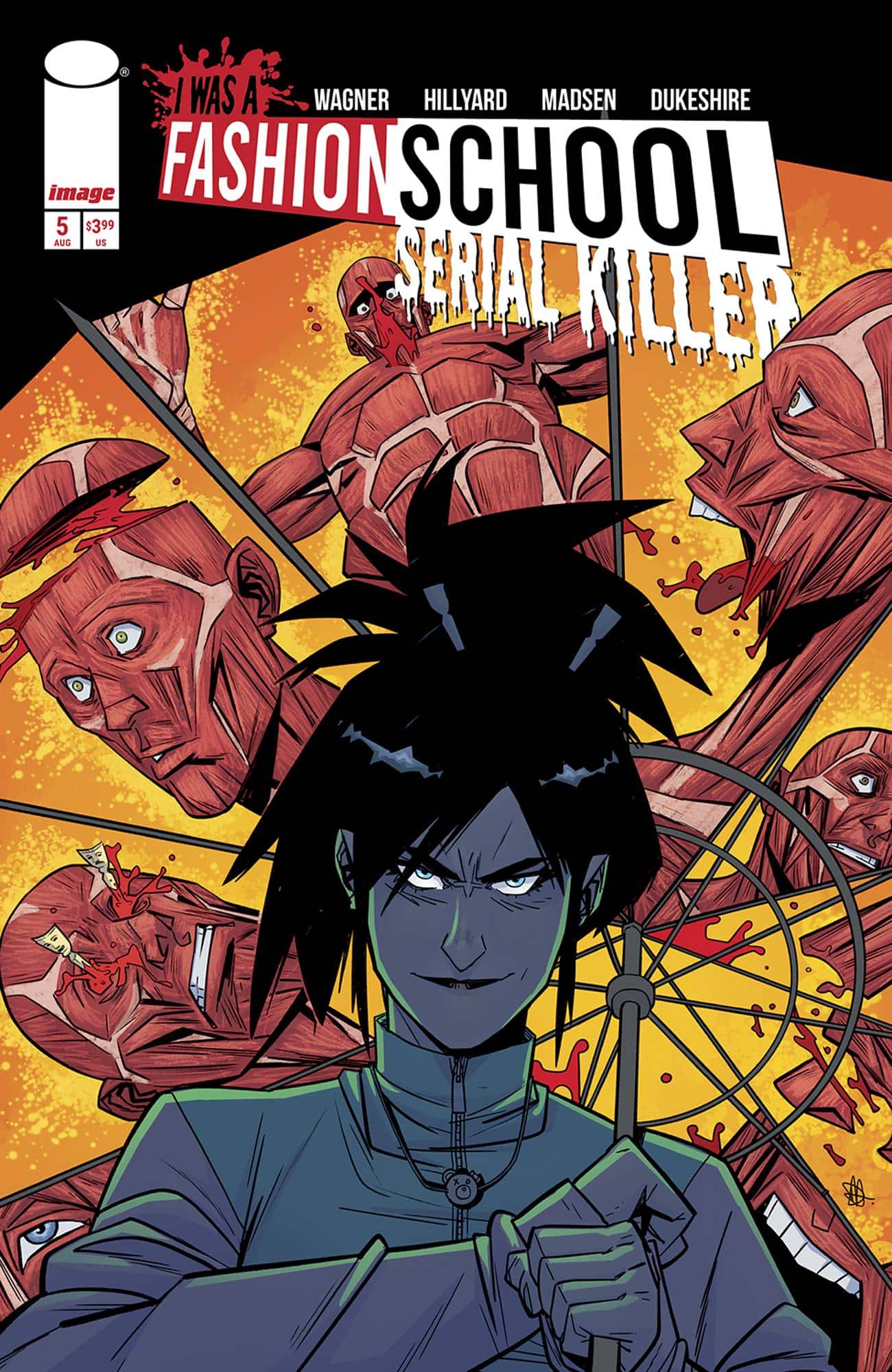
Writer: Doug Wagner
Art: Daniel Hillyard
Colors: Michelle Madsen
Letters: Ed Dukeshire
Publisher: Image Comics
Review by Clyde Hall
If you picked up the first four issues of I Was a Fashion School Serial Killer, you may not be shocked by the following revelation. And if you haven’t, read no further because this review of the miniseries conclusion will contain spoilers for what’s happened previously. Instead, go to the review of Issue #1 by The Beat’s own Jared Bird here: Wednesday Comics Reviews: I WAS A FASHION SCHOOL SERIAL KILLER and PLAGUE HOUSE offer scary new #1s.
With the final issue, Doug Wagner has delivered an updated chronical of Countess Elizabeth Báthory, the infamous ‘Blood Countess’ and ‘Countess Dracula’, as protagonist. And, borrowing a concept or two from shows like Dexter and Wednesday, he’s convincingly made his Rennie Bethary an antihero we can side with. One not so innocent as Carrie, but with similar appeal when it comes to scores settled.
Given efforts by some modern historians to uncover the veracity of accusations against her, namely that she killed young women and bathed in their blood in a quest for immortality, Wagner’s narrative is timely. The real-life Báthory was a powerful noblewoman who gained control of even more wealth and property after the death of her husband in 1604 Hungary. That’s when rumors of her evil abuses began circulating, and for which she was tried and convicted in 1611. Thereafter, the Countess was locked away in selected rooms at Castle Čachtice, an early form of royal home confinement, for the rest of her life. As a result, her lands were confiscated by other royal relatives and debts owed her by other royals seemed to evaporate. In short, Báthory by trial accounts could have been an inhuman monster, but by financial accounts, painting her as one may have been an expedient Game of Thrones political move.
In the wrap of I Was a Fashion School Serial Killer, we’ve seen both elements reflected in Rennie. Yes, she’s a murderer. But mostly of those richly deserving it. And yes, she’s struggled navigating the extremely competitive and political world of New York fashion Academica, only to find her talent and potential recognized, but her options curtailed by others in the game plotting against her. They just hadn’t planned on the difficulties arising when your ‘victim’ isn’t prey, but an extremely competent serial killer.
Rennie’s evolution from rich loner feeling her life’s calling in fashion design yet torn by the danger her choice of…materials…carries, to a student whose hard work and talent finds appreciation, to a more functional and social artist with her darker tendencies pacified, is appealingly crafted through the narrative. And in the conclusion, we see her bloodier artistry reemerge with a righteous vengeance when Sofie, the schoolmate who made much of her social and fashion progress possible, is at risk.
There are questions which seeped up during the telling of every entry in the series, including the finale. Rennie mentions that she’s had friends before, and how that all played out apparently was instrumental in her embracing the loner existence she was settled into at the start of the miniseries. It seemed like a bit of foreshadowing regarding her budding schoolmate associations and rivalries, but we don’t revisit or have any wayback moments as a parallel. Maybe we will in a second volume.
Also, by its nature, blood-bathing requires a pileup of empty receptacles. Rennie tends to go through a lot of them, though intermittently. Hiding and/or disposing of a pile of corpses in a major metropolitan area like New York City, especially ones you’ve taken home, flayed, and bled out, carries risks of detection. I was waiting to see what sort of efficient system Rennie had devised for this part of her ‘artistic process’, but it isn’t shared.
The art style of Daniel Hillyard is quite effective throughout the series, never more so than in the final issue. It’s a balanced aesthetic between the croquis and fashion flats of the school, and the horrific art supply collections and bath aftermath of Rennie’s homicidal nature. Although subtle and stylized, certain panels carried a current of Patrick Nagel’s art influence. Both Rennie and Sofie have the dark hair and the pale skin of the iconic Nagel femme, versions perhaps with hard-edged sophistication still blossoming in stages before personifying an era.
With the final issue, I Was a Fashion School Serial Killer ties things up as securely as remains on a meat hook. Its success owes a lot to Wagner’s efficient and effective writing style. He set the groundwork by page 16 of the first issue and never lost that pace. The rest of his creative ensemble matched that flow brilliantly. And despite sticking the landing with the sharpness usually reserved for elegantly carved bone hair sticks, there’s enough material left for a second volume. I’d love to see one, especially in the autumn, as Rennie’s Fall Collection.
 Space Ghost #1
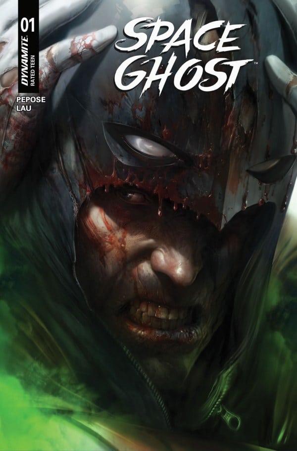
Writer: David Pepose
Artist: Jonathan Lau
Colorist: Andrew Dalhouse
Letterer: Taylor Esposito
Publisher: Dynamite Entertainment
Review by Jordan Jennings
The latest volume of Dynamite’s stellar Space Ghost has kicked off this week with Space Ghost #1. Writer David Pepose and Artist Jonathan Lau return once again to deliver a superhero comic that is full of heart, hope, and honest-to-goodness monkey shines. The creative team may look familiar to readers of the Space Ghost series as they are the primary creative team from the prior volume. The story itself picks up from the prior volume and I cannot find a creative reason why this book was relaunched with a new #1. Given Dynamite’s recent litigation with Diamond distribution, it is easy to see this relaunch is a financial decision. As frustrating as that is as a comic reader and critic, I understand that is just business.
Comic business talk aside, Pepose and Lau knock it out of the park in this excellent one-and-done issue. The narrative structure is simple but effective as the young wards and sidekicks of Space Ghost, Jan and Jace, are meeting their estranged grandfather for the first time. As he offers to take the siblings in, the young heroes explain to their grandfather what Dax, Space Ghost’s civilian identity, means to them. While this family drama is being played out, we are treated to cutaways of Space Ghost’s adventure with Jan and Jace’s thoughts of Dax overlayed on top of Space Ghost and Blip’s adventure freeing hostages from the Toymaker.
This narrative structure is not uncommon in comics as the medium really lends itself to these types of stories. It is particularly effective here though as 1) it is a great entry point for new readers and recaps the events of the previous volume in an organic and exciting way, 2) it emphasizes Space Ghost as a person and not just a cosmic vigilante and 3) Its Space Ghost and Blip on a straight up Batman ‘66 style story as they have to escape a deathtrap and save the day. On their own either portion of the story would have been weak. The family drama, while compelling at times, wouldn’t hold up as its own standalone segment. As much as I enjoyed the Space Ghost and Blip adventure, it doesn’t have any real weight to it without Jan and Jace describing Space Ghost’s character. Good on David Pepose for weaving these two narratives together in such a way that it becomes much greater than the sum of their parts.
Jonathan Lau continues to employ a sketchier style that gives the book a looser feel than the classic Hanna-Barbera, Alex Toth minimalistic designs. It allows for a lot more dynamism in the character’s body language as we can see Space Ghost’s form change for extra emphasis. Way back in my review for the previous Space Ghost #1, I made mention of how Space Ghost is a challenging character to render on the comic page. His costume is largely a void and his cowl doesn’t have a strong silhouette like Batman. I appreciate Lau eschews the minimalistic tradition of Space Ghost in favor of this more more Neal Adams style line work. It never feels too busy, either. It is just enough to give a sense of form and emotion. Lau also draws Space Ghost with a cape that would make Spawn envious. It is long and flowing and manages to evoke more of that Dark Knight feel over say a Superman style hero.
Space Ghost #1 is a great first issue for new and returning readers alike. Story is simple but effective at getting to the heart of Space Ghost as others see the man. We get a sense of his compassion, his tenacity, and his good spirit. We also are treated to some straight up Silver-Age comic fun where Space Ghost and a cybernetically enhanced monkey takes down a villain. It’s a lot of fun and well worth a read.
Rapid Wednesday Comics Reviews
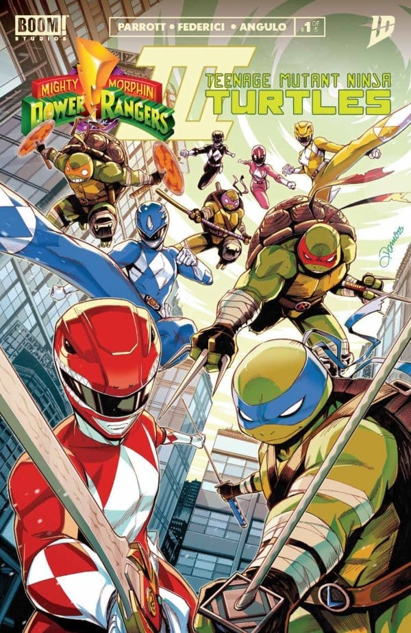
- Mighty Morphin Power Rangers/Teenage Mutant Ninja Turtles III #1 (BOOM! Studios): I was the exact right age to lose my mind when the live action Ninja Turtles: The Next Mutation series crossed over with Power Rangers in Space. It was two of my favorite things on screen together, and that was enough for my unrefined palette. Fast forward nearly 30 years and I’m still a sucker for intercompany crossovers. Even so, the first two TMNT/Power Rangers were the weakest of the many teamup comics both franchises have embarked on over the last few years. Still, I can’t say no to another crack at it, and if this first issue is anything to go by, the third time is the charm. With no need to waste time introducing the heroes and villains to one another, we are dropped right into the action and drama. Ryan Parott has been writing the Power Rangers for years and he has a well-honed voice for the characters. There’s obvious growth here too in the pacing and structure of the issue from his earlier stories. The quips and banter feel authentic to each of the characters and his Lord Zedd and Shredder are cold, calculating, and threatening. Vincenzo Federici’s art is more in line with the gritty roots of the TMNT compared to the hyper-sleek cartooning of the previous volumes’ artists and that is a perfect match for the darker tone volume 3 takes. The action is dynamic, with limbs, action lines, and angled borders leading the eye across the page smoothly. Like Federici’s rougher, grungier lines, Raúl Angulo’s colors are a bit more muted and grainy than the bright poppy cartoon style of previous volumes. This issue just looks and feels different. Power Rangers stalwart Ed Dukeshire does the letters and he adds fun visual flair to the word balloons that adds depth to the dialogue while reminding readers that these characters, even in dramatic moments, are inherently silly. This is a fantastic first issue that does away with laborious crossover setup and throws you right into the surprisingly intense fray. It’s the crossover I have been waiting for since way back when I was a kid. —Tim Rooney
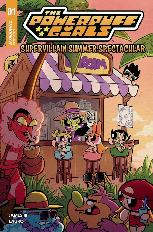
- The Powerpuff Girls Supervillain Summer Spectacular #1 (Dynamite): The Powerpuff Girls Supervillain Summer Spectacular oozes such love and reverence for its source material, hooking you instantly. It’s love is contagious. Writer James III is in sync with the voice of the show and voices of the characters; I could hear the narrator, I could hear the characters and it just felt right. All this, while playing to the girls’ penchant for gratuitous violence, giving artist Carlo Lauro some over the top Power Puff Girls violence to play with. The book has such a visual charm thanks to Lauro and the smart choices being made; filling the pages and masterfully controlling the eye while translating the style of the show so well. It’s colorful and vibrant with the work of colorist Giulia Lafranceschina and the lettering of Jeff Eckleberry. There’s something that really grabbed me in the initial flip; the prisons being ineffective and the mayor doing an event for the villains of Townsville. There’s more to this obviously but it approaches conversations on carcerality and the judgments we place on people in a way that hooked me. Villain’s Day is a wild approach to rehabilitation but it’s got the spirit and this issue has the spirit of the show oozing from it like a broken beaker full of Chemical X. This is a light summer read and I highly recommend it for anyone that needs more sugar and spice in their lives. —Khalid Johnson
Ensign’s Log – Stardate 81225
As IDW’s Star Trek comics continue to expand, Ensign Avery Kaplan has enlisted here to keep a careful log!
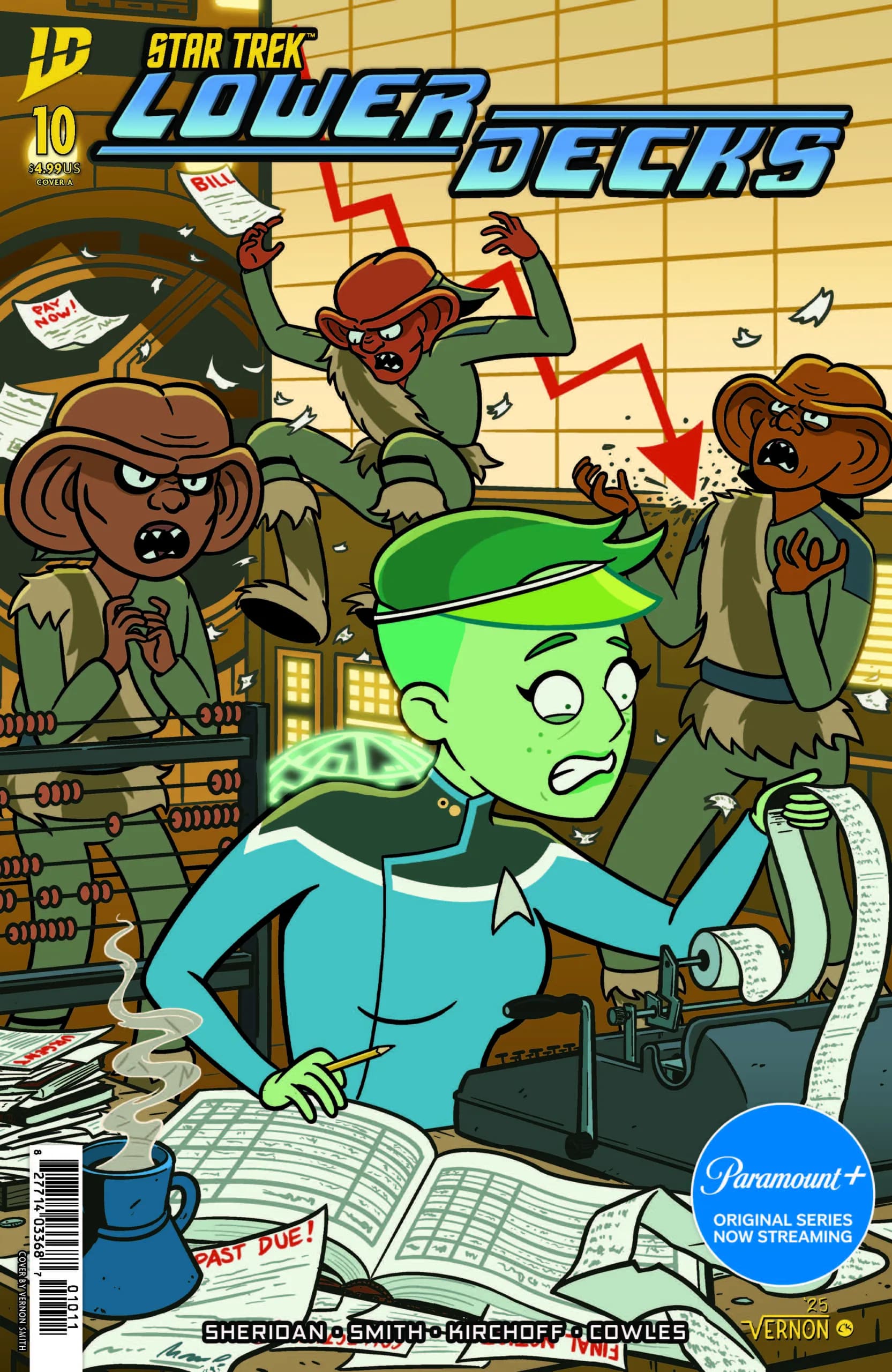
- Star Trek: Lower Decks #10 (IDW Publishing): This issue follows up on the story that started in Star Trek: Lower Decks #9, and features the same creative team. It’s written by Tim Sheridan with art by Vernon Smith, colors by Charlie Kirchoff, lettering by Clayton Cowles and design & production by Johanna Nattalie. “A Pound of Flush: Part Number Two” (oh, now I get it) hits the ground running with an hilarious “previously on” page that calls to mind the 90s TV Star Trek era and includes an allusion to Star Trek III: The Search for Spock. This issue is crammed with funny jokes, with a B-plot that emphasizes the meta side of Lower Decks’ humor. Sheridan will have you laughing out loud with this one. And in addition to a funny story and lots of amusing dialogue, there are also some great visual gags. Smith really knocked it out of the holosuite! Kirchoff’s colors are well done as always, and Cowles is (as ever) a lettering expert. Overall, the two-issue format adopted by the Lower Decks comic series has worked very well, generally allowing for a more plot-oriented first half and a more comedy-oriented second half. It’s a good rhythm! And hopefully, it’s encouraging plenty of readers to return month after month, because I hope this series continues into the distant future. —Avery Kaplan
The Prog Report
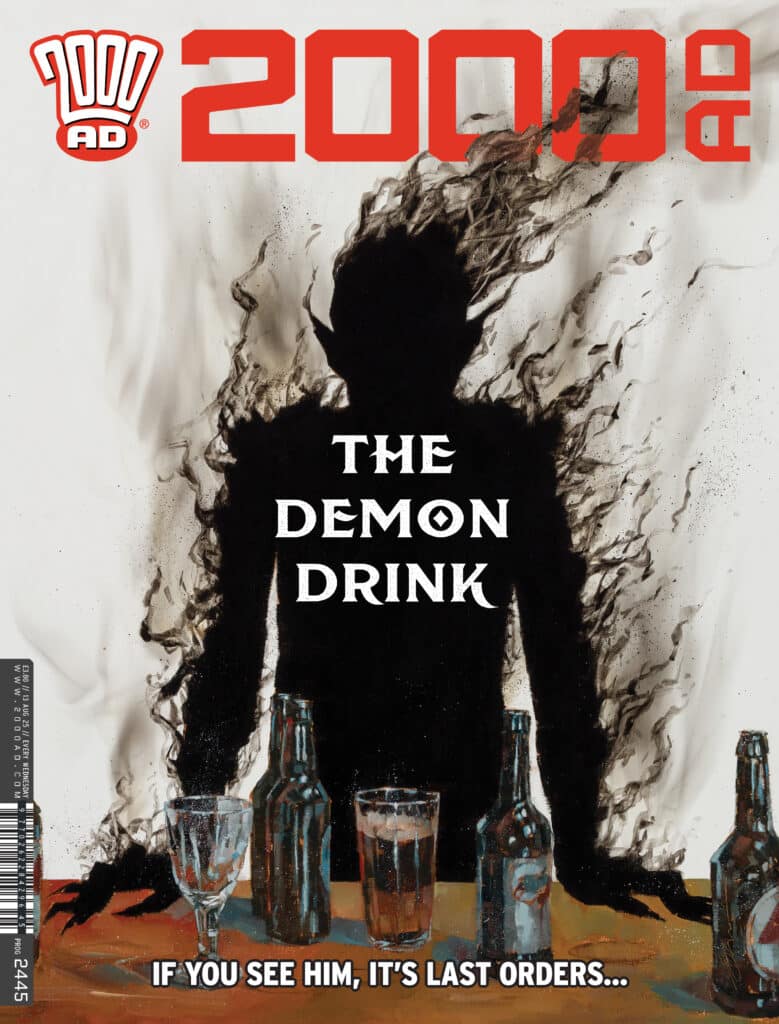
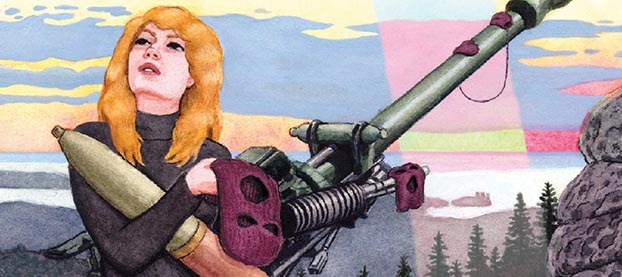
 2000AD 2445 (Rebellion Publishing): I’ve mentioned a few times in this space that I’ve been enjoying the Prog’s new occult crime strip, The Ravilious Pact, and I have been. This comic by writer T.C. Eglington, artist Steve Austin, colorist John Charles, and letterer Simon Bowland is a great genre mash-up, played out with a pressure cooker setup. Well, in this week’s sixth chapter, that tension starts to come to a head a bit as the status quo begins to unravel. The creative team did a great job foreshadowing a lot of what’s happening here, and you might even call it a bit obvious — but it’s still been engrossing and entertaining to follow. And I think the best is yet to come with this one, as I can’t guess even a little bit what might be coming next. This week’s cover (above) is by Simon Davis. As always, you can pick up a digital copy of The Prog here. —Zack Quaintance
Column edited by The Beat’s reviews editor, Zack Quaintance. Read past entries in the weekly Wednesday Comics reviews series!


!["Superman" (2025) Brings Heart, High Stakes, and Surprising Twists [SPOILER-FILLED REVIEW]](https://www.supermansupersite.com/Superman_2025_Retro_Poster.jpg)

 English (US) ·