This week’s main review is Helen of Wyndhorn #6, which wraps up another stunning collaboration between Tom King and Bilques Evely. Plus, the Wednesday Comics Team has its usual rundown of the new #1s, finales and other notable issues from non-Big 2 publishers, all of which you can find below … enjoy!
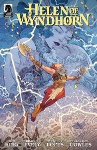 Helen of Wyndhorn #6
Writer: Tom King
Artist: Bilquis Evely
Colorist: Matheus Lopes
Letterer: Clayton Cowles
Publisher: Dark Horse Comics
Review by Sean Dillon
There are, of course, two masters at the heart of Helen of Wyndhorn. The first, and most obvious, is that of the pulp adventure novel. Your Conan the Barbarians, your Princess of Mars, your Strange Adventures. These stories tell of adventurers traveling to far off lands and discovering adventure, horror, wonder, and a bit of romance. The second master is the gothic novel. Your Wuthering Heights, your Jane Eyres, your Wasp Factories. Stories of returning (or entering) a home that has the sense of the uncanny that typically revolve around a sense of self discovery from within.
There has been a long history of the two forms combining into one. Psycho, for example, is both a work of Gothic Literature as well as Pulp Literature, being a story of an uncanny house written by the apprentice of who is arguably among the 20th century’s greatest pulp novelists. Indeed, both the pulp and gothic can share a number of elements akin to one another: the supernatural, notably, frequents both stories, be it the ghosts which haunt Hill House or the devils fought by John Silence.
Tellingly, one can see the difference at the heart of these genres through how they relate to the supernatural. With the gothic, the supernatural is treated as something beyond the knowledge of man. Not in the sense that it is inherently hostile, but rather that it is inherently unknown. The gothic lies in the ambiguities and uncertainties of the world. Whereas in the pulp tradition, the supernatural exists to be confronted. Even in works such as Lovecraft, where knowledge typically drives one mad, knowledge is gained. It is understood and confronted. Sure, the Lovecraftian protagonist often meets a grim end, but so to do many a pulp detective.
It is at this point that I become tempted to quote Mark Fisher or China Miéville and their thoughts on the matter. But I am aware of my limited space and do not wish to make the same mistake twice. What I am ultimately getting at is that Helen of Wyndhorn is engaging with these two spheres of twentieth century fiction. And, ultimately, it aligns with the Gothic in a truly stunning and beautiful display.
This is, of course, a literal description of the book, as the work by artist Bilquis Evely and colorist Matheus Lopes is truly stunning. From the crashes of waves in a fantastical landscape to the sheer black darkness of a seaside cave all the way to the way hair flows in the air. One could look at the pages for hours on end and find new details and beauty with each passing second. I truly hope Dark Horse decides to release the trade as a deluxe sized work akin to what TKO did with Mobilis.
Further adding to the beauty is the poetic language used by writer Tom King. Each piece of narration, dialogue, and, at one point, monologue, adds to the work’s quality rather than detracts from it. Furthermore, despite the verbosity of the written word, it never feels like King is overwriting the images. Both he and Evely are in perfect conversation with one another to deliver a truly smashing work of art. And, of course, the final pages are perfect.
Helen of Wyndhorn was my favorite comic to follow issue to issue this year. I have had an absolute blast reading and engaging with the work.
I will leave with one final note regarding the gothic and the pulp. The gothic, at its best, ultimately lies within the questions about the world and the answers about the people in all their multitudes. By contrast, the pulp lies in the answers about the world in all its majesty and horror. Of the people, it can often be a coin toss.
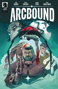
 Arcbound #1
Writers: Scott Snyder and Frank Tieri
Character Development: Tom Hardy
Artist: Ryan Smallman
Colors: Frank William
Letters: Buddy Beaudoin
Publisher: Dark Horse
Review by Jordan Jennings
What does it mean to be human? This is the question that plagues humanity after they have long left the Earth in search of new lives in the off-world colonies. We meet Kai, field leader for The Mediators, Zynitec’s corporate army, as they complete a blood bath of a mission. The name is misleading as the mediators rather let their weapons do the talking instead of negotiating solutions.
With the Mediators being sent on yet another mission, we see Kai becoming increasingly disillusioned with the Cause and beginning to call everything into question as the next mission begins to appear even more pointless. What will become of Kai as quickly learns the answer to humanity’s lingering question.
The creative team for Arcbound #1 is intriguing. Scott Snyder’s horror elements are at work with the arcbound process—this body horror resurrection protocol that turns one into a cyber zombie slave, but you can really see Frank Tieri’s fingerprints all over this book with focus on military and betrayal. I cannot really pick out what Tom Hardy has done here, but it is obvious he serves as the character model for Kai. Knowing what I do about Hardy’s involvement in projects like Venom, I could see him providing some character motivation and insights to the writers. It reminds me of Keanu Reeves and BRZRKR.
Who knows exactly what all was brought to the table by the writers, the question is the story any good? To that I say, its pretty fun and enjoyable if not a bit familiar. Arcbound leans heavily on some familiar sci-fi tropes and plot beats in the first issue. The issue structure itself is a familiar one with the story being told via flashback bookended by the present revealing the horrors that have unfolded. It is nothing earth shattering, but I argue a comic doesn’t have to be this completely novel take each time.
What Snyder and Tieri do is execute those familiar elements in a way that provides for an enjoyable reading experience. I have written in the past about this topic, and I still stand by that. There is nothing wrong with playing with the tropes of fiction. Sometimes, a story works best by leaning on familiar tropes as that allows the writer to do something different with the composition of these elements.
Of course, leaning on familiar tropes in comics works best when the art is good and Ryan Smallman understood that assignment. Smallman’s art style is best described as animated and dynamic. The proportions are distorted but in a way that makes for a visually interesting page but is also consistent throughout. Smallman’s character designs and models are sharp. They do play with common design motifs seen in sci-fi in the last 20 years, but the way they are presented just makes me happy. The energy in the panel composition is great and makes the book a real page turner. The art is complimented by Frank William’s colors. They are vibrant and create an otherworldly feel that helps seal this as a good Sci-fi comic.
Overall, I found Arcbound #1 to be a strong start to this 12-issue mini-series. It does feel like this comic is some sort of treatment for a larger project, but I haven’t found anything else about that exactly but does feel like the intent is to help get a movie, game, or tv show off the ground. That’s fine with me as I understand how comics are sometimes made. It helps that this comic is well executed on all fronts. It may play a familiar tune, but damn, it’s a good tune.
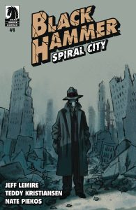
 Black Hammer: Spiral City #1
Writer: Jeff Lemire
Artist: Teddy Kristiansen
Letterer: Nate Piekos
Publisher: Dark Horse Comics
Review by Jared Bird
The latest series to come from the beloved ‘Black Hammer’ universe, created by writer Jeff Lemire and artist Dean Ormston in 2016, Black Hammer: Spiral City is sure to have a lot of eyes on it. Coming right off of the heels of Black Hammer: The End, which ostensibly closed off the universe as it was for good, Spiral City is the first book after a massive story that evolved over the course of seven years. How does it do? Pretty well!
The lead of this issue is fan-favorite Inspector Inspector, finally becoming real just like he always dreamed of. The problem is, reality absolutely bites. Superheroes, oddballs and those that don’t fit in are mostly relegated to the poverty stricken Supertown, the ashes of a suburb destroyed by the battle with Anti-God. The setting of Spiral City is far more dystopian than people might be expecting. It’s grim and gray, with social unrest, poverty, oppression running rampant and politics right at the forefront of the narrative. It’s not hard to see where Lemire might have gotten inspiration from, and it contrasts greatly with how mostly hopeful Black Hammer has been up until this point in time. It’s realized incredibly well, and it’s an interesting evolution for the series to go to, even if just temporarily. In a new, chaotic world, our characters have new challenges and new problems, which opens the door for lots of exciting storytelling possibilities.
It should come to no surprise by now that Jeff Lemire is a fantastic writer. He’s got a great knack for creating memorable, interesting characters, and the core cast of this book is no different. Whilst we only see glimpses of our other characters, Lemire is setting up a cruel, chaotic and cutthroat world here that contrasts with what readers might expect from earlier Black Hammer books. Our protagonists are just trying their best to get by, in a world that might chew them up and spit them out for doing so. Inspector Inspector remains one of Lemire’s best creations, equal parts hilariously out of touch and incredibly sympathetic and intriguing. He’s a great character, and I’m glad to see him front and center of this upcoming stage of Black Hammer. I don’t think this book is particularly new reader friendly, nor does it necessarily have to be. I’m sure someone would be able to understand and appreciate the story on its own, but part of why this book works is its thematic and tonal contrast with the rest of Black Hammer. It definitely feels like the series is going back to its roots and challenging what the meta-story of the series had evolved into over the last few years, which may be lost on beginners.
The artwork by Teddy Kristiansen is one of the most unique aspects of the book. I don’t think his style is for everyone, but it works well with the tone of the story they’re going for, and the dark impressionistic nature of it is wonderful. It emphasizes the noir mystery elements of Inspector Inspector’s character, and the gray desolate state the world is in. His artwork is always in service of the larger tone and narrative, adding an almost surreal touch to the book that makes it wonderfully unique compared to previous Black Hammer titles.
Overall, Black Hammer: Spiral City is a good start to a brand new stage of the epic Black Hammer universe. It’s familiar and yet brand new at the same time, opening up the door for plenty of exciting storytelling possibilities in a series that ran the risk of getting stale. Kristiansen provides a bold, unique visual style to the book that keeps up the trend of Jeff Lemire working with wonderful and unique artists, and the two seem to share a vision of the story they want to tell, which is both timely and well set up. I’m not sure it’s a good point for new readers to latch on to, but it’ll be a treat for Black Hammer fans or fans of Lemire’s work.
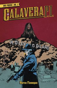
 Calavera PI #1
Writer/Artist: Marco Finnegan
Letters: Jeff Eckleberry
Publisher: Oni Press
Review by Clyde Hall
What comes wrapped in the scent of cheap paper and placed under a disarmingly cool bizarre crime cover? Nope, not just your favorite classic pulp magazine. Not anymore. Calavera P.I. premiers this week, and the first issue may be printed on quality paper stock with variant covers, but its Pulp/Noir spirit will have you reliving your first encounters with The Maltese Falcon and Black Mask magazine.
In life, heroic gumshoe Juan Calavera protected the Chicano barrios beneath the attention of the Los Angeles police. Until, that is, a case on Dia de los Muertos, 1925, ended his mortal existence. But sometimes, just sometimes, a soul can return from its eternal rest to put the wrong things right. Sometime like Halloween, 1930. And wrong things like the kidnapping of a child. Maybe even the mystery of Calavera’s untimely demise.
Writer and illustrator Marco Finnegan loads a rich cast of characters into the first issue of this title and steeps them in the Latin culture of early 2oth Century Hollywoodland. It’s a tale of undercover rescues, a gritty streetwise Hércules in a budding relationship with crime beat reporter Maria Valdez, and dirty deeds done by people wanting interference from neither.
The pulp flavor is savory here, and there’s an appropriate spiciness owing to language rougher than the classic genre reads. Some of it is tucked away in Spanish dialogue. The art style Finnegan applies is sketchy, minimal, and direct, matching well the kind of prose he’s replicated.
For as nicely as Finnegan sets up the legend of a fallen P.I. delivering supernatural comeuppance, mostly it’s done by lots of showing and minimal telling. Thankfully, it’s an extremely stylish, at times humorous, showing. And the hows and whys of exposition are largely forgotten the first time we see a fedora-wearing skeletal detective light up his Fortuna coffin nail.
The hard-bitten, lone wolf P.I. one step ahead but several headlines behind the LAPD whets our appetite for details to come. This first issue of Calavera P.I. leaves us wanting to see future chapters filled with chin music and gunplay applied to a deserving west coast underworld trafficking in human suffering. More, it leaves us needing answers on who’s filling out the list of suspects, usual or unexpected.
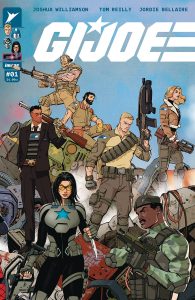
 G.I. Joe #1
Writer: Joshua Williamson
Artist: Tom Reilly
Colorist: Jordie Bellaire
Letterer: Rus Wooton
Publisher: Image Comics – Skybound
Review by Zack Quaintance
Buzz and sales-wise, the Energon Universe remains one of the hottest things in comics, a true comics publishing success story in 2024, when comics publishing success stories are increasingly rare. Part of the success of these books — which unite Transformers, G.I. Joe, and the new concept, Void Rivals, in one shared universe — is that the Skybound publishing group has kept the line very tight.
It started with Void Rivals, which sort of Trojan Horse-d Transformers into its story, unbeknowenst to readers. Next came the launch of a Transformers ongoing, followed by a set of miniseries featuring G.I. Joe characters. This was a patient and restrained way to build out this world, and it has continued to pay off. This week, we finally get the launch of a proper new G.I. Joe ongoing, nearly a full year and a half since the Energon Universe project began in June 2023.
I couldn’t help but think that there’s a different timeline somewhere where this whole thing started with a much-hyped triple launch of G.I. Joe, Transformers, and Void Rivals, with giant promotion for all of it. Maybe that would have been just as successful, we’ll never know, but personally I think this is a better way of doing it, as it applies to the actually storytelling in the books. And this new G.I. Joe #1 is a perfect example of that.
Written by Joshua Williamson, with artwork by Tom Reilly, colors by Jordie Bellaire, and letters by Rus Wooton, this issue brings together a number of slow-burning storylines from the pages of Duke, Cobra Commander, Destro, and even Transformers. As someone who has followed all those books (and enjoyed them), G.I. Joe feels like a payoff for a great and patient buildup.
On a practical level, it is basically a two-sided heist story. Cobra characters are trying to heist a piece of alien technology, while Joe characters are trying to defend it. We know where both sides are coming from and why, and it makes the battle feel all the more tense. Williamson scripts fantastic action comics, and this issue is no exception. Reilly and Bellaire are also a fantastic team that nail all the big visual moments.
It all culminates in a fantastic ending page that speaks to the other thing I really like about these comics — they are not being precious about the licensed characters they star. There’s a sense that anything can happen in these books, moreso than in other long-running IP, and it creates actual stakes. I also think this issue functions as a perfectly fine jumping on point for anyone who hasn’t followed the wider universe, netting it my highest recommendation.
Wednesday Comics Reviews
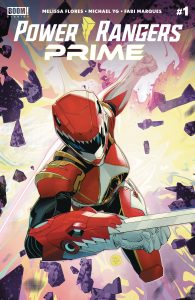
Power Rangers Prime #1 (BOOM! Studios): One of the most exciting things about Marvel’s Ultimate Universe (both versions) and DC’s Absolute line is that it allows writers to reconfigure the familiar universe with all of the different retcons and additional characters built into the foundation of the concept. Green Goblin can be inextricably linked to Spider-Man’s origin, Bruce Wayne can be childhood friends with his various rogues. In Power Rangers: Prime we get the first real reevaluation and reinvention of the franchise in its history. While I loved the original Boom run of comics, they were firmly rooted in the first three seasons of the franchise, even as it added a few wrinkles in over time. But none of those changes fundamentally reimagined the concepts.In this first issue of Power Ranger: Prime, writer Melissa Flores presents us with a colonized Earth where Power Rangers are a myth, an ancient team of protectors spoken of in whispers because of the threat they pose to the Eltarian race which now controls the planet.Our hero and entry point is Lauren Shiba, a Ranger from one of the latter day seasons who comes from a long line of Rangers dating back to feudal Japan. She is on the run, wounded by the police, and taken in by a pair of half alien refugees. Half of the comics spends time with these young aliens, who provide opposing histories of the colonization. Artist Michael Yg manages the heavy exposition here with natural skill and creative storytelling. There is some innovative work here like one moment, where a character recalls a painful memory and the silhouette of his profile acts as the actual panel containing the visuals of that memory. It’s a trick I’ve never seen in a comic before. The layouts throughout are dynamic and action scenes in particular look great, with overlapping and jagged panels.
Colorist Fabi Marques gives the scifi take on an Earth a bright, perfect technicolor look that matches the perfect society Eltar propagandizes. Letterer Ed Dukeshire is terrific as always, using the font and word balloon choices add to the storytelling. Longtime Power Rangers fans might be a little uneasy with the different approach to the setup here which is so far lacking in many familiar characters. But it is exciting to see the building blocks from throughout the last 30 years from across TV and comics be remixed so ambitiously. There are a few other surprises and nods to more obscure American Toku history here, too, that 90s kids will certainly delight in. But Flores is doing more here than just playing on nostalgia and that should appeal to fans of superhero comics or scifi stories without any interest or attachment to the historically cheesy Power Rangers. Positioning the Power Rangers as rebels against an uncaring empire is a fundamental shift in what the characters stand for and I’m excited to see how this new take unfolds. —Tim Rooney
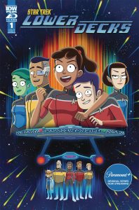
Star Trek: Lower Decks #1 (IDW Publishing): Star Trek: Lower Decks is back — in sequential graphic narrative form! In my review for the 2022 Lower Decks miniseries, I asked, “why only three issues?” Several years later, my prayers to the Cosmic Koala have been answered. Fresh off the nacelles of the incredibly excellent interactive graphic novel Star Trek: Lower Decks: Warp Your Own Way, an ongoing Lower Decks monthly has launched to fill the void soon to be left by the animated series.Once again, like the two Lower Decks comics before it, this series is written by Ryan North. No stranger to writing not one but two #1s for the same title, North doesn’t miss a beat as he rejoins the California class. Unlike the preceding Lower Decks title and the graphic novel, however, this issue is illustrated by Shax’s Big Day alum Derek Charm, the first of a roster of rotating artists on the monthly series. And if that isn’t enough parallels with The Unbeatable Squirrel Girl for you, this series also brings back North’s signature bottom-of-the-page comments, which were absent from the OGN (where they would have been prohibitively impractical given the Choose Your Own Adventure vibe of the book).
While the first Lower Decks series had a heavy Star Trek: The Next Generation influence and the OGN channeled a lot of Star Trek: The Original Series, this new #1 draws heavy inspiration from Star Trek: The Animated Series. After a brief, heavily meta introduction that comments on the humdrum nature of most Cali class missions, Lower Decks #1 becomes a pretty direct sequel to one of the most memorable episodes of TAS.Without spoiling too much for those who will be as delighted to discover this comic’s secrets as I was, this sequel even pays homage to the art style and shot composition of TAS. Perhaps even more so than most episodes of Lower Decks, this issue is a metatextual story, which befits its comic book format. No strangers to collaboration with one another, North and Charm integrate perfectly for this fun and funny setup issue.
And do I need to tell you Clayton Cowles nails the lettering? Yes, I do, because I would be remiss to overlook any member of the crew when reviewing a Lower Decks comic. Plus, hey: Cowles is also a USG alum. You think they’ve got a Doreen Green program on the holodeck? Finally, the issue features design & production by Johanna Nattalie, who was also involved in the equally-great-looking first run of Lower Decks from IDW.
Really, the only wish I have for this issue is for some back matter. The first Lower Decks run had commentary from Badgey and adverts for the U.S.S. Cerritos food replicators in the back, and I hope this kind of content returns in future Lower Decks issues. It would be a great counterbalance for the funny-in-itself “recap” page that opens the book. Overall, Lower Decks #1 is a great start for what I can only hope will be a long-running ongoing series. Just like that delicious Mexican street corn programmed into the Cerritos replicators, you’ll want seconds (and thirds) of this tasty treat. —Avery Kaplan
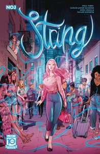
String #1 (Mad Cave Studios): String #1 sees Yoon-Sook Namgung, a civilian consultant paired with detective Mayfield to investigate a murder. The catch is that Yoon-Sook can see the strings that connect people with sexual partners or their murderers. This first issue does a great job expositing on this through organic conversation between Yoon-Sook and detective Mayfield. It feels very natural and that’s to the credit of writer Paul Tobin while artist Carlos Javier Olivares with colors by Sara Colella brings a charm through our protagonists navigating nuance and subtlety between the back and forth and then really dialing it up when a high speed chase ensues and navigating the energy and motion across the panels and pages, pulling back to give us a look at the action before pushing back in on our protagonists and their banter, lettered by Taylor Esposito. On their banter; there’s a conversation here that starts to scratch at where I get jaded with police stories and the idea of the institution in general, (being a cop and being one of the good guys). I hope and wonder if that idea will be taken further especially given our protagonists’ relationship to the force and an ending that creates even more intrigue. —Khalid Johnson
The Prog Report
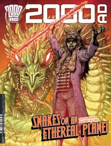
2000AD 2408 (Rebellion Publishing): I’ve written about Nightmare of New York in this space before, as recently as last month, but I continue to greatly enjoy this excellent story by writer Kek-W, artist David Roach, colorist Peter Doherty, and letterer Annie Parkhouse. It’s the type of story that continues to unfurl its full scope in surprising ways with each installment, making it at this point — eight chapters in — almost unrecognizable from where it started, which I mean as a compliment. We’ve just gotten such a steady flow of new characters, new ideas, and excellent artwork. It’s the type of story that makes me glad I read the Prog from week-to-week. As always, you can nab a digital copy of this week’s Prog here. —Zack Quaintance
Read more entries in the weekly Wednesday Comics reviews series!






 English (US) ·