This week’s Wednesday Comics Reviews column features the return of one of comics best ongoing series with Lazarus: Fallen #1, an intriguing new series launch with New From the Fallout #1, and a great first arc finale from The Seasons #5. We also look ahead at a trio of new titles eligible for pre-order in our FOC Watch section. Plus, as always, The Prog Report!
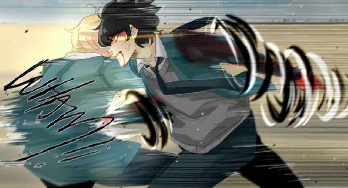
 Lazarus: Fallen #1
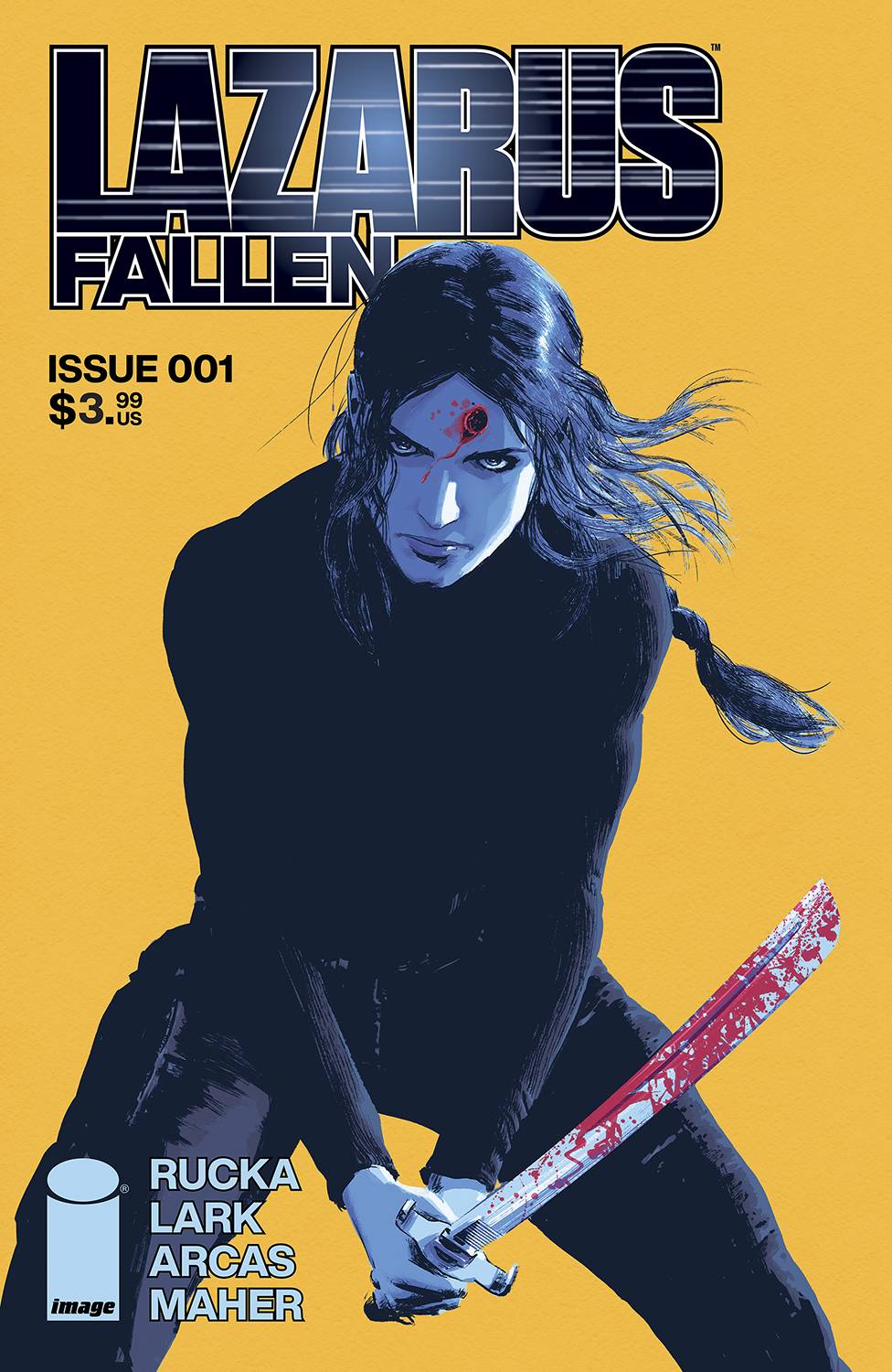
Writer: Greg Rucka
Artist: Michael Lark
Colorist: Santiago Arcas
Letterer: Ariana Maher
Publisher: Image Comics
Review by Zack Quaintance
One of my favorite series in all of comics is back this week, starting its final story arc. This book is, of course, Lazarus, and for its finale it’s getting a new #1 with Lazarus: Fallen #1, from the full series creative team of writer Greg Rucka, artist Michael Lark, colorist Santiago Arcas, and letterer Ariana Maher. This finale is a long-time coming, with the previous issue of Lazarus — Lazarus: Fallen #7 — nearly two years ago, back in September 2022.
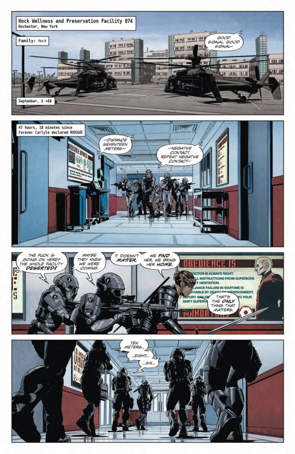
But the book picks up right where it left off, both in terms of its very high quality and its plot. Lazarus is one of the true gems of monthly comics and has been for some time. Michael Lark’s artwork is fantastic, colored to perfection by Santiago Arcas, and complimented perfect by Ariana Maher’s letters. Part of what’s for sale with Lazarus has always been it’s world — a world that is both sci-fi skewing and dystopian, yet utterly plausible in every way. Lark’s gritty yet realistic art captures and conveys this perfectly, and it’s as strong as ever in the new book.

Structurally, this new issue makes clear in its opening act that we’re running for the finish, using time jumps in interesting ways that serve and enhance both the action and the plotting. And while we don’t see much of our hero — the titular fallen Lazarus, Forever Carlyle — we do see the impact her most recent actions are happening on the world around her and the people in it. It’s a great, bold way to play the start of this final arc.

So yes, as a long-time reader of Lazarus I absolutely loved and highly recommend the first issue of its finale arc. It’s not new reader friendly (I mean, it’s the first issue of a finale arc), but it doesn’t need to be. The important thing here is that one of the best long-form stories in modern comics is going to get an end, and I couldn’t be more excited for the rest of it.
News From the Fallout #1
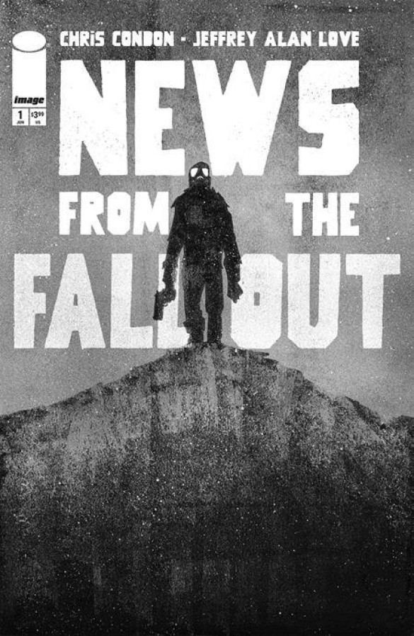
Writer: Chris Condon
Artist: Jeffrey Alan Love
Letterer: Hassan Otsmane-Elhaou
Publisher: Image Comics
Review by Ricardo Serrano Denis
Atomic bombs are the horrors that keep on giving. There’s not a single situation in which the mere thought of their use doesn’t bring about visions of the end of the world. Cold War-era horror and sci-fi excelled at using the bomb as a source of cosmic threat and monster creation to drive the point home on how close to complete oblivion nuclear power had taken us (consider Them! or Godzilla, ants and lizards respectively that became behemoths after exposure to radiation). Chris Condon and Jeffrey Alan Love land on this concept with their new series Notes from the Fallout, a black, white, and very gray comic about the monsters we create and how we bring them down upon ourselves.

The story takes place in 1962 and centers on private Fallows, one in a group of soldiers that has been chosen to be guinea pigs for a big brass general who’s ordered a nuclear detonation for what looks like unsanctioned and extremely dangerous human experimentation. As to be expected, the whole exercise leads to some of the soldiers becoming flesh-eating creatures, because that’s what atomic bombs did in the Sixties. A mad scramble ensues, and then it’s all about survival.
Condon’s dialogue is economical but ominous, resorting to short exchanges that leave more questions than answers. There’s an air of secrecy behind every line of text and it works to create an immediate sense of unease. It reminded me a bit of the early chapters of Stephen King’s The Stand. It goes straight to the apocalyptic event and never lets up on the horror. Listen close and you’ll hear Blue Oyster Cult’s Don’t Fear the Reaper playing in the distance.

This is all amplified by Jeffrey Alan Love’s silhouette-heavy art. Characters are shrouded in different shades of greys and blacks that echo shadow puppet work. They transition from one panel to the other in that same style too, though not every single character gets this treatment (which keeps things versatile). Alan Love proves to be very intentional with poses and body language because of this, especially when one considers there aren’t many facial expressions on display. Tone and atmosphere are wrapped around those silhouettes and they combine for a look that evokes the black and white movie aesthetic of the 50s and 60s, but with more modern inks and textures. Imagine a Twilight Zone episode with current indie sensibilities.
Hassan Otsmane-Elhaou takes full advantage of the dark silhouettes to get creative with text placement. Traditional word balloons comingle with bits of text placed in shadows and even inside character outlines because of the predominantly black quality of the art design. It creates a kind of “classified document” feel that further deepens the idea that truly terrible things are taking place and that they will scale to the detriment of human existence should information get out.

Notes from the Fallout #1 is a deliciously grim start to a series that has its eyes on putting humanity through yet another doomsday scenario. What makes this one special, though, is its overall design. The story is allowed to unspool slowly, with death and destruction taking its time with the people involved. Dialogue that deceives and gloomy character designs converge for an experience that finds a lot of despair mixed in with the intrigue surrounding the bomb test. And like most disasters, it’s impossible not to look at.
 The Seasons #5
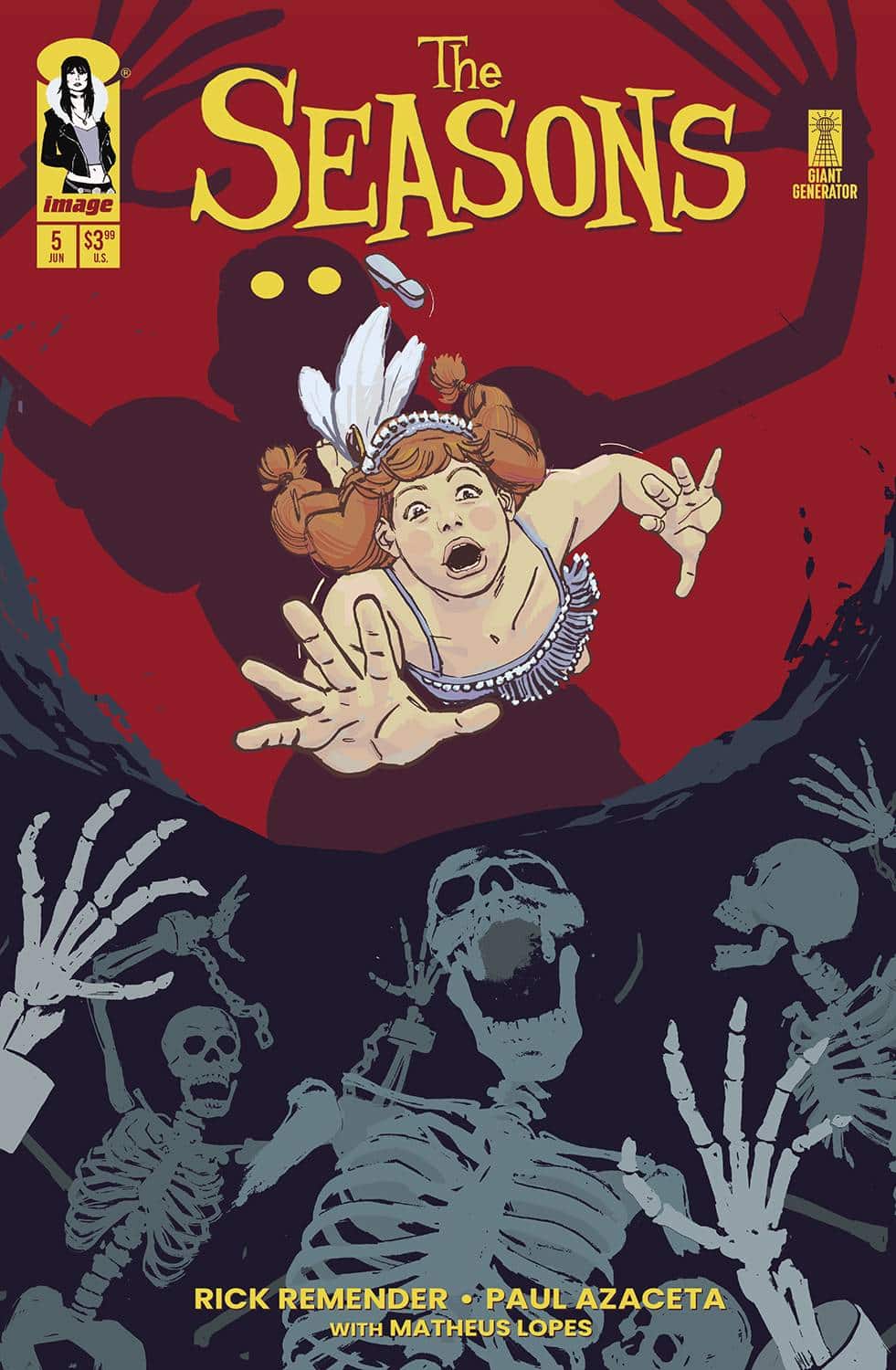
Writer: Rick Remender
Artist: Paul Azaceta
Colorist: Matheus Lopes
Letterer: Rus Wooten
Publisher: Image Comics
Review by Jared Bird
The Seasons begins off its second major arc in issue #5, following a two month hiatus and the unsettling finale of the previous issue. The genre-bending adventure series, written by industry legend Rick Remender (Deadly Class, The Sacrificers) and illustrated by the superb Paul Azaceta (Outcast), continues to impress as it kicks off the second stage of its story, both delivering answers and asking even more questions than ever as the story of the Seasons sisters continues.

Following her disastrous attempts to get her sisters to listen to her, Spring Seasons is left all alone to combat the growing and unsettling power of the Carnival and its mysterious figurehead. Her broken family hasn’t come together just yet, and Spring finds herself in the deep end of a conflict that she understands very little of. Will she succumb to the forces of darkness, or manage to bring her family together once more? That’s still to be seen, but this issue is the darkest of the series yet, veering into some of the horror elements of the story that have mostly been left hidden in the cracks until now. It continues to be an incredibly rich book, stylistically, mixing an adventurous, Ghibli-like tone with a Belle Epoque aesthetic and elements of mystery and horror fiction. There’s nothing else quite like it on the shelves, a book that genuinely feels unique and more than just a blend of concepts and influences. It deftly balances tones, storytelling techniques and styles, organically becoming something entirely to its own and standing out both in the larger industry but also Remender’s career itself.

Rick Remender is someone who needs no introduction to most long-term comics fans; his career and the consistent quality of his books speaks for themselves. This issue features some of his best work. It’s genuinely unnerving and unsettling without losing the sense of whimsy and spectacle that got readers on board with the series to begin with. Remender is tapping into a timeless, pulp-inspired narrative voice for the characters and it works entirely in the series favour, as each member of the Seasons family feels well-thought out and realistic, more than just a stereotype, even if they don’t have much page time in any given issue apart from Spring. The series is deftly plotted, with a witty and funny sense of dialogue that knows when to hit hard and when to just focus on being a great and fun read. It’s a great showing from Remender, who could easily be playing it far more safely at this point in his career, but instead he’s choosing to make a book that’s unique unto its own.
Paul Azaceta is delivering the best artwork of his career here. The visual storytelling of this book is bombastic and exciting in every panel, but Azaceta knows exactly when to slow things down and focus on humour or intimate character moments. His incredible sense of design is apparent on every page, with the bold and striking character designs continuing to be one of the best elements of the book. He knows exactly how to blend tones the way Remender does, and the two work in perfect sync with one another. The colors from Matheus Lopes are one of the defining aspects of the book, rich and stunning to the extent that they fly off the page. The book has such a unique style in huge part to its color palette, and Lopes is probably the unsung hero of the creative team. This book wouldn’t work as well without him, as well as letterer Rus Wooten.

Overall, The Seasons #5 continues the series excellent trajectory and consistent level of quality. Every creative is operating at a fantastic level, creating a fun and exciting book that’s mindblowing and genreblending. Whilst we finally start to get answers on the mysterious carnival out to ruin Spring’s life, there’s still a lot left to learn, and it’s absolutely worth checking in to the series as it goes on and evolves, before we reach our inevitable conclusion. When a comic is this well made, it should be something you go out of your way to check out.
Don’t Forget Your Briefcase #1

Writer: Eliot Rahal
Art: Phillip Sevy
Colors: Warnia K. Sahadewa
Letters: Frank Cvetkovic
Publisher: Mad Cave Studios
Review by Clyde Hall
Ah, farce. You know, the most slapstick application of satirical parody. Real-life people of import, caricatured as buffoons doing buffoonery in ways so outrageous they could never, ever really happen. Right? Well, I think there’s a reason why we see much about satire but seldom come across the word ‘farce’ these days. It’s the ‘too bizarre to ever really happen part’ that may hinder its use, as modern political landscapes and social discourse blur the lines daily.
But now comes Don’t Forget Your Briefcase, the first issue of a five-part miniseries, proudly waving a banner proclaiming itself Nuclear Farce. It’s a bold assertion, and one as it turns out that’s not overselling itself. The situations of building nuclear confrontation are outrageous, those who should be most wise and insightful are buffoonish, and those armed with a degree of practical wisdom and insight are naturally assigned lesser positions. And yet, they still get swept into the tidal wave of circumstance.
Colonel Honken has just been assigned as Special Military Aide to the President of the United States. It’s a job that includes carrying the nuclear code briefcase known as ‘the football’. And while most would see it as a position of great responsibility, Honken sees it as a way of sticking her somewhere for show because she refuses to retire. The inference may be she’s the sort of Marine you keep behind a Break Glass in Case of Emergency barrier, and who in the meantime tries the patience of her superior officers.
Miss Katrina Milfer is a single mother trying to raise her ten-year-old son, Elmo, and hold down a job in the Communications Department of the White House. In a series of black comedy errors (read, very dark), Elmo’s school briefcase and the nuclear football get switched. Which takes the first detour on a roundabout to nuclear escalation.
Eliot Rahal turns in a deft and solid narrative, pivoting between the worlds of Honken and Milfer. We get humorous peeks into how each one copes with their differing, distinctly individual challenges. While they could easily become collateral damage in the dangerous situations brewing if the story was a simple action tale, the insights we get confirm they’ll probably be the stopgap preventing atomic meltdown. Or humanity’s greatest hope surviving the mushroom clouds and going forward.
The outlooks of caustic warrior and loving single-parent professional are contrasted well, two sides of the storyline coin as Rahal presents it. It’s how he lands that toss with the coin standing on edge in a last page reveal that impresses. There are great exchanges between characters throughout with the dialogue of the fictional POTUS perfectly illustrating an Executive level of cluelessness.
Phillip Sevy on art varies the panels with off kilter angles at times, a definite fit for this kind of story. And while he breathes personality into each character, I want to give kudos on his capturing the architecture of Washington D.C. Most of it is in-perspective backgrounds of buildings and landmarks, and in many panels the detailing is superb. These elements go above and beyond, as does Sevy’s White House interiors. The realistic touches he gives these settings intensifies the darkly absurd comedic elements being played out there.
In our current era, taking on the subject matter this creative team does comes with risks. They were willing to take those chances, and the result is something we can laugh about. Or at least smirk over. However, especially with events transpiring the last week, this brand of humor may land poorly for some readers. Dr. Strangelove or: How I Learned to Stop Worrying and Love the Bomb took a similar dark comedy track for calming Cold War tensions. For many readers, this title may do the same. For others, not. If you liked that particular film, you’ll probably be onboard for this.
In this first issue of Don’t Forget Your Briefcase, the farce glove fits well. Well enough that it brought to mind the seemingly prophetic power of The Simpsons’ satire. Because farce when done well may actually come to pass, especially as boundaries of the unthinkable or absurd get stretched. Given the quality crafted into this radioactive tale, we can hope it’s one farcical future that doesn’t cross into reality.
 Godzilla 70th Anniversary Foil Classics: Godzilla: Half-Century War #1

Story/Art: James Stokoe
Color Assist: Heather Breckel
Publisher: IDW Publishing
Review by Jordan Jennings
In celebration of Godzilla’s 70th Anniversary, IDW has been reprinting the #1 issue of the best Godzilla series they’ve published. This week we get the first issue of what arguably could be considered the best Godzilla comic from IDW– Godzilla: Half-Century War #1. For the uninitiated, Godzilla: Half-Century War is a series by writer/artist James Stokoe that follows Ota Murakami and Kentaro Yashiara, members of the Japanese Self-Defense Force, as they wage a nearly 50 years-long war against Godzilla from the King of Monsters first raid of Japan in 1954 to 2002.
Each issue of the mini-series details a separate run-in with Godzilla over the decades with each issue mirroring the style of Godzilla movies from that respective era. Godzilla: Half-Century War #1 takes place during the events of Gojirra and is a masterclass in action and suspense as two soldiers out of their element face off against Godzilla. Long time readers of our Wednesday Comics column will have noticed I talk about the importance of the human element to a Godzilla story. The best Godzilla movies, comics, tv series, etc have a well developed human story. There isn’t much you can do with Godzilla in terms of emotion and growth plus we aren’t giant irradiated monsters from the land before time. We have to have a human connection and Stokoe’s focus on Ota and Ken is what makes this series sing for me and especially this issue. The use of first person narration from Ota’s perspective gives the story this personal feeling as we see this one man’s obsession with Godzilla grow.
The action of the issue is top notch as Stokoe delivers an expressive experience be it on the humans or Godzilla. There is a snappy pace to this story with a race against time to redirect Godzilla and prevent his raid from destroying the fleeing civilians. The tension and dread is palpable in this first issue as Ota and Ken struggle to get their old Sherman tank to move fast enough to defend their city against this primal force of nature.
This is of course aided by Stokoe’s amazing art on the issue. Stokoe style is hyper detailed and highly kinetic, not unlike Daniel Warren Johnson or James Harren. The way he renders the emotion on Ota and Ken’s face you can feel their frustration, fear, and, ultimately, relief as they attempt to survive Godzilla’s Raid. Combined that with the detail work on the backgrounds and Godzilla you will come away from this issue amazed by how much was crammed on each page.
This reprint is $9.99 for what presumably is a fancy chromium foil cover treatment. Unfortunately, that is difficult to convey in the digital review copy. I am sure it is stellar to look at and I will likely look for it at the comic shop this week. As for if this reprint is worth the price-tag is up to you. It is going to be cheaper than buying the original single issue, that’s for certain, but for that price you can pay a bit more for the various collected editions of the series that are out there today. I definitely recommend checking out this series as it is a must read for comics and godzilla fans alike.
FOC Watch
These books are available for pre-order now.
Archie Vs. Minor Threats #1

Writers: Timmy Heague, Jordan Blum, and Patton Oswalt
Artist: Scott Koblish
Colorist: Hi-Fi
Letterer: Nate Piekos
Publisher: Dark Horse Comics
Due Out: August 6, 2025
If you like alternate superhero worlds, Minor Threats has been serving up a good one, slowly building out their characters and settings by working with a number of different talented creators, all under the leadership of writers Jordan Blum and Patton Oswald. It’s good stuff, and now it’s getting its first major crossover — with Archie. I’ve always had a special place in my heart for Archie crossovers, and this book — which has its FOC this coming Monday — should be a good one.
It’s got art by Scott Koblish, who is a perfect pick to bring to life characters from both of these worlds, and a fun concept that involves the usual Riverdale gang, as well as some magical meddling by Sabrina, the Teenage Witch. If all that sounds fun to you (and it should) make sure to get this one on your pull list!
Godzilla: Escape the Dead Zone #1

Writers: Ethan Parker and Griffin Sheridan
Artist: Pablo Tunica
Letterer: Nathan Widick
Publisher: IDW Publishing
Due Out: August 6, 2025
The Godzilla comics from IDW Publishing have really been doing a lot of fun and interesting things of late, with books ranging from the anthologies that see Godzilla stomping through various U.S. cities (the ones you almost never see Godzilla stomp through) to fun miniseries like Godzilla: Heist. Come August, the line is set to expand its new Kai-Sei era with a second book in that area, Godzilla: Escape the Dead Zone #1.
Obviously, if you’re interested in the Kai-Sei material, you’re going to want to pick this one up, but you may also want to snag it on its own merits, too. It’s got fantastic Pablo Tunica artwork, first and foremost. But on top of that, it’s also based around a fun mystery story, staring a half-kaiju, half-man. This book also has its final order cutoff this upcoming Monday, so make sure you let your shop know you’re interested.
The Voice Said Kill #1

Writer: Si Spurrier
Artist: Vanesa Del Rey
Colorist: John Starr
Letterer: Hassan Otsmane-Elhaou
Publisher: Image Comics
Due Out: July 23, 2025
This is one of those books with a star-studded creative team, that you’ll probably pick up based on creator pedigree alone. It’s also got a super cool title and a perfect, intriguing first page (see below). Yes, The Voice Said Kill is a no-brainer to pre-order.
But if you’re on the fence, consider the solicit text: “The wet heat of the Louisiana bayou. Alligator poachers prowl the mudbug mire. A park ranger, heavily pregnant, raises a hateful mug of moonshine with a criminal matriarch. And one deadly sonuvabitch, out of his mind on shrooms and retribution, loads his rifle for the Human Hunt and screams down the stars.”
I’ve had a chance to see the first issue, and you’re going to want to get in on this book. Anyway, onto that cryptic and moody first page…

The Prog Report
 2000AD 2438 (Rebellion Publishing): As a big fan of the recurring Thrag’s 3rillers feature, I was delighted to see that a new one was starting in this week’s Prog. As the title (sort of) implies, these are three-part stories, and this week’s installment serves up the first five pages of a story called Far Below Eden. It’s written by Alan Kerr, with art by Ian Richardson, colors by Pippa Bowland, and letters by Simon Bowland. I hate to be reductive, but it feels a bit like Starship Troopers meets Jeff VaderMeer’s Southern Reach Series. It’s a sci-fi strip, wherein Earth is destroyed and humanity is seeking refuge on a new planet called Eden. To make it habitable, however, they must first destroy a giant tree of some sort. When they get down into the roots, however, they discover bugs. And a battle for survival ensues. It’s smartly scripted, but the real standout of the first chapter is the artwork by Richardson and Bowland, which is just tremendous. This week’s cover (above) is by Lee Carter. As always, you can pick up a digital copy of The Prog here. —Zack Quaintance

Column edited by The Beat’s reviews editor, Zack Quaintance. Read past entries in the weekly Wednesday Comics reviews series!
Next week…the Wednesday Comics Review crew wonders how is it already July?! And then shakes that alarming business off to write about the week’s marquee comics, as we always do!


 English (US) ·