In ‘Covers Album’ each Tuesday, we ask comics creators, publishers, and commentators to pick three of their favourite comic covers…but with a small twist. One must be chosen for aesthetic reasons, one for inspirational reasons, and one for pure nostalgia!
This week’s Covers Album spotlight is on David Gallaher, co-creator of High Moon and The Only Living Boy graphic novels, and the award-winning writer behind Tom Clancy’s Ghost Recon franchise.
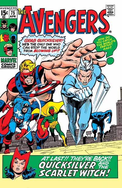
Inspirational Choice: The Avengers Vol. 1 #75 (1970)
Penciler: John Buscema | Inker: Tom Palmer | Letterer: Sam Rosen
Covers with dialogue are risky — but this one nails it. Goliath bellows a warning as Quicksilver hurtles toward the reader, exploding through the page with fury and momentum. It’s cinematic before “cinematic” was the benchmark. Foreground panic, mid-ground propulsion, and a crackling background hinting at unseen stakes. The energy is pure Buscema, amplified by Palmer’s surgical inks. Years ago, I saw the original art board — stained with a brutal coffee spill — and even then, it radiated urgency. That moment taught me something vital: perfection isn’t the goal — impact is. Let your work be messy. Let it be loud. Just make sure it moves people.
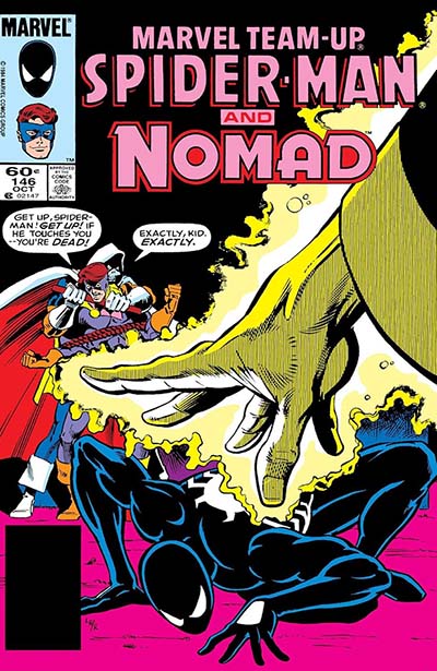
Aesthetic Choice: Marvel Team-Up #146 (1984)
Penciler: Greg LaRocque | Inker: Mike Esposito | Colorist: George Roussos | Letterer: Diana Albers
This cover is a masterclass in comic composition — striking a balance between foreground, mid-ground, and background elements. Every layer contributes to the narrative and sense of motion, pulling the viewer in. It’s one of my all-time favorites from a design standpoint: clean, dynamic, and full of energy. Nomad is held back by Taskmaster while Spider-Man, clad wonderfully in his black suit, is at the mercy of a mysterious enemy. Brilliant drama. Covers like these didn’t play it safe — and neither should you. Because the right image doesn’t just sell a story — it ignites urgency.
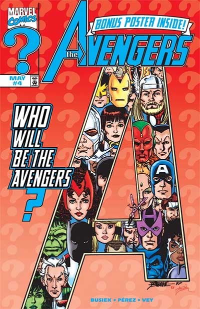
Nostalgic Choice: The Avengers Vol. 3 #4 (1998)
Penciler: George Pérez | Inker: Al Vey | Colorist: Tom Smith
If you know, you know. For those deep in the mythology, this cover signals a seismic shift — the dawn of a new team, a new era, a new possibility. It might not dazzle with action or sizzle with color theory, but if you grew up watching the Avengers roster change like seasons, this image hits like a thunderclap. Pérez, a true architect of the Marvel Universe, knew exactly how to build anticipation with posture alone. That quiet confidence, that implied drama — that’s what stuck with me. It arrived at the right moment in my life and rooted itself deep. Sometimes a cover doesn’t have to scream. Sometimes it just stands there, daring you to turn the page.
About the Contributor
A Harvey Award winner and advocate for digital storytelling, David Gallaher is a writer and editor whose work spans comics, video games, and audio drama. His credits include Tom Clancy’s Ghost Recon, Sailor Moon, High Moon, The Only Living Boy, and the X-Men. He lives in Paris, France.
Article by David Gallaher
Tags: al veycovers albumdavid gallahergeorge perezgreg larocquejohn buscemamarvel team-upmike espositothe avengerstom palmer
— David Gallaher







 English (US) ·