Kaoru Kumi | September 10, 2025
When I, a Japanese reader, look at English translations of Japanese comics — manga — I find myself often skipping the words. Instead, I start by following the images. It’s not intentional — English is not my mother tongue, even though I’m quite familiar with it. This experience gives me a sense of what American readers feel when they pick up manga in Japanese, untranslated.
While this essay centers on Akira Toriyama’s work, the visual techniques it explores — narrative clarity without reliance on language — is widely shared across Japanese manga.
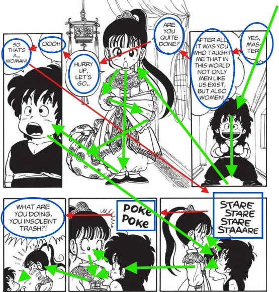
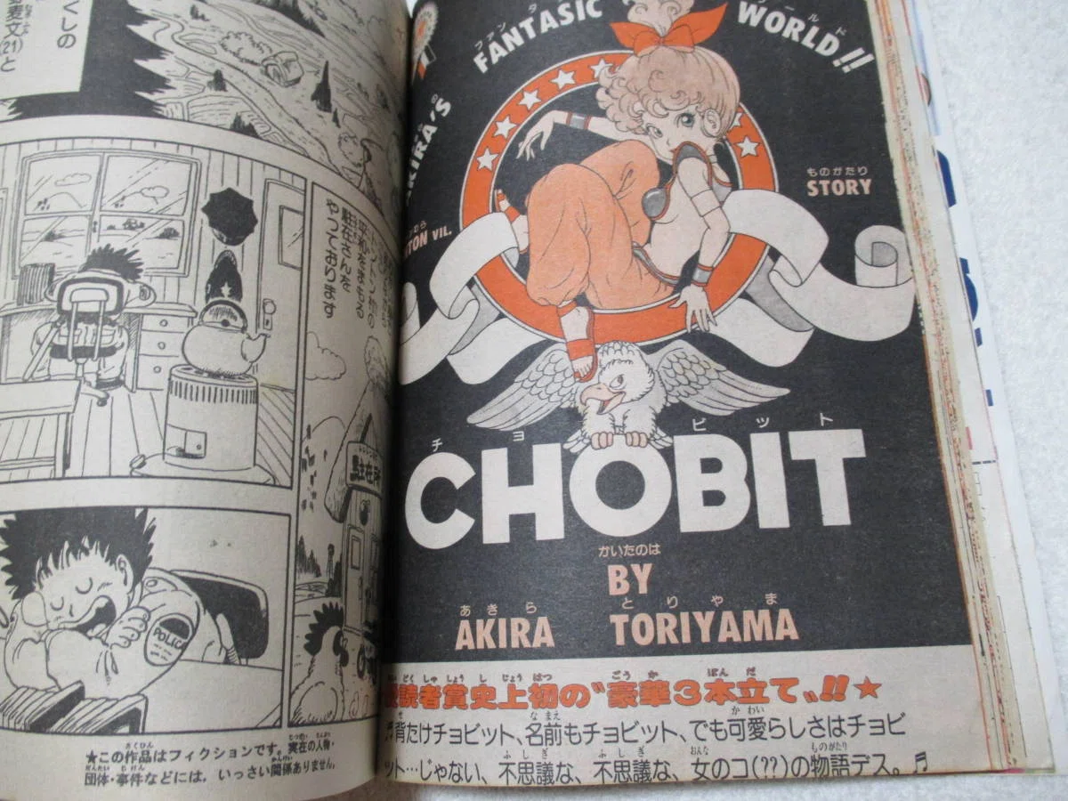
Here is a sample page from the English edition of Toriyama’s Dragon Boy.
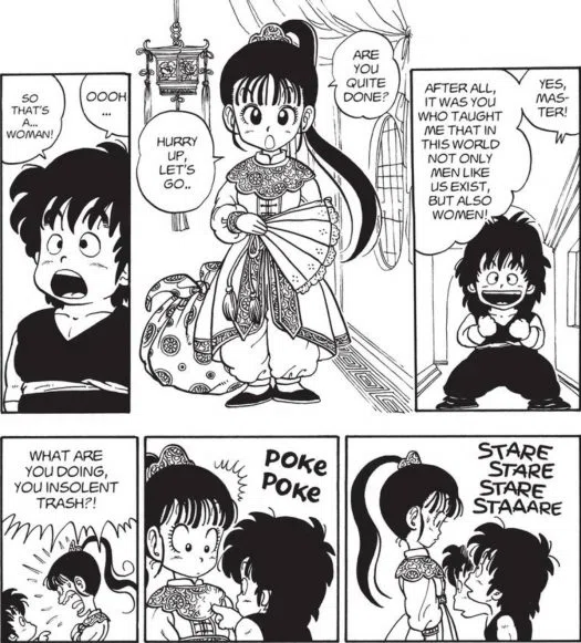
Since most readers of The Comics Journal are English speakers, their eyes naturally go to the English text inside the speech bubbles—just like this.
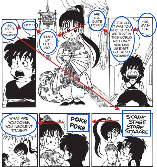
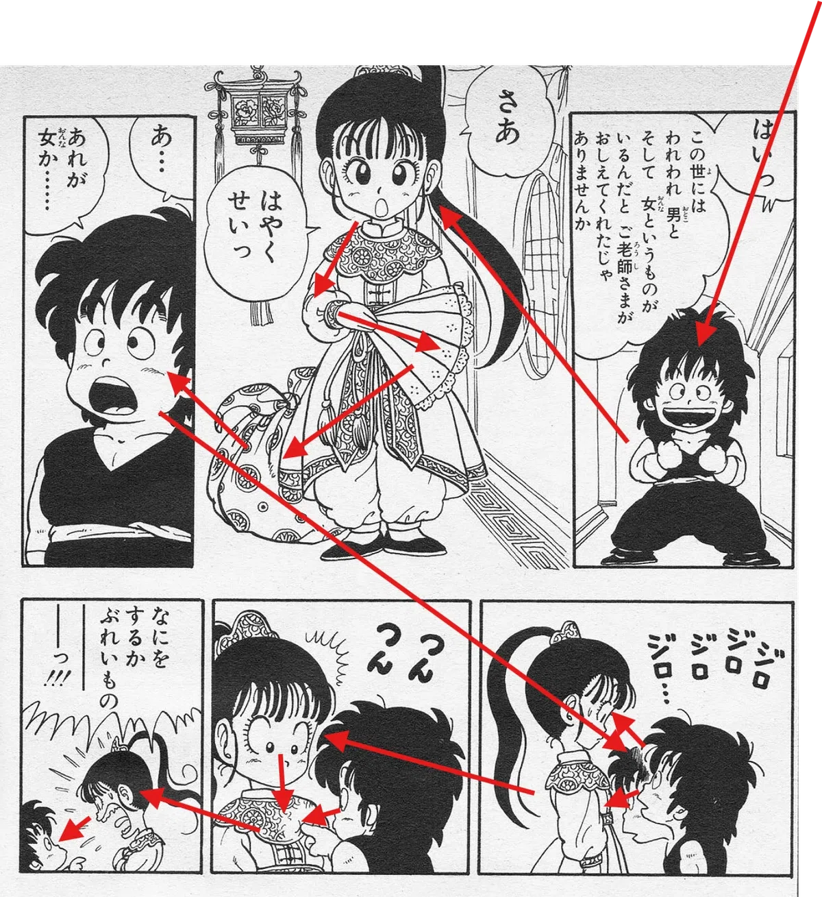
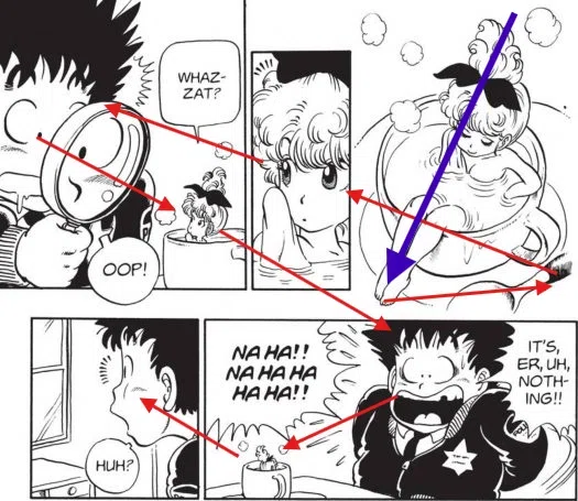
Let’s switch to the same page, but this time, from the original Japanese edition. For most TCJ readers, the speech bubbles will now be unreadable. In that case, the reader’s gaze is likely to move across the page something like this:
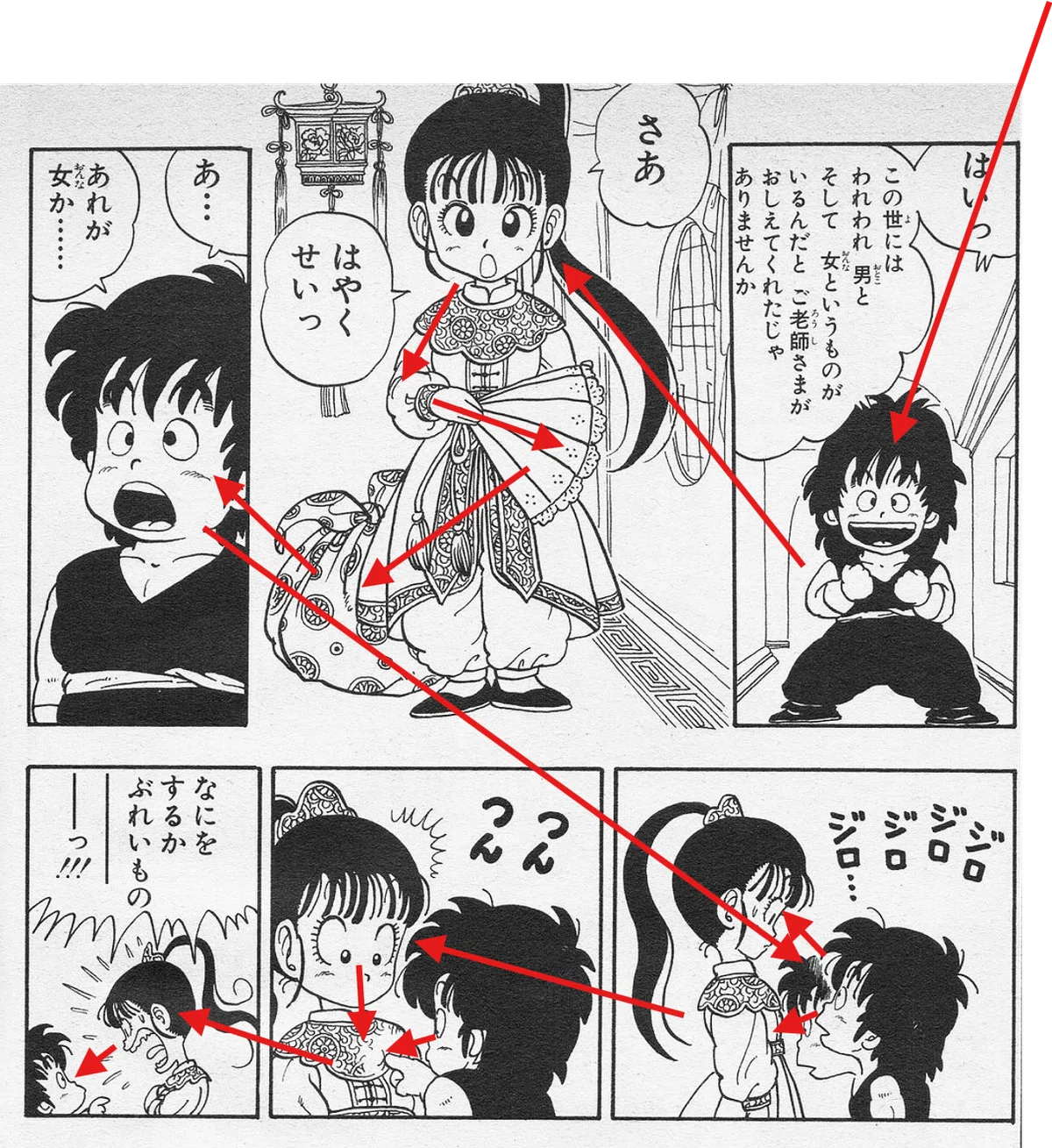
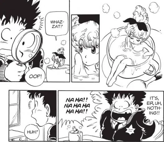
Now, let’s return to the English edition. With the speech bubbles and the sound effects once again readable, the reader’s eye movement shifts accordingly, like this:
Next, let’s move back to the original Japanese edition. For readers who don’t read Japanese, the movement of the eyes becomes simpler, like this:
And yet, even that is enough to follow the story: A rough but innocent boy is paired with a girl who seems to come from a noble or upper-class background. He stares at her with curiosity, as if she were some rare creature, and starts poking at her body. When he touches her chest, she scolds him, but he has no idea why she’s angry. Without reading a single word, we can tell: for him, this is his very first encounter with the creature called “woman.”
And with that, the reader realizes — perhaps even with a chuckle — that this is the beginning of an Adam and Eve story, set in some imagined version of ancient China.
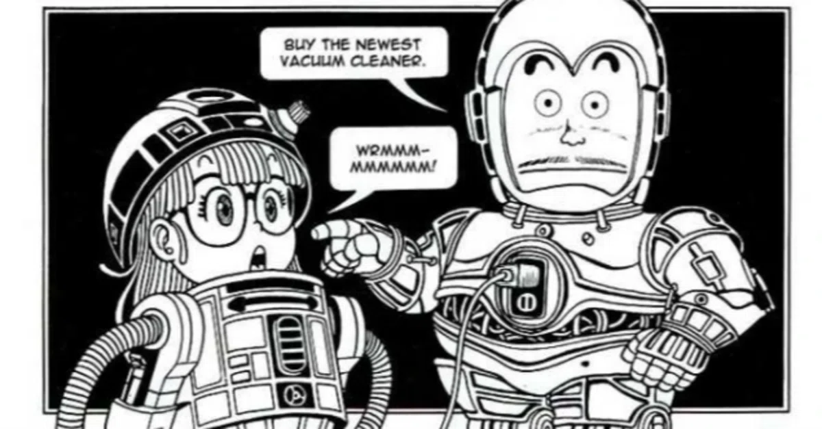
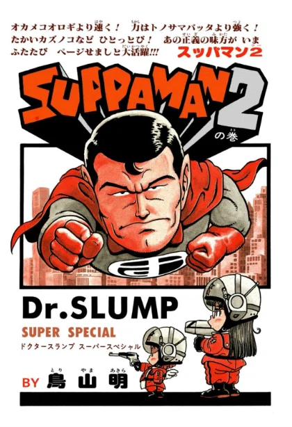
Look, it's SUPPAMAN!
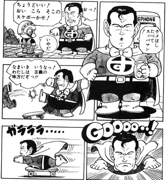
Toriyama, a lover of parody, often revisited his own discarded material to mine it for characters. The comic figure known as Suppaman (Sour-Man in English) is a prime example. Originally created during his early, struggling years — when he drew over 500 pages of manga drafts, only to have them all rejected — Suppaman was later revived and inserted into Dr. Slump, the breakout hit that launched Toriyama to stardom. (The scene we looked at earlier is itself a parody, this time of a Jackie Chan kung fu movie.)
Aesthetic shock from the U.S.
It’s fairly well known — at least among those with some background in Western art history—that 19th-century Japanese woodblock prints were celebrated in Europe, especially in France, where they went on to inspire countless artists, including Vincent van Gogh.
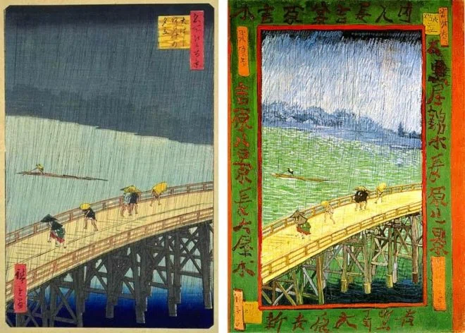 Left: the original by Utagawa Hiroshige; right: a copy by Vincent van Gogh
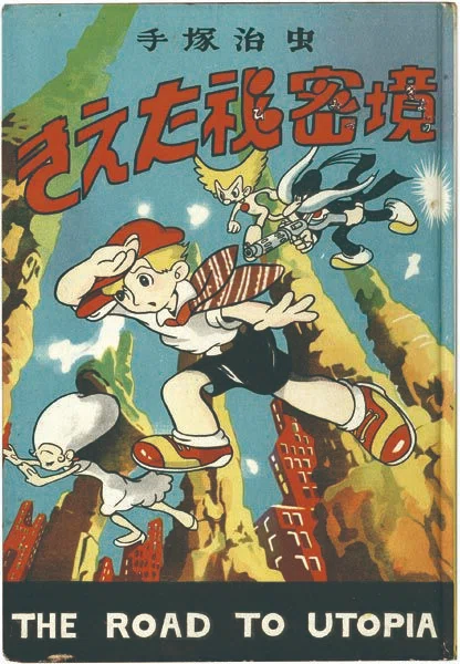
In 20th-century Japan, a similar kind of cross-cultural echo occurred in reverse. American cartoon art — particularly comic strips — had a powerful influence on Japanese artists. One of them was Osamu Tezuka (1928–1989). His early comic books clearly bear the imprint of Disney comics, right down to their cover layouts, a style introduced to Japan by American soldiers who left behind piles of such material during the U.S. occupation. (For more on this cultural context, see the work of Ryan Holmberg.)
The contrast between the firebomb hellscapes of the American air raids and the flood of cheerful pop culture that followed in the postwar years made American comics more than just a creative influence — they were an aesthetic shock. Even for artists like Tezuka, who had already encountered American strip cartoons such as George McManus’ work in Japanese translation as children, the four-color printing, the bold English lettering — it must have been dazzling. One can easily imagine him reacting much like van Gogh, who once copied a Hiroshige print with such reverence that he reproduced even the Japanese characters printed on the image.
It was vintage cool to Toriyama
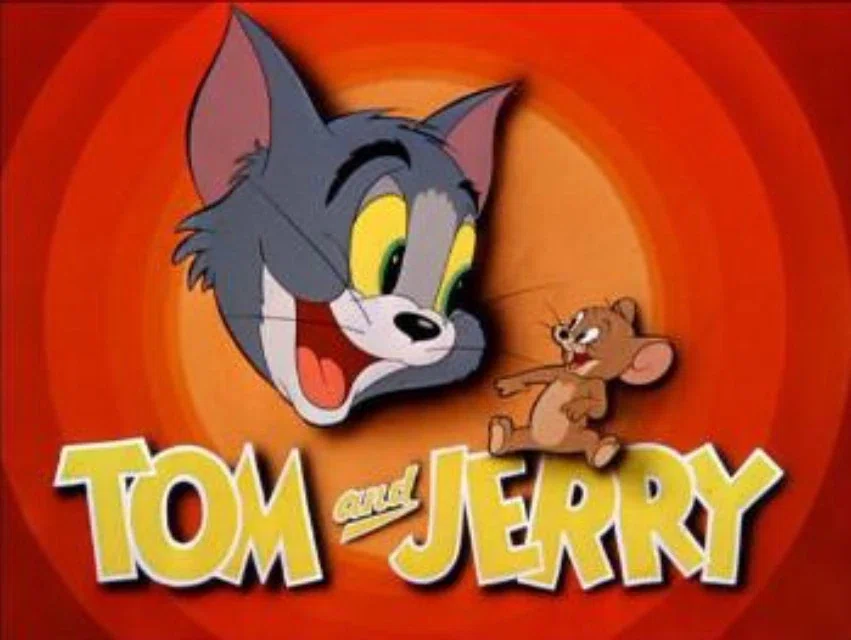
In contrast to Tezuka — who, at the end of the war, was sixteen years old and whose adolescence coincided with the terror of wartime air raids and the grim expectation of being drafted into the final battles before reaching adulthood — Toriyama was born ten years later, in 1955. He later recalled that, as a child, he gained confidence after receiving an award in a children’s art class for an illustration inspired by Disney’s animated feature 101 Dalmatians (released in Japan in 1962). Meanwhile, his preteen years coincided with the rapid spread of television into households, exposing him to a flood of American TV dramas and cartoons, such as Tom and Jerry.
While both Toriyama and Tezuka shared a childhood love for Disney and Hollywood films, Toriyama’s artwork reveals that American pop culture was less about admiration and more about riffing on it with playful, laid-back parodies, like wearing a cool vintage jacket with a twist.
Here is one of several standalone short works Toriyama created between weekly installments of his breakout hit, Dr. Slump, in the early 1980s. The design mimics the MGM logo style, featuring a heroine reminiscent of the protagonist from the TV show I Dream of Jeannie, accompanied by catchy English slogans. It clearly shows the playful joy Toriyama felt in creating this cover page, blending parody with affectionate homage.
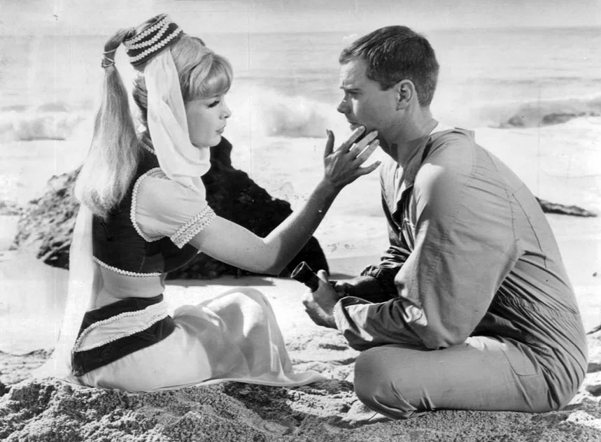
Parody often works as a kind of critique, even if the creator doesn't consciously intend it. In this page, for example, we glimpse the place American pop culture occupies for Toriyama (filtered through his trademark touch of slightly risqué and playfully childish humor).
As I mentioned at the beginning of this essay, even though I read and write English reasonably well, I’m not a native speaker. So when I look at English translations of Japanese comics, my eyes often skip over the English text — at least at first — before engaging with it more carefully. As shown in the diagrams above, my gaze follows a path quite similar to that of someone who encounters a Japanese manga without being able to read the language.
Echoes of early Tezuka in Toriyama
Let’s try the experiment again, this time with another of Toriyama’s comics, in the original Japanese.
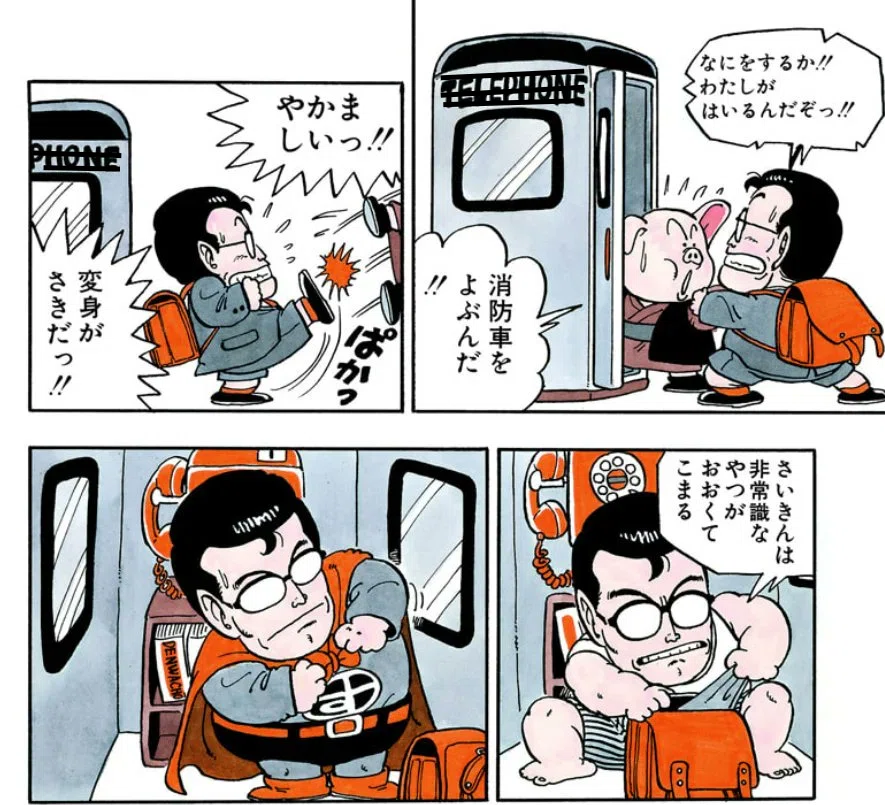
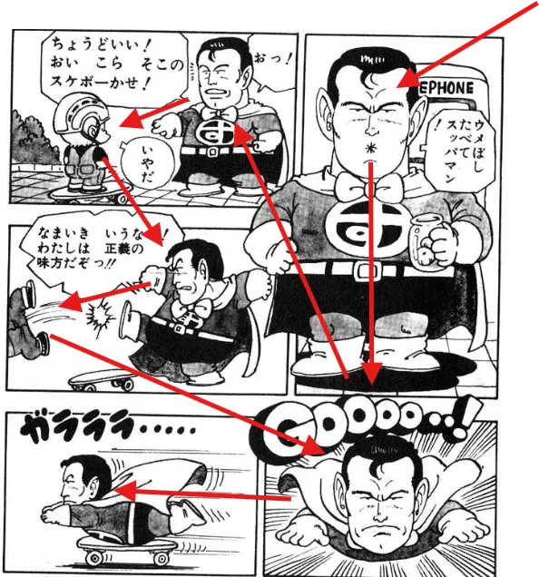
Even if you don’t read Japanese, you can likely follow what’s happening: a caricatured Clark Kent tries to enter a phone booth to transform into Superman — or rather, Suppaman — only to find someone else rushing in first (a pig, humorously anthropomorphized in classic Disney fashion). He shoos the pig away and finally starts to change into his costume. Simply by following the panel flow, the story is clear.
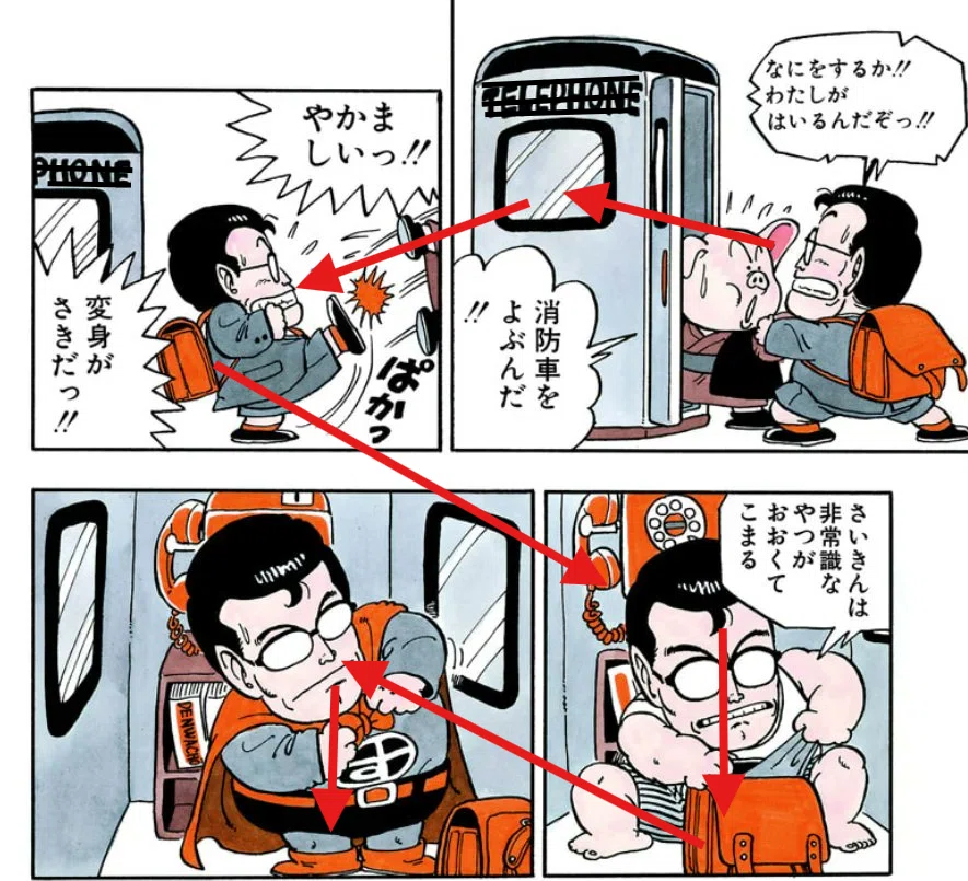
This panel contains no text at all—no dialogue, no sound effects.
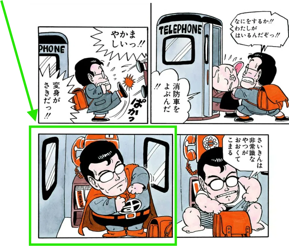
Toriyama likely wasn’t thinking about it consciously, but this technique — dropping both dialogue and sound effects in the middle of an action sequence (in this case, the Clark Kent figure transforming into Suppaman), without losing clarity or momentum — actually pulls the reader deeper into the story.
In fact, it reads as an unconscious echo of a technique pioneered several decades earlier by Osamu Tezuka in the immediate postwar years, inspired by stacks of American comic books left behind by occupying U.S. soldiers.
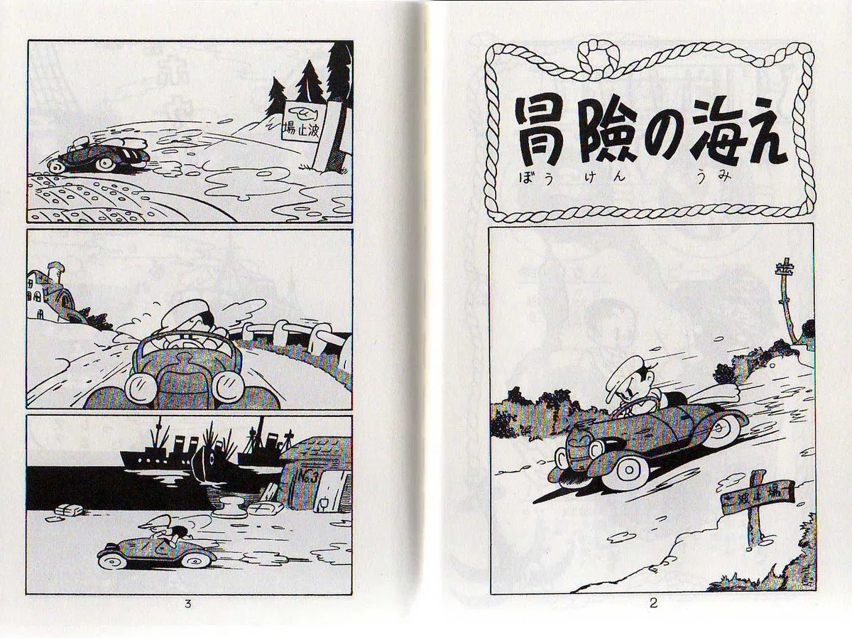 Shin Takarajima (New Treasure Island), published January 1947
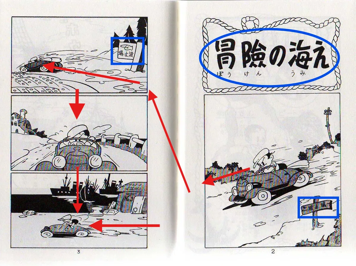
The road signs — blue-coded here for reference — read “Harbor.” A car speeds past it, and in the final panel on the left-hand page, we see the harbor itself. Meanwhile, the top of the right-hand page carries a Japanese phrase that translates to “To the sea of adventure." With just these three verbal cues — no sound effects, no speech bubbles — the sequence still holds together. The images of the speeding car, combined with the layout and pacing, form a coherent narrative sequence.
That wordless dynamism went on to shape his earliest published work — and in turn, influenced a whole generation of aspiring manga artists. It also helped expand the postwar market for children's comics, which soon became a major part of Japan's popular culture.
Fat superheroes
Here's another example of a Superman parody, this time from a 1956 comic strip version of the character. I've blacked out all the English text in the panels. Try "reading" it: can you still follow the story?
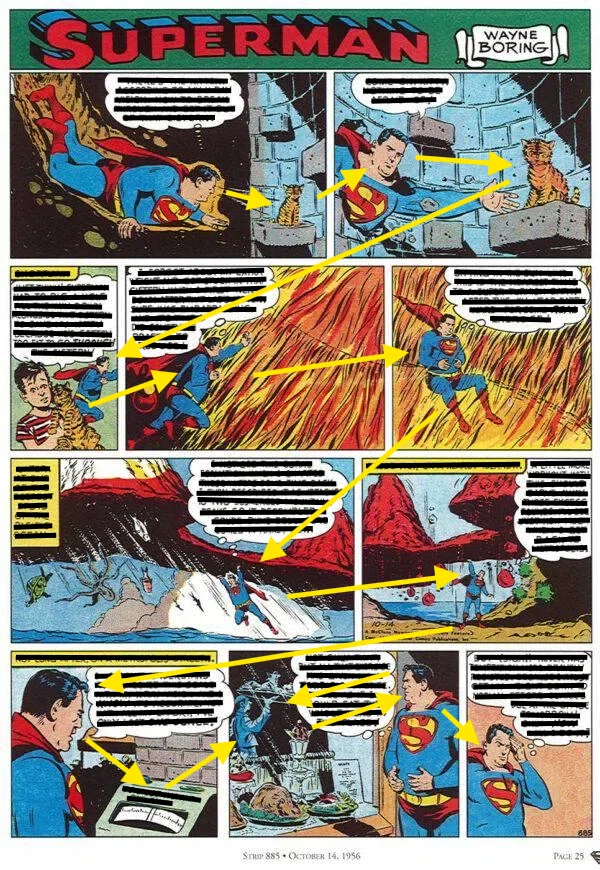 From Superman Sunday Edition, October 14, 1956. Art by Wayne Boring.
Let’s see how Toriyama reimagined the Superman figure in his own way — as Suppaman. Even if you don’t read the speech bubbles or the sound effects, it’s easy to enjoy the absurd spectacle of a man utterly convinced he’s a superhero.
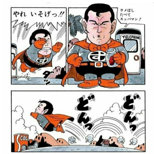 From Weekly Shonen Jump No. 24, 1981
The influence of American comics on Japanese manga has often been acknowledged, yet rarely examined in depth, even in Japan. This is partly because, from the very beginning, that influence operated not at the level of structure or narrative grammar, but as visual inspiration: a spark of form, rhythm, and surface. Japanese artists, unable to read English, absorbed American comics as pure image, much as Impressionist painters once studied ukiyo-e prints without understanding Japanese.
It is precisely because this influence was non-verbal and non-systematic that it has so often been reduced to a single phrase in manga histories: “inspired by American comics.” But within that vague attribution lies a deeper, overlooked history of transnational seeing — a visual dialogue without a shared language.
Comics as testimony
 And that construction — how a character comes to feel real to us, across languages, media, and decades — is not only a question of aesthetics. It’s also a question of cultural consensus, and in some contexts, even legal definition. This ability to recognize a character — visually, across frames, and even without words — raises an intriguing question: what does it mean, culturally and even legally, for a fictional figure to be identifiable?
Some years ago, I wrote a separate paper exploring how, in American legal discourse, fictional characters have gradually come to be treated as if they were patentable inventions — as “objects” that can be defined, owned, and defended. I traced this development through court opinions and legal reasoning, mapping how judges described characters as coherent entities with recognizable attributes, consistent behaviors, and economic value.
In a way, the courtroom and the comic panel share more than we might think. Both rely on our ability to recognize identity, intention, and continuity — not through text alone, but through pattern, context, and visual logic.
That legal study is available online. If this essay has asked how we read comics when we can’t read the language, that earlier piece asks: what happens when the law tries to read fiction? Toriyama’s manga, with its parodic energy and wordless clarity, embodies this lineage of cross-cultural visual transformation — not as critique, but as divergence. Not as resistance, but as reinvention. And it is in this silent divergence that future inquiries into comics may yet find their richest material.


 English (US) ·