Takekuma Kentaro | August 26, 2025
“Dōgu to tacchi no hyōgen hensen-shi” — An essay from Manga no yomikata (How to Read Manga, co-authored; published by Takakarajima-sha, 1995), pp. 38-51.
Translator's introduction
Takekuma Kentarō really needs no introduction to fans and scholars of manga. Even a Monkey Can Draw Manga (co-authored with Aizawa Koji, published in 1990) is legendary for its masterful ability to both discuss manga in a manga-format (much like Scott McCloud’s works) but also, with their sharp satirical fangs, they bit into and made fun of the industry they so loved. (Even a Monkey Can Draw Manga, or Saru-man, is a multi-volume work, but only about the first third has ever been translated into English by Viz [in 2002]). Similarly, the book How to Read Manga (Manga no yomikata, published by Takarajima [1995]), of which Takekuma is one of the book’s two most prominent co-authors — along with Natsume Fusanosuke, is a canonical collection of early Manga Studies essays. This work probably has its best comparator in McCloud’s Understanding Comics (1993), although it is mostly verbal in its discussion of the formal aspects of manga than in using comics to describe comics. (Natsume recalled how he and Takekuma first saw a printing of Understanding Comics in 1994 before How to Read Manga appeared, and they felt a shared kinship with it. “We are not alone!” they jointly cried out when seeing it, riffing on the line from Close Encounters of the Third Kind. At the same time, they felt McCloud had beaten them to the punch by doing his book in the comic format.) Takekuma’s essay here is very much representative of a formal analysis of manga that properly began in the 1990s, a trend headed by Takekuma, Natsume, Yomota Inuhiko, and others.
In this translated chapter essay, which must be considered one of the more substantial pieces from the How to Read Manga book, Takekuma goes into detail thinking about and talking about how Japanese artists feel about lines and the tools they use to create them. Perhaps only Natsume Fusanosuke had written as much about this formal aspect in manga — in fact, he did start his essay on the same subject in How to Read Manga. Line factors big into the book, unlike in McCloud’s. Natsume’s own essay, which he would develop and refine for his own book Why Is Manga So Interesting?: Its Expression and Grammar (Manga wa naze omoshiroi no ka: sono hyōgen to bunpō, 1997), has been translated and published previously in TCJ in two separate chapter essays (Chapter Five and Chapter Six). Both Takekuma and Natsume dwell on what the drawn line means to the artist, to the reader, and in the greater view of the history of manga expression.
However, Takekuma spends far more time than Natsume does talking about the physical properties of each drawing implement, breaking down their main characteristics, their advantages, and their disadvantages. By doing so, he can clearly match different phases of manga genres to the tools that created them. One cannot talk about gekiga without talking about the G-pen, for example, but in fact, Takekuma is one of the few scholars to make sure his gekiga discussion pivots on the G-pen. Likewise, he sees Ōtomo’s upending the gekiga landscape through the artist’s maru-pen. Published in 1995, Takekuma’s essay is dated in the sense that we do not get to computer-assisted drawing tools, and we ask other scholars elsewhere to pick up that newer thread. In terms of an analysis of the existing drawing implements up into the 1990s, Takekuma’s essay provides a solid foundation for discussion of Japanese manga art implements and techniques used over at least a four-decade period.
The translators thank Takekuma-sensei for his permission to publish his writing in English. We hope that this essay will generate new discussions about how comics and manga artists draw, how they talk about how they draw, and how they feel about the tools that help them draw.
— Satomi Newsom and Jon Holt
***
How can we understand 'the individuality of an artist’s line'?
Instead of having an introduction, and before I get into theorizing about lines, let me first clear up the individual relationship each artist has with his or her or their instruments. Let’s begin by assuming that there will be one manga artist that has their own individual line (sen). For this artist of ours, the line actually has something that is characteristic of them, but once we try to start to discuss that artist’s individuality, and we say things like their “characteristics” or something “particular” to the artist, what we talk about comes out only sounding like some subjective criticism that does not add up to much of a theory. Haven’t you ever felt such frustration?
Why then does the discussion always turn to that kind of impressionistic review? Well, I think that it is because we do not have in us the kind of rational standards to talk about lines. However, if we allow for the premise that there is such a thing as a “manga line common to all” (ippan-teki na manga no sen), then we should be able to discuss an artist’s individuality in their line using that as our baseline. And yet we must ask: what exactly is that “manga line common to all”?
If, for example, you had 100 people draw one line, I think it is fair to assume that each of those 100 lines would have 100 “individualities” to them. They would all vary in the thickness of their lines (sen no futosa), each with their own heavily and lightly accented areas (kyōjaku), their lines may have some wavering — however so slight they might be, etc. Because a line’s individuality is rooted in things like the artist’s physicality and subconsciousness, once we try to strictly take those things into account and imagine a general or “common line for all” in manga, that idea immediately becomes impossible for us.
However, here is the truth. For example, in manga, we absolutely see come into existence a new “mainstream style” (shuryū no tacchi) from time to time. When Ōtomo Katsuhiro went mainstream, all of the sudden the industry was flooded with all this manga that looked like they had the “Ōtomo touch.” When you think about it, isn’t that strange? Once we consider such cases like that, the idea of a “common manga line” is not so strange at all. The reason why is that we did have at that time in the world something called “a general manga line that makes you think of Ōtomo Katsuhiro.”
In reality, once any artist figures out what the trick is to Ōtomo’s line, then anyone can draw with the “Ōtomo touch” (let’s put aside whether they do it well or not). How can this be? It’s because his style has something individual about it. It seems like a complete contradiction, but it really isn’t. Let’s take a simple, similar example: I think I can get you to agree with me that any one of us can do an imitation of the [singer] Mori Shin’ichi. It is just a matter of technique; the more the target person has their own characteristics or individuality, the technique to copy them becomes all that more easier. In other words, the more pronounced the person’s individual characteristics, the easier it is to just focus on those things to copy them.
Ōtomo’s line appears to be very sober and to have something inorganic to it. The reason is that he uses a “maru-pen” [sometimes called a “mapping pen”]. Up to Ōtomo’s time, for the most part, the majority of pen types used by manga artists were either the “G-pen” or the “kabura-pen” (“turnip pen”). It was Ōtomo who decidedly chose the “cold feeling” (tsumetasa) of the “maru-pen” because it was through that tool that he could display his own kind of aesthetic. When Ōtomo unleashed this maelstrom in the manga community, so many manga youths [i.e., young men] flocked to art supply stores. Of course, it was because they all wanted to purchase the “maru-pen.”
A Theory of Line from Instrument Types and Why It Makes Sense
The cold line of the maru-pen was the antithesis of the “hot-blooded line” possible with the G-pen. This kind of change, at least in the history of manga and the history of pictorializing, is a problem that comes up time and time again.
For example, in Figure 1, we have a person drawn by the brush of the Edo-period artist Katsushika Hokusai. Look at the marvelous touch Hokusai has with his brush, being able to bring out thick and thin lines (kyōjaku); now look at Figure 2, which is a mechanical and witty picture done in pen by Charles Wirgman. Compared to Wirgman’s, Hokusai’s drawing does feel like a pre-modern drawing.
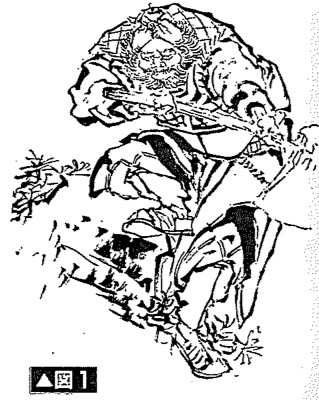 Figure 1. “The Brush” (fude) gives the most organic line and one’s freest line. “The Man Crazy for Pictures” Hokusai and a free-hand picture (nikuhitsu-ga) done in his final years. The brush is the tool that allows for an extremely organic connection to oneself and conveys quite effectively the most direct expression of the movement of one’s hand. For the most Japanese, until the introduction of Western-style pen drawings at the end of the Edo period [i.e., 1850s-1860s], they only knew of lines produced by the brush (fude). This picture is an original drawing from Hokusai done in the artist’s final years. It is a virtuoso display of his hand, rich with contrasts in thick and thin lines (kyōjaku) that only Hokusai could do. (Katsushika Hokusai, Daily Exorcisms [Nisshin joma, 1843-1844].)
 Figure 2. The line of the pen, which has an intellectual and inorganic feel. Were drawings by pen back then the equivalent of Computer Graphics for Japanese at the end of the Edo Period? Long time ago, manga was called ponchi-e (“Punch” pictures), and the origin of that word is traced back to Japan Punch (Japan panchi), which was first published in [the foreign settlement of] Yokohama in 1862. Satirical manga (fūshi-manga), drawn by Britisher Charles Wirgman with his pen and done in his witty style, sparked a giant boom in this genre. The line of the modern pen has something inorganic about it, but perhaps, as a result, it could also convey a nuance of intelligence, which the brush cannot do. That must have been because the pen was a new form of technology back then; it must have been something like for the mid-19th century the equivalent of what is CG for today’s Japanese. (C. Wirgman, “The Mad Joys in the Nomura Street,” Japan Punch [1877].)
As Japan entered the Meiji era [1868-1912], manga were done by the pens that were imported from the West. I wonder what Japanese at this time thought about them? Perhaps they had a feeling like the way people today have when they see CG. It is in the way that tools can sometimes change even the sensibility of an age. This is because tools have “individuality” in their very physicality, and I believe this is extremely important in discussing manga lines. I think that it is considerably meaningful to write about theories of manga lines and a larger notion of expression (hyōgen-ron) from the perspective of implements that create them. Let me list first a few reasons why in simple terms:
- Any drawing tool will have its own real physical properties; the kind of lines it can create are, by necessity, bound to them and any characteristics of such lines will result from those qualities;
- The individuality of the artist and the line born from his tool seem to have a mutually reciprocal relationship; the line of the artist will vary — for every 100 artists, there will be 100 different aspects; at the same time, we can still recognize in any artist commonalities [from their shared tools]; a great deal of what they will have in common is regulated by the tools which they commonly use;
- Any tool has qualities of being in vogue and falling out of vogue according to its time; what this means is that there is also a “line type that belongs to its age” (jidai no sen), which will transcend any differences among individual artists;
- When it comes to our theory of the drawn line that is mediated by its tool, for the person doing it, there is “something certain” (jikkan) in the drawing; this means that any manga artist has somewhere in their consciousness their own perceived feeling that the lines they make cannot be thought of without tools they use.
Now, for the next few sections, what I would like to do is consider in more detail the characteristics of line produced from different types of drawing implements.
The Brush
The brush, which directly reflects the physicality of its artist, by its nature demands “the skill of a master”
 Figure 3. The impeccable work of a true master. Taiwanese Chen Uen is the manga artist who has had the greatest success in Japan as a non-Japanese person. His lines are rich with lighting and shading effects that make you think of a suiboku-ga ink painting. His work has slowly spread through and had repercussions on the world of manga in Japan, whose artists had been shackled to the pen for so long. For the longest time, the brush has always been the implement far more unfettered than the pen. (Chen Uen, Tales of Eastern Zhou Heroes [Tōshū eiyū den], serialized in Comic Morning [1990-1993]).
The Brush: the tool that most a part of the artist’s body
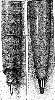
In Japan, the brush (fude) has long been the most traditional implement to create pictures. Until it became common to use the pencil and the pen, there was no other way to draw pictures without the brush. Depending upon the use, a brush will have various forms, but I will discuss here the most common one, the maru-fude brush.
The maru-fude has the following characteristics: it has a weak base (koshi ga yowaku)—and this will depend upon the quality of the bristles; it has the ability to directly translate the artist’s movement and the force on the page; it is the drawing tool that can give the most organic lines; it also can be said that it provides the most range to allow a master to reveal his art and individuality into its line.
In other words, in order to carry out the line of one’s goal, one must have the technique to perfectly control the movement of one’s hand and arm with it, so perhaps we can also say that it is an implement that is considerably difficult for an amateur to have a good command of it.
The characteristics of the brush, when compared to that of the pen, are such that, because there is no inherent directionality in the brush as one moves it, the more one can master the brush, the more freedom will have the kind of lines one can draw. For a true master of the brush, she holds it near the top without letting her elbow get too close to the paper. As with things like this, it becomes possible for a person to sustain a line as long as the reach of her arm. Control of the brush then purely follows the whim of the master, who can vary the thickness or thinness of their line with how much force they put into the brush.
The brush’s one weakness is that, because it is a tool that reflects the raw physicality of its user, it is therefore probably quite difficult to pull off a sustained, uniform line thickness with the brush. No matter what you do with the brush, you will end up producing accents of heaviness or lightness with it. Put it another way, there really is no other drawing implement that can produce a “touch,” or a personal style, quite like the brush.
Furthermore, if the artist is able to skillfully control the power they put into their strokes, the thickness of ink they use, and their speed in their brushstrokes, it is possible for her to develop a kind of faintness (kasure) or varied thickness or thinness even within the same brushstroke. That is the last point I would like to offer as a feature of the brush for which the pen lacks.
These days, manga artists who use the brush to create “omo-sen” (things like the outlines of their characters) are really quite rare, with the exception of few artists. That is because the brush is a tool that is really quite difficult to use for drawings. If people do use it, the brush serves mostly as tool to fill the page space with black ink (beta) or white (howaito) to cover areas with the solid ink. In those situations, the use of the brush does not involve any special skill and it still is a very handy tool for those things.
The Turnip Pen
The turnip pen’s line is the most well-balanced: never too fat; never too skinny; it is the true average
The turnip pen: the representative of the middle line, of the average line
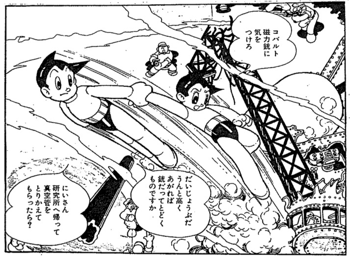 Figure 4. The feeling of excessive life force and how Tezuka Osamu contained that with his intelligent lines. The circle and the curved line make us feel how alive something is. On the other hand, a regulated and standard line creates the impression of something cold, inorganic, and intelligent [i.e., void of emotions]. Although in his pictures, Tezuka mainly uses these circles and curves for his subjects, because he draws with the kabura-pen he achieves a kind of standard line. It is through that standard line that he can generate in us an impression that he masterfully controls with his rationality all of the pulsing life in his pictures. I could boldly say that Tezuka’s lines have “desire” (akogare) that dispense with the feeling of reality. This is the secret of his mastery in the SF and fantasy genres. (Tezuka Osamu, Tetsuwan Atomu [Astro Boy], Shōnen Magazine [1952-1968]).
The kabura-pen should be best described this way: although it can be manipulated a bit depending upon how much force you put into it, for the most part it is limited to create the most average, the most “middle” line — the line will be neither thick nor thin. Of course we could say this about every pen tip, but the turnip pen has, by its very construction, a directionality in how one extends it, and each has its own set law to how much line strength or line lightness (i.e., “touch”) that is produced by applying force to them. Actually, when we consider such “line strength or line lightness” (sen no kyōjaku), we should say that any pen — compared, say, to the pencil or to the brush—really has very tight limits on what it can do. It is also nearly impossible to express “density or faintness” (nōtan) with it.
If we look at it from the opposite side, we could say that the pen is geared more for manuscript pages (especially for rough zara-gami paper used in letterpress printing), where uniformity in line is what is desired in printing. Had the pencil or brush been the popular tool to use, the huge publishing industry [of manga] we have today would just not have been possible. The expressiveness of such density or faintness, of such heavy or light lines that really give “definition” to brush and pencil lines, really don’t work with the form of letterpress printing that dominates the manga industry.
The pen, unlike the brush and the pencil, lacks that organic touch they have. We really should see it for its mechanical aspect. I say that, but because it is a tool that is an extension of the human body, the pen will manifest a slight kind of human quality. This is particularly true when it comes to the kabura-pen. Even though its line is very even and it has a “standard quality,” it is less inorganic than the maru-pen and seizu-pen (which I will explain shortly). Compared to the maru-pen, the kabura-pen has a nice thickness, and so one often gets the feeling of “something human” about its lines; and since it does not produce a truly “standard” line like the seizu-pen, again the kabura-pen comes across as something much more “human.” However, the kabura-pen is still not as “human” as the brush and the pen. That is what makes it so interesting. In everything it does, it is always in the middle. We should consider that point together with the type of manga artist Tezuka Osamu was as well as the idea of the kinds of lines that we see in postwar manga, which Tezuka Osamu built up from the ground floor. If we pursue those avenues of thought, I think all kinds of interesting issues would then pop up for us.
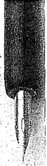
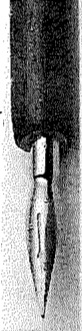
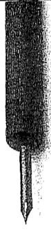
The G-Pen
The G-Pen, with its pen tip capable of expressing “flesh,” set the stage for Gekiga
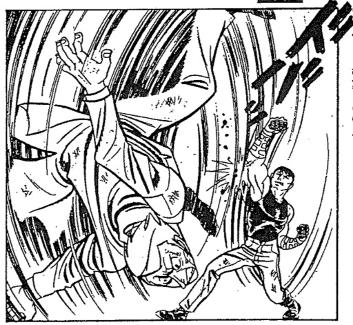 Figures 5 [above] and 6 [below]. The 1960s: The excessive sense of body that the G-pen can produce. If Tezuka’s line was one that could manifest body and lifeforce through its intellectuality, then those in the gekiga camp were the ones that would rationally try to push their lines to have an excessive sense of the human body. The line of the G-pen can richly express both dense and faint forms, so it was just what the doctor ordered. (Above: Sonoda Mitsuyoshi, Iron Muscle [Aian massuru, Tokyo Toppu Sha, first publication unknown]. Right: Shirato Sanpei, Ninga Martial Arts Scroll [Ninja bugeichō, Sanyōsha, serialized 1959-1962].)
G-Pen: physicality in line was now made possible again in a pen
The G-pen, too, is a pen tip with a long history, but it became the favored pen type of manga artists only after the start of what we call “gekiga.” In the beginning, gekiga artists got their start coming out of the kind of line Tezuka established with his kabura-pen, but as they established their new direction for their works, then nearly all of them would go on to use the G-pen (figures 5 and 6).
As for the G-pen, it has a base that is pliable. Hard and soft lines can clearly be differentiated depending upon how much force the artist puts into the base. As one puts more force into the pen, one’s line will, just like that, become thicker; and, as one lessens one’s force, the line becomes fainter, as if it will disappear. Artists call the latter “nuki” (highlighting or picking out). It is true that the same kind of effect is possible with the majority of pens, but with the G-pen, one can push the thinnest nuki line to the very limit. In other words, with this pen, an artist can produce a “touch” that has a clear contrast between his strong and faint lines. In that sense, we can say the G-pen is the one pen quite close to the brush.
It is clear what this means. When we compare the G-pen to the kabura-pen, we see it truly has a pen tip far more capable of rendering “the body.” Ultimately, the reason why the gekiga group of artists latched onto the G-pen was nothing other than a revival in expressing “the body through line” (byōsen ni okeru nikutaisei). At the same time, the G-pen also was the antithesis of “the average line, the medium line” that was represented by the kabura-pen, which in turn represented the style of Tezuka Osamu.
Gekiga was a revolt against Tezuka Manga
The name “gekiga” took off in the year 1958 in the rental-manga circles of the Kansai region. It was given its name by Tatsumi Yoshihiro, a flourishing manga artist of that group. Tatsumi, together with Saitō Takao and Satō Masaaki, formed the Gekiga Workshop (Gekiga Kōbō). He stipulated that this “gekiga” had to be “story manga that would be serious and real and aimed at young adult audiences (seinen).” Really, these young men were raising a rebellious flag against the world of children’s manga of which Tezuka Osamu was the main representative.
I wonder then just what are the real differences between Tezuka’s style of story manga and that of gekiga?
I can be plainly blunt to answer that: there really are no essential differences between the two. Those twin ideals of reality and seriousness that are professed by the gekiga artists are also actually visible in Tezuka in his early period. Plus, the very same techniques of panel layouts that all the gekiga artists unconsciously followed were nothing other than what Tezuka had perfected prior to them. In other words, looking at them today from our view, we can say that if you want to understand gekiga, you just need to realize that theirs was a style that developed the already existing aspects that were latent in Tezuka’s works.
I say that, and yet both the manga creators and their audiences at that time equally felt something really different in gekiga that had not been seen in Tezuka’s manga and so they maintained their support of this style with a feverish passion. I wonder why they could feel this way?
Real Lines, Real Bodies
I noted this earlier, but my assertion is that we can only understand the true difference between Tezuka and the gekiga artists in how they reveal “the body through line” (byōsen ni okeru nikutaisei).
For example, let us compare a scene where Astro Boy gets destroyed and collapses in his title Astro Boy (Tetsuwan Atomu) with a murder scene drawn by Sonoda Mitsuyoshi where a full spray of blood issues from a person, drawn in a dynamic motion. Both scenes express an aspect of “violence” and yet the impressions from them are significantly different. Sonoda’s is much more physical — we feel the “body” more in his manga.
The problem is not due to the basic difference in that Tezuka is drawing Astro, who is a robot, whereas Sonoda is drawing a murderer, who is human. It is that those wild lines, which Sonoda loved to draw, have something of a real human “body” about them. Because Sonoda used the G-pen, his lines directly reflect the movement of the artist’s drawing arm. The “body sense” of his line has something completely improvised about it.
Tezuka’s lines are those where he variously used a lot of curves and circles. We cannot deny a kind of eros, or a feeling of life force in those curves. However, the very nature of the lines of his kabura-pen manifest something inorganic, something neutral, and so there is not so much a feeling of a real body. As a result, when we look at Tezuka’s pictures, we see there is simply “symbolic and theoretical” (kigōteki, kannenteki). That is correct up to a point.
 Figure 7. The 1970s: Nagai Gō with his G-pen makes the human body work for both gag humor and SF. The G-pen line, which can manifest excessive aspects of the body, was thought to be incompatible in manga genres like SF and gag humor (gyagu), but Nagai Gō transformed it into his weapon for them, contrary to conventional wisdom. Plus, he was able to draw such works that ran rampant with naked bodies and naked passion. (Nagai Gō, Iyahaya Nantomo, Weekly Shōnen Magazine, serialized 1974-1976.)
 Figure 8. The 1970s: The enka-like lines of Motomiya Hiroshi. Someone said that the lines of Motomiya are “have a kobushi in them” [i.e., they have in them a warble, a technique an enka pops singer uses to express rich emotions]. He made up his mind and put all of his energy into the G-pen, and so we can see why all the passion that Motomiya that puts into his lines also gives his pictures an enka-like quality [Note: enka is an old-school style of schmaltzy ballads and pops still enjoyed by mainly older audiences in Japan today.] We cannot then imagine a futuristic SF work coming from Motomiya’s lines. (Motomiya Hiroshi, Legend of the Dragons [Gunryūden], Weekly Shōnen Magazine, serialized 1972-1973.)
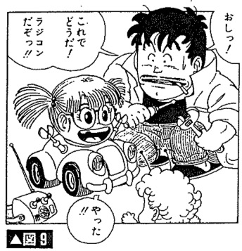 Figure 9. The 1980s: “Tezuka-like” lines as drawn with a G-pen. Toriyama Akira was a member of the G-pen faction, but he attained mega-popularity by drawing SF works with a neutral line that suppresses the contrast of heavy and light lines. In other words, he was a kind of return to Tezuka-like lines; he was an antithesis of the gekiga-esque lines. He was also the opposite of Ōtomo Katsuhiro, who used the maru-pen. When Ōtomo and Toriyama came on the manga scene, the gekiga era was in its last throes. (Toriyama Akira, Dr. Slump [Dr. Suranpu], Weekly Shōnen Jump, serialized 1980-1984.)
That is funny, because the opposite is also true: Saitō Takao and Motomiya Hiroshi, who were hardcore, graphic G-pen artists who liked to draw the body, never could do SF and fantasy works. And even when they tried, they couldn’t help but create works that made one cringe.
The Maru-Pen
Going from the age of the body and intense feelings to a new era of the “inorganic,” the Maru-pen created a craze for “cool” by the way it made lines.
 Figure 10. Once people and backgrounds became unified through the touch of the maru-pen, which made all of its lines thin and homogeneous, the maru-pen upended the common assumptions of the manga world. The drawings of Ōtomo Katsuhiro are packed with his superdense lines down to the smallest details, nonetheless, his work somehow feels so light. This is a result of his using the maru-pen to draw them. Normally, if an artist uses a maru-pen to draw lines for her characters, they get buried into the backgrounds and so they are hard to pick out and see in the panels, but Ōtomo had an exceptionally creative organizing power that could overcome that problem. (Ōtomo Katsuhiro, Dōmu, [Action Deluxe Super Fiction, serialized 1980-1981].)
Was there any truth to the notion of the “Ōtomo Shock”?
When it comes to the maru-pen, among all the pen tips an artist normally uses, the maru-pen is a tool that can make a line that is the thinnest, the hardest, and the most monotonous. If one does put force into its tip, it is possible to produce a thick line, but it cannot be as smooth as the one made by a G-pen. The tip of the maru-pen is better at making a uniform and an inorganic line than what the kabura-pen can do.
In manga of yesteryear, it was rare to see artists using the maru-pen to draw their “omo-sen” because of those qualities; instead, artists back then mainly used it for motion lines or to create backgrounds. Ōtomo Katsuhiro was the person who made his colleagues gasp in surprise for the way he radically used the maru-pen to draw people [i.e., his omo-sen lines].
The descriptive lines that Tezuka made with his kabura-pen had those average and inorganic qualities, but because they were of a middle-type, where they were “not too fat and not too thin,” his linework never lost a sense of life force or a sense of vitality. When we get to the G-pen of gekiga, those artists aggressively marketed intense physicality and emotion. However, in the case of the maru-pen and the artists who used it, the drawn line loses any kind of vitality; the impression we get is a cold merging of people and backgrounds. Readers in the 1970s must have felt a new kind of reality in such linework.
Come to think of it, all manga after Tezuka’s appearance, including the work of the gekiga artists, is a history of separating people from backgrounds through the different approaches to making lines. To draw lines for their characters (omosen), Tezukians would use the kabura-pen to create that middle line; the gekiga group would use the G-pen to make their thick lines for people. Similarly, both types of artists would use the maru-pen and such types to draw backgrounds that had thin and normal lines. It was through this kind of process that manga artists of those times could differentiate people from their backgrounds, and so they could emphasize the existence of each individual character.
Gekiga artists especially attempted to put excessive vitality into their lines and thought that was how they could express “reality.” On the other hand, Ōtomo blended the lines for people and the lines for background by making his omo-sen disappear. His idea was the exact opposite of what the gekiga artists did.
If we think about it, in terms of how things exist in this world, both people and inanimate things all have the same kind of average lines about them. The idea of making a human’s line more importance implies a very human-centric thinking, where humans always take precedence. What Ōtomo did with his line was to utterly revolt against that kind of thinking with both nihilism and objectivity.
Readers and younger artists, who had become tired of the G-pen, which was always aggressively promoting intense feelings and sensual bodies for so long, really went crazy for the cold realism that Ōtomo fashioned with his maru-pen. I think this is probably what is referred to as the “Ōtomo Shock” (Ōtomo shokku).
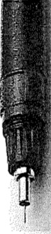
The Rapidograph (Seizu-pen)
To pull off lines that are utterly lacking in humanity like those of the seizu-pen, you need to have a clear strategy for doing it
 Figure 11. There was a time when manga done by seizu-pen had a popular phase, but the person who continued using it was, in the end, only Hisauchi Michio. The seizu-pen (Rotring) was popular for a short time among manga artists, but Hisauchi Michio is the lone remaining representative of such artists. His goal in using it was to use its cool line to satirize the desires of human beings. To do that, it was necessary for him to draw with the seizu-pen. (Hisauchi Michio, The Unusual Affection of the Female Professor [Onna hakase no ijō na aijō, serialized in Manga Daikairaku in 1978].)
No other pen is as thoroughly homogeneous and inorganic like the seizu-pen
Calling them rOtring [Rotring] was popular in the day, but since that was a particular company brand name for them when they appeared, here I will just ask that you let me label them seizu-pen, or technical pens.
If you were going to further push a cold, homogeneous aspect of line, represented by the maru-pen, then you would end up with the line of the seizu-pen. The seizu-pen was an implement designed to create a very standard or equal line. It only makes sense when an artist draws a seizu-pen line, because the line is mechanically made, then all lines are the same. Also, the seizu-pen does not have the capability to create heavy and light lines. No matter how hard they try, the best that artists can do is to create a line with a slight trembling touch with one’s freehand.
Based on the above characteristics, you might think that you would have to be a very special and talented manga artist to be able to pull off omo-sen character lines with it. Indeed, before Hisauchi Michio, no other artist could do this with the seizu-pen.
Here are some points that make the seizu-pen different from using the maru-pen. The seizu-pen come in a wide array of widths in their point sizes; as a result, an artist does not vary his line heaviness or lightness with one implement, but he can make and differentiate his line thickness easily [with different rapidographs] and thereby create different accents on his page. Furthermore, the artist’s panels and page surface that gets illustrated with such pens give the impression of something extremely inorganic and mechanical. That means the opposite could be true, too: namely, if one wants to instill a sense of life or life force (seimeikan) onto one’s page, how one creates one’s “touch” (the heaviness and lightness of one’s line) would then be incredibly important.
When one uses the seizu-pen, one must use it by holding it at an angle perpendicular to the page surface. If you do not do this, then one’s line not only becomes totally muddied, but also you can ruin your seizu-pen tip. Also, if you neglect a proper maintenance of the pen tip, then it easily gets clogged. This is a tool that is really hard to use.
In the history of manga, there were artists who attempt to take to the extreme the idea of “eliminating of the organic out of line,” which is what started with Ōtomo and his maru-pen, but their linework ended up being far too inhuman with the seizu-pen; they gave the impression of having one’s theory dominate the feeling of the lines, and probably because of that, this kind of craze lasted only for a short time. In the end, the person who was the last man standing and kept using it was Hisauchi Michio. (In his case, Hisauchi had a brilliant strategy to use the seizu-pen to visualize his goals and to manifest his own vision.) As a phase in manga history, the seizu-pen was a drawing tool that all too soon came to naught.
And yet, we cannot ignore the seizu-pen and the kind of line it produced. The reason why is that, later when the “mili-pen” makes its appearance, we can see how the seizu-pen influenced the ways that the mili-pen would create a new wrinkle in the history of manga expression. I’ll touch on that aspect in the next section.
The Sign Pen and the Mili-Pen
The sign pen combines the qualities of both the brush and the pen. The mili-pen has that middle-zone line.
 Figure 12. Perhaps it is rough lines that possess the original charm of manga? “Heta-uma” (so bad it’s good) manga like this taught us the charm that manga-graffiti originally had for people. This “heta-uma” style really took off with the crazy combination work done by two people in two different field: the illustrator Yumura with the advertising writer Itoi. (Picture by Yumura Teruhiko, words by Itoi Shigesato, “Penguin Shuffle,” [GARO magazine, 1976].)
The sign pen and the return to the middle line
The sign pen (sain-pen) is a relatively new tool in terms of it being used for manga. In the latter half of the 1970s, there was that group of artists called heta-uma (so bad, it’s good) artists, like Yumura Teruhiko, who started to use it and it then became a popular drawing implement for manga. Because the core of the sign pen is made out of felt, an artist has an extremely light feeling drawing with it; its tip has the perfect thickness; it is easy to use; it is actually hard to make mistakes with it.
The line of the sign pen has some characteristic qualities of having a “bluntness” (nibusa) and a “warmth” (atatakasa), so, in that sense, we can say its line creates a fleshy and organic feeling. However, what’s interesting is that, unlike the brush and G-pen and tools like them, the sign pen does not have a clear contrast between thick and heavy lines and thin and light lines. In other words, There is something unique about the sign pen line: its wideness has a kind of uniform homogeneity to it, although its line quality is organic.
 Figures 13 (above) and 14 (below). The appearance of the mili-pen ushers in the return of the “standard line” to the world of manga. The mili-pen is like the sign pen, a kind of felt-tip pen. Because the mili-pen’s line is always the same, its pictures give the impression of being “the norm.” (Figure 13 (left): Aoki Mitsue, There Goes Koumi-chan II [Koumi-chan ga yuku II, published in Gekkan Manga Kurabu, 1991]. Figure 14 (right): Karasawa [Naoki], Picture Book of Laid-Back Classroom, [Nōtenki kyōshitsu zukan, serialized in GARO, 1990-1991].)
It is totally different from the line quality of the maru-pen, but it is so interesting because it completely took the manga world by storm in the same period (the late 1970s) that the maru-pen was also popular. The two of them share the same characteristic in that “the uniform line width,” so in that sense, the sign-pen was a kind of return to the “middle-zone line” of Tezuka and his era. We could also say that the sign-pen was also a line that buckled against the G-pen.
The mili-pen is a kind of sign-pen, but its construction is closer to that of the seizu-pen rapidograph. It maintains the “warmth” of the sign pen. Therefore, it is a drawing implement that is unique for combining that “warmth” with the very homogeneous line it can also make.
The mili-pen made its appearance only in recent years [i.e., by the early 1990s], and it was at first used as “the easy seizu-pen.” Compared to the seizu-pen, it really is amazingly easy to draw with it and manga artists came to love using it when they drew panel borders. Furthermore, it has many kinds of pen widths, so it really hits the spot for artists who like to use the line thickness of their liking to draw their omo-sen character lines. These days, there are many manga artists who draw everything with mili-pens.
In other words, it is a drawing tool that splendidly responds to those very choosy customers, who want the best quality possible and will demand something like, “O.K., the G-pen has a line that has all the dense and light areas, but it is a bit too old for me. I’m sorry to say it, but well, I also hate the coldness of the lines like that of the seizu-pen and the maru-pen. Now I like the drawing feeling of the sign pen, but it’s hard for me to stick with just one pen width.” Thus: the mili-pen. We might call it the manga pen that symbolizes the manga world of recent times [i.e., the 1990s].
The Pencil
As a tool for manga artists, shouldn’t the pencil’s potential be explored more than it is?
 Figure 15. Rokuda Noboru’s experimental manga drawn entirely in pencil. I think more attention should have been given to Rokuda Noboru’s experimental all-pencil manga than what it got. Even so, his use of pencil here seems extremely pen-like. It is regrettable because what happened to it. Because of that look, his work ended up seemed like it was a manuscript without its final finish. I’m looking forward to how he explores all-pencil manga in the future (Rokuda Noboru, Sky [Young Sunday extra number the rookie of the year,1992]).
The pencil line: the most fundamental manga line of them all
Manga artists use the pencil as a tool mainly for their initial layouts. From its aspect of being easy to revise with its eraser, there is nothing that beats it when it comes to its use as a tool for trial and error; plus, it is also a tool that probably most manga artists first used in their lives. The pencil’s line is the most fundamental line for all manga.
The greatest characteristic of the pencil is its pliability and its freedom to draw the lines you want. Plus, as one can sharpen and shave down its tip, depending upon how one applies it to the surface of paper, one can make it do whatever one wishes, including line thickness and accents of denseness and lightness. In that sense, it resembles the brush but compared to the demands of the brush for one to learn how to use it, the pencil is an implement that any beginner can pick up and use without worry.
In other words, the pencil is a “tool of a million drawing possibilities” in how one can use it to potentially express a great number of things in one’s style, in what one wants to accomplish in one’s pictures. However, that high number of possibilities is ironically what earns the pencil the hatred of manga artists when they try to use it for their omo-sen character lines.
I am guessing that the biggest reason is how the pencil, which is supplied with the ability to create dense and light areas in its lines, means that it cannot be used much for character lines. If you ask why, it’s because manga in the immediate postwar era was originally developed in an industry in which printers had (as a basic premise) to use the uneven manuscript paper called “zara-shi” (rough sheets). The pencil’s light and dark lines were fundamentally not suited for doing letterpress printing, which was based on this uneven [manuscript] paper base.
 Figure 16. When pencil is used in the place of screen tone. The advantage of using pencil is that one can apply the kind of shading exactly as one wants to the drawing. Using the pencil in this way, Ōtomo Katsuhiro challenged himself and made a very unique work where the pencil is used instead of screen tone to create such shading effects (Ōtomo Katsuhiro, Allaying the fire [Hinoyōjin, COMIC CUE, 1995]).
The pencil’s line for manga, as I stated before, really is a fundamental drawing line. Nonetheless, the sad truth is that there are so many manga artists for whom the pencil is not that fundamental to them – they say that the pencil is just to be used for “drafting” – and because they believe in that baseless idea, I think that the cool possibilities for pencil mostly have gone untapped.
What people like about line keeps changing with each generation
Line is always determined by tools possible to it
Five elements of an artist’s touch and the properties of the drawing tools
I would like to pick out the representative points of each implement that I brought up in this chapter essay and briefly review them here. The special qualities of line (or: a “touch”) can be broken down into five elements. In the list below I have summarized them as such, but in terms of that which is sought after in lines in manga mostly can be seen in the top four main list items. As for the fifth item, the density or lack of it in a line, I was thinking of how an ink-and-brush painter can vary the intensity of their black line, but in letterpress printing, this kind of thing is impossible, so it is not much appreciated in the manga world.
The Top Five Elements of a Pen Touch
- The thickness of the line
- The gradation from heavy to thin quality in a line
- The steadiness of a line
- The sharpness of a line’s edge
- The density or lack of it in a line
When it comes to the fourth item, the sharpness of a line’s edge, I think I need to slow down and explain that a bit more. It is easier to understand if we take for examples the kind of the same thickness in line produced by both the mechanical pen (seizu-pen) and that of the mili-pen. Both pens might have 0.3 mm pen tip for both, but there will be an obvious difference in the line quality. In other words, when you compare them both, the mili-pen produces what feels like a “soft or vague (amai) outline.” Because both the mili-pen and the sign pen have the same kind of felt tip as their pen cores, the kind of line you draw out with them will have an edge (outline) that is a bit fuzzy. The mechanical pen or rapidograph, quite the contrary, has a metal core to it, so it hardly ever gives one the impression of fuzziness. As a result, a reader will feel that the mili-pen and the sign-pen lines have something “warm” or “organic” about them, whereas the metal-based pen tip gives a line that feels “sharp” and “inorganic.”
I do not feel it is necessary to over-explain items one through three, but, as a rule, when you have lines that are thicker, that have lines with clearly contrasted areas that are strong and weak, that show the hand to be a bit unsteady, then the reader can feel something “organic” in those lines; on the other hand, if the line is fine, or standard-sized, or has a kind of that perfect steadiness, then one would say such lines are “mechanical.” It seems easy enough to say a line is organic or inorganic, but I would like us to note that we only feel that way based on how all the factors come together into a whole impression.
Having touched on the five elements now, I would like to move onto my next chart that covers “At a Glance: The Characteristics of Drawing Implements” (see below). Let me just state in advance as a warning that the following judgements are born mostly out of my own biases here.
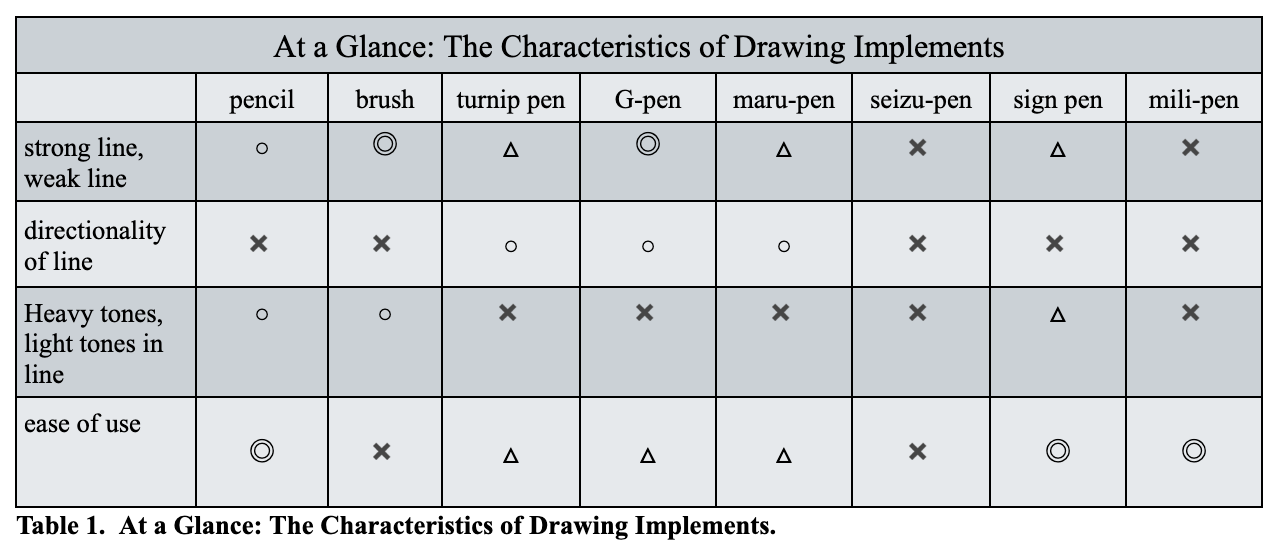
For the first row, “strong line, weak line,” there is probably no need to discuss it further. The next row, “directionality of line [gained from the tool],” what I am talking about is whether or not the direction of the line is determined in advanced as one goes about making one’s line. Pens that have a set kind of directionality are: the kabura, the G, and the maru-pens. The brush and the pencil have no such thing. When an implement has no directionality to it, one is totally free to draw out the line in whichever way one wants. In other words, that latter group shows them to be tools that can greatly express the physicality of its artist. On the contrary, compared to the pencil and the brush, that former group of tools are really poor in “physicality.”
There is also the “ease of use” row in my chart. What that means is the level of proficiency required to use the tool, especially when one uses it free handed. So, when the tool requires a high level of proficiency that makes it hard for a beginner to use it, I marked that tool with an x-mark. The lower the level needed, the more I gave circles or double circles. The triangle in this case represented a kind of medium-level requirement.
Drawing tools: organic types vs. mechanical types
I would like to pick up the representative points of each implement that I brought up, looking at the individual properties that each implement can bring to its line, and so I have broken them down into two major categories: organic type versus mechanical type. The brush is the most representative of the organic type. For the pen, from its aspect of giving a inorganic feel to its line, I label it a mechanical type. The most mechanical type or the most inorganic line quality would have to belong to the rapidograph mechanical pen.
Where I began to see a kind of reciprocity in the aspects of line that the different implements could share, I created a “Drawing Line Tool: Relationality Map” (below). Along its vertical axis, we see a rising or falling heaviness or lightness; along the horizontal axis, it swings in “edge sharpness” from “sharp” to “fuzzy” (boke). I’ve tried to place each implement in their appropriate zones.
Line becomes more organic the more it accentuates heaviness and lightness. Line becomes more inorganic when there is less accent in those areas. Furthermore, line is more mechanical the sharper the line becomes; the fuzzier it can be, the more organic it will be. Therefore, those implements located in Area 3 of the map have the most organic feel; and, Area 2 implements are the most mechanical. The reason why the brush and pencil occupy such a large swath of areas is because they are tools that can enable the artist to draw all kinds of lines. Especially in the case of the pencil, because it allows for both organic-type expression and mechanical-type expression.
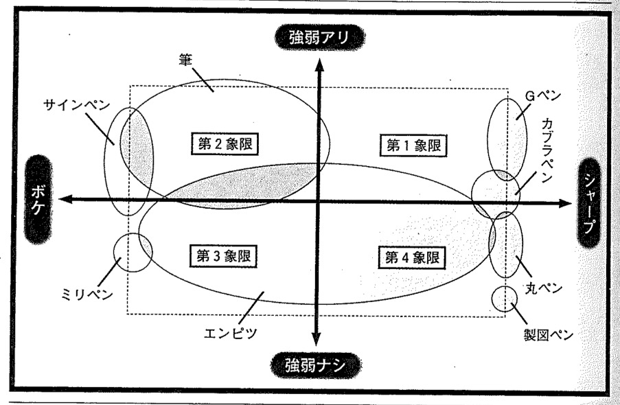 Chart 2. Drawing Line Tool: Relationality Map. The left-right axis shows the degree of “fuzziness” (left) to its opposite “sharpness” (right). The top-bottom axis shows the degrees of difference from “having lights and darks” (top) to “not having lights and darks” (bottom). Clockwise from top right: Zone 1 runs from G-pen to turnip-pen; Zone 2 runs from maru-pen to seizu-pen [rapidograph]; Zone 3 runs from pencil to mili-pen; Zone 4 runs from sign pen to brush.
In other words, if one wants to go back and rethink the history of manga from the standpoint of “Line and Drawing Tool,” then we should look at the three main periods of “The Era of the Brush,” “The Period of the Pen,” and “The Time of the Felt Pen.” (By “felt pen,” that is a collective word that includes things like the sign pen, the mili-pen, etc.)
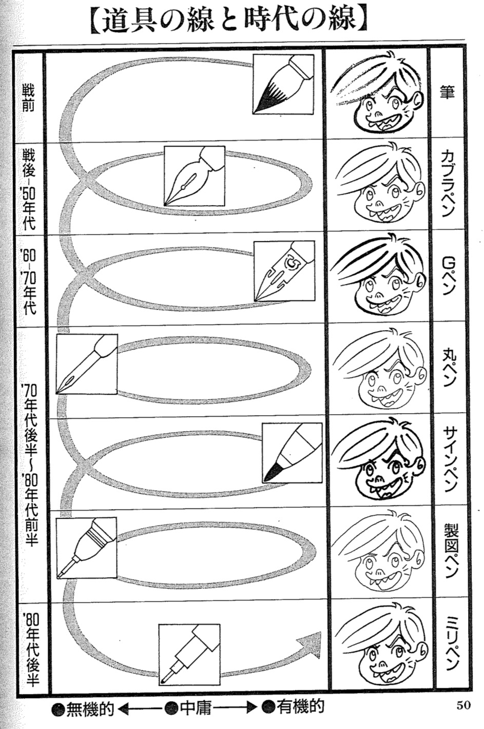 Chart 3. Lines Born out of Their Tools; Lines Born out of Their Times. In the above chart, there are 6 rows showing the oldest periods of manga drawing tools to the most recent: (1) Prewar: the Period of the Brush; (2) Postwar up through the 1950s: the Period of the Turnip Pen; (3) The 1960s & 1970s: The Period of the G-Pen; (4) The Latter 1970s through the Early 1980s: (4a) The Period of The Maru-Pen, (4b) The Period of The Sign Pen; (4c) The Period of the Seizu-pen/Rapidograph; (5) The 1980s: The Period of the Mili-Pen. Note that the main middle column positions a drawing tool according to the lines it can produce from “inorganic” (left) or “neutral” (middle) or “organic” (right).
If we look at it from the angle of “the line quality,” then the brush line is organic (i.e., reflects some physicality); the pen is more mechanical. The felt pen [types] would be a compromise between those two.
Of course, even in “The Period of the Pen,” there was a time when artists tried to get back some of that physicality, when they tried to get as close as they could to the brush with the G-pen; and, if that is true, then you would expect the reverse, that there was also a time when the maru-pen was popular because its inorganic quality was a reaction to what came before it. When we get up to the time of the seizu-pen, with its extremely inorganic and theoretical feeling, there then were artists who came forth and used the felt pens again to bring back the organic qualities in line. Because of these aftershocks, manga line has a rich history in a larger sense.
Counter-culture is a 'culture of the amateurs'
With the “law of aftershocks,” we know this is not just limited to the world of manga, but one finds a truth and a quality that all counter-cultural movements must have, by necessity.
Whenever a culture reaches its maturity, its coded cultural expressions get to the point where they demand a very high level of knowledge and technique [to produce them], so inevitably, they will also reach that point where novices are forbidden entry. Then, you have the novice culture which is born out of a response to that. That is counterculture. For example, in the Edo period, kabuki theatre was born out of resistance to the theatre of Noh, which had long been the dominant culture of warrior society. So, kabuki was the counterculture that belonged to the commoners. Therefore, the technique and knowledge required to produce kabuki was not all that sophisticated in its beginning. They used whatever implements they had at hand and with very simple techniques. With these things, the true value of kabuki was doing it with one’s own style.
However, even though in the beginning it was its own counterculture, which was an form of expression that belonged to the commoners, as time goes on, those kabuki acting techniques become more cultivated, where it reaches a point where it is no longer an art “that anybody can do.” Counter-cultures are also called sub-cultures, but at some point in the sub-culture, the sub becomes main. When this happens, a new counter rises up against the new main, so it is born and then others will be born after it. That’s just the way culture constantly changes.
Manga history is a history of countercultures
When it comes to Japanese comics, I would like to try to consider manga in this way. In the Edo period, Japanese had a popular form of pictures called ukiyo-e and they seem to be treated by people in the same way that Japanese view manga now. Originally, ukiyo-e belonged to the commoners and it did not try to be sophisticated; but, as time went on, the techniques used to make it underwent radical changes, so that by the time of the end of the Edo period [i.e., in the mid-19th century], it no longer became an art form that novices could even hope to copy or create.
However, after the Meiji Restoration [i.e., after 1868], Western-style pictorial expression became all the rage and stormed Japan. Among those kinds of images, there were also Western-style cartoons done by the pen and without a doubt a lot of Japanese were surprised at the kind of mechanical feel those cartoons conveyed with their keen sharpness — something the brush could never do. At the same time, they might have also produced a kind of change in people’s sensibility where they felt that the ukiyo-e line done by the brush now seemed like the work done by “hicks” (yabottaku).
So, in that sense, the act of drawing cartoons with pen was a counter-cultural shift against the traditional visual culture represented by the brush. I think the artist who did that was Tezuka Osamu, who takes the stage in history during the latter part of the First Age, that is, at the end of the First Pen period. Tezuka’s linework had a vitality or life force in his curved lines, but the actual line quality itself had an inorganic feel to it. That is the characteristic produced by the kabura-pen.
Tezuka thus prompted a revolution in contemporary manga so that postwar manga was completely dominated by those standard lines popularized by Tezuka and his followers. However, in that state of things, soon a counter-cultural movement was formed to fight Tezuka’s movement. The gekiga artists made their appearance on the stage with their lines reflecting their physicality through their G-pens.
And then, once the gekiga artists came into dominance quickly over the manga world, we see the appearance of Ōtomo Katsuhiro with his maru-pen and Hisauchi Michio with his seizu-pen. Almost at the same time, in comes the heta-uma group from the illustration world, mixing in with the manga world, and these heta-uma artists used the sign pen in their manga to bring in a “rough” touch to their stories. (In a way, this is like what happened when techno and punk made their simultaneous invasions into the world of rock music.)
Nowadays [in the 1990s], we can at least place them in an era that really is a jumble of these various movements and trends in manga illustration. I just kind of wonder what will happen next: what new drawing tool will appear and how will it change line as we know it in manga? You know that it is going to be the computer. Then again, it just might be the pencil, but who knows?


 English (US) ·