
This week the Wednesday Comics Reviews team has a quieter week on its hands, but still checks in with books like I Was a Fashion School Serial Killer, Star Trek: Lore War, Past Time, and more. We also look ahead at a new title eligible for pre-order, specifically Dark Regards and Vanishing Point. Plus, as always…The Prog Report!
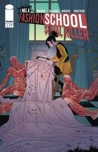 I Was A Fashion School Serial Killer #1
Writer: Doug Wagner
Artist: Daniel Hillyard
Letterer: Ed Dukeshire
Colorist: Michelle Madsen
Publisher: Image Comics
Review by Jared Bird
Starting somewhere new is always an awfully complicated experience. Particularly when you’ve got a penchant for fashion and an insatiable need to kill. I Was a Fashion School Serial Killer #1 sees Doug Warner and Daniel Hillyard, the team behind comics such as Plush and Plastic, present the world with a brand new serial killer story for readers to fall in love with.
Rennie Bethary’s just been accepted into the most prestigious fashion school in all of New York. She exclusively wears clothes she makes, and stands out for her visceral and unique designs. Little do those surrounding her know, her clothes are made from body parts, and she’s got an insatiable need to kill, even if she just wants to focus on fashion. Part teen drama, part mystery, and part horror, the series reminds me a lot of 1990’s and 2000’s classics like Scream and I Know What You Did Last Summer. It takes that tone and goes further with it, really pushing on what the audience might be expecting and dedicating itself to committing to its tone. That alone makes it worthwhile to check out if you have any interest in the premise.
Doug Wagner’s writing is tight and energetic. Rennie’s internal narration is the highlight of the issue in my opinion, a totally immersive and engaging element of the story that really adds depth to some of the sequences that otherwise could seem frivolous. He balances the various tones well in the dialogue and sets up a lot of potential plot dynamics and story elements without feeling heavy handed or overly dramatic.
Daniel Hillyard’s artwork particularly shines during the expressive character sequences and the explosive moments of violence and gore, particularly towards the end of the issue. He also has a skill in character design, which helps the setting of the book feel more well realised and thought out. Some sequences feel a little bare in terms of backgrounds, but it’s never distracting enough that you notice unless you look really closely. Colorist Michelle Madsen adds a vibrant energy to the book befitting its teen-drama style, and the two work well in sync with each other.
Overall, I Was a Fashion School Serial Killer #1 is a fun read and seems to be building to something interesting. Even hardened horror genre fans will find something to latch on to, and the series has a solid emotional throughline that makes it feel fresh and interesting, even if in premise the book seems familiar. Two talented creators are giving it their all and that’s always an exciting thing to read and see on the page, and the series’ unique setting sets up an exciting story to come.
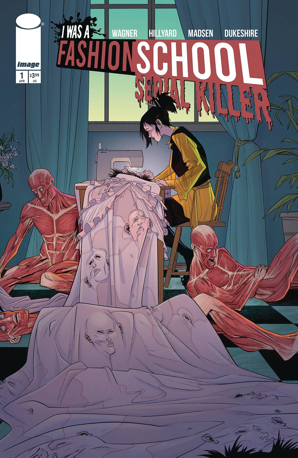
 Plague House #1
Writer: Michael W. Conrad
Illustration and Letters: Dave Chisholm
Publisher: Oni Press
Review by Clyde Hall
Most of the time, the Paranormal corner of reality television feels like an artificially cobwebbed attempt by hyperbolic hosts to stoke a need in us. A need to know the truth behind ghosts. About haunted places. Discovering any real or imagined force at the heart of supernatural phenomena. Knowing exactly what the chilling but elusive presence, entity, or phantasm really is.
Seeing those questions raised well and in ways more akin to The Haunting of Hill House but with a thoroughly modern perspective, the first issue of a 4-part series, Plague House, launches this week. Writer Michael W. Conrad keeps the focus tight on a trilateral crew of paranormal investigators. It was organized by Del, driven since a childhood brush with death to seek answers regarding what lies beyond. But also a leader who’s honest enough to admit he’s thoroughly uncertain about what that something may be. It makes him consider any evidence with fully open options, from residual energy to infernal involvement. He also comes in believing, based on his previous investigations, that the vast majority of ‘hauntings’ really aren’t.
Holland is the group skeptic. A debunker and an exposer of questionable science, Del’s ghost hunting podcast has been the target of Holland’s ridicule. That’s why Del issued an invite to accompany him on investigations. An invitation the unbeliever accepted and why Holland is now a valued part of his crew.
Jacob rounds out the team, a theologian with past experiences some would say prove the existence of physical evil manifestations preying on humankind. He leans toward demonic influences as the root of phenomena they explore, and while Del and Holland don’t necessarily subscribe to the same philosophy, Jacob’s input is regarded as valid as any other. For a serious ghost hunting team, their playing field of inquiry is level.
Until it’s slanted, then overturned, by the McCabe House. It’s one of those really, truly haunted places Del says is rare. During their investigation of the quaint suburban site where Orin McCabe murdered his father, his wife, and his two children a dozen years before, what Del and company uncover is a breakthrough. A major discovery regarding the relationship between mortals and their encounters with the supernatural. Unfortunately, what they find doesn’t care about their beliefs, their theories, or their doubts. And things go horribly wrong.
That last bit is largely hinted at through the first issue, setting steely but ethereal hooks for finding out more regarding how everything turned and the degree of horror which followed. But judging by the setup Conrad constructs, that truth the crew seeks may exceed any of the more common haunting tropes. That’s the promise, and the way he composes the opening chapter makes one want to believe it’ll be realized.
Del’s crafted as a protagonist we can get behind. The kind who goes into charting the unknown with an open mind. The kind who recognizes mad analytical skills of someone like Holland and invites them along even after he’s felt the sting of their scrutiny. The kind who, it’s hinted, may suffer the most for the discovery they make.
Art, colors, and lettering are handled by Dave Chisholm, and he manages a multilayered approach with panel-to-panel chameleon abilities. Humor quickly becomes horror, then a mischievous mix as needed and appropriate. The former is applied with a light touch, the sort even the most serious researchers carry with them. The horror, though, is varied as it is violent. Through any lighter moments, through the erstwhile intentions of our explorers, the depth of the McCabe House horror is never diminished. It’s a real one, as Del calls them. And it wants something.
There’s appeal here for those who enjoy ghost hunting and paranormal investigation in any form, as well as readers who love a chill-worthy haunting. If you fit into either category or both, you should launch your own investigation and explore Plague House.
Rapid Wednesday Comics Reviews
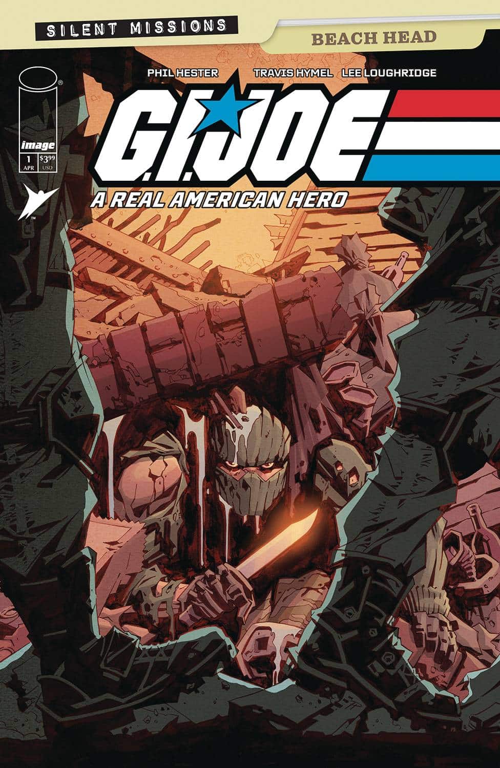
- G.I. Joe – A Real American Hero: Silent Missions, Beach Head #1 (Image Comics / Skybound): This week, Image and Skybound kick off a monthlong homage to the classic Snake Eyes silent issue of G.I. Joe by Larry Hama, Steve Leialoha and George Roussos, a defining comic of Hama’s long career (and one that gets a reprint this week). This new month of silent one-shots spotlights some of the best cartoonists in the business. Beach Head is written and drawn by artist Phil Hester, who has one of comics’ most striking and unique styles. Hester’s bold, graphic shapes and thick lines, his use of heavy contrast makes for clean, easy to read panels and striking imagery–especially in moments where he pushes the contrast to pure silhouette. Without sound effects or word balloons to rely on to add context or punctuate the imagery, Hester has to rely on his figure work and the rhythmic construction of the page. The lack of words allows him to get a little funkier with the shape of the page and play with light, shadow, and snow to build mood and motion. A silent issue when done poorly can feel like a comic that is just missing an element. That’s not the case here, this is an artist with a distinct vision and style pushing his storytelling and it’s a treat to read. It’s a complete story about grit, determination, and quick-thinking. One man and a few kids against an army. Travis Hymel’s inking pushes Hester’s angular style and stark contrast of light and dark even further, and Lee Loughridge‘s colors, desaturated and sapped of warmth in the brutal winter scene adds a morose hopelessness that makes Beach Combers’ odds feel even greater. With big names like Wes Craig and Leonardo Romero on future issues, this is a series of comics to keep an eye on–even for folks like me with no nostalgic love for the franchise. —Tim Rooney
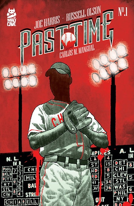
 Past Time #1 (Mad Cave Studios): Timed roughly to baseball’s opening day, Past Time #1 is a book that splits time between the 1980s and 1920s as it explores a horror-tinged story of a lost ball diamond great. It’s written by Joe Harris, with artwork by Russell Olson, and letters by Carlos M. Mangual. I loved the concept of this title, which I gave extra points to because it involves the true story of the Chicago Cubs’ classic home, Wrigley Field, not getting lights for night games until the late ’80s (I’m a native Chicagoan myself, and the day game thing was always a talking point, namely as it applied to the Cubs long World Series drought, but I digress…). The book extrapolates the first night games into the story of a player who could have been an all-time great, if not for a ghastly secret. There’s a lot to still be revealed within this story, but the first issue does a great job of seeding intriguing, getting the reader to relax in the bleachers and prepare to stay for the full nine innings, as it were. Olson is also just the perfect artist for this book, bringing his keen eye for the time period and noir to the story in a way that heightens all the ideas. There’s a lot to like in Past Time, and even more so if you enjoy some combination of historical fiction, baseball, and horror. —Zack Quaintance
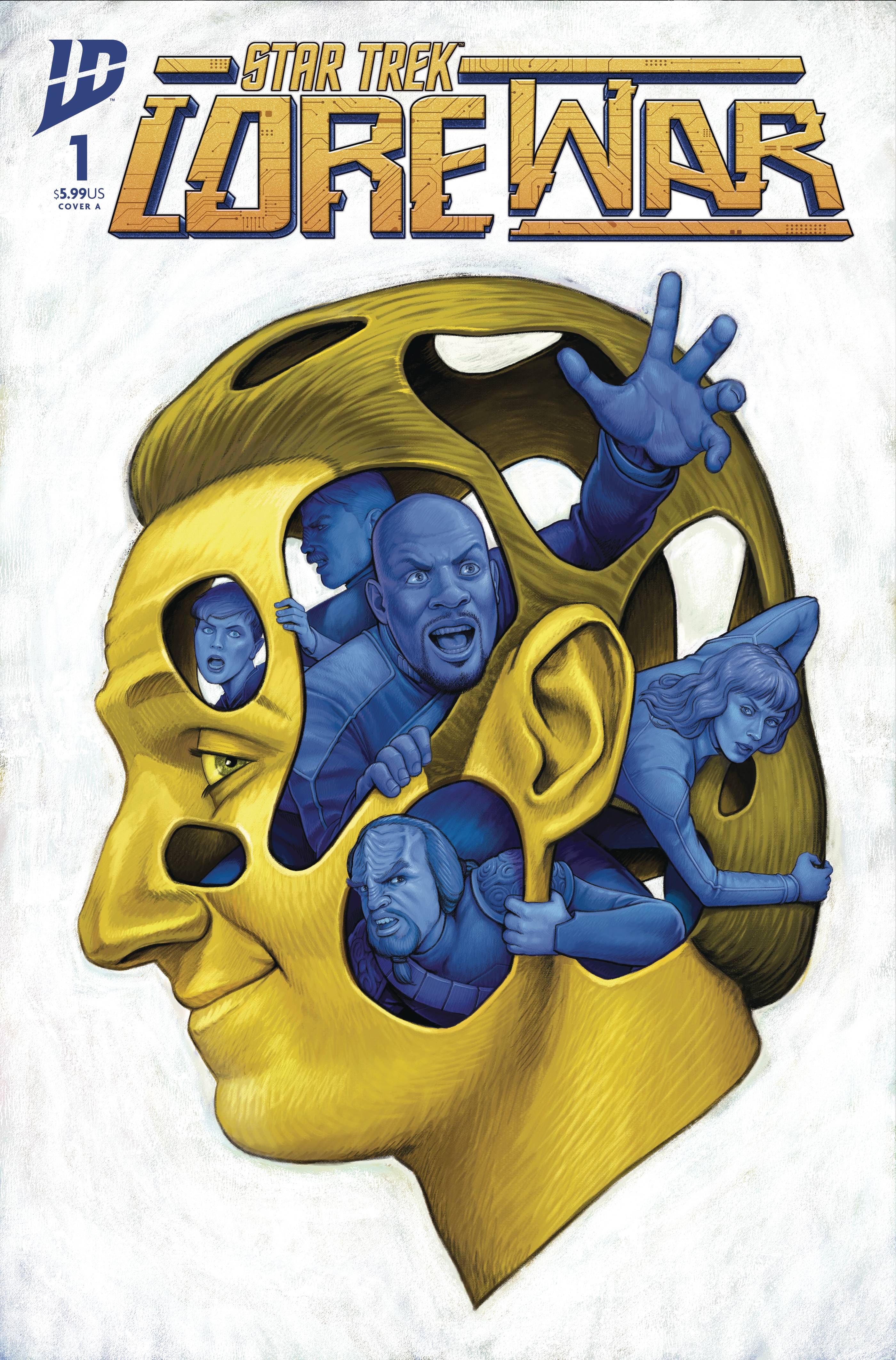
 Star Trek: Lore War #1 (IDW Publishing): It’s true: IDW’s ongoing Star Trek and associated Star Trek: Defiant series are coming to an end. However, they’re going out with a bang thanks to a special crossover event! First up is Star Trek: Lore War #1. This opening issue is written by Christopher Cantwell, Collin Kelly, & Jackson Lanzing, with art by Davide Tinto, colors by Lee Loughridge, lettering by Clayton Cowles and design & production by Neil Uyetake. The issue mainly sets up the crossover’s conflict, examining a galaxy remade in Lore’s fascist image. It’s a lot like those Marvel Comics stories where everything has been rewritten by a Cosmic Cube (Pleasant Hill, Heroes Reborn, etc). We’re reintroduced to characters who have been slotted into new roles in this reality, which (among myriad other changes) sees the Maquis becoming an anti-Lore fighting force. Whether you’ve been following the Star Trek and Defiant comics or not, you’ll be able to identify most of the characters that appear from the shows. Personally, I enjoyed seeing some of the smaller characters return more than those who headlined their own shows already. But in any case, these familiar characters are all well-rendered and instantly recognizable. The coloring is bright and well-done throughout, with variable tones for different scenes and locations. Both of these elements work especially well on the splash pages, including the one that closes the issue. While all of the lettering is well done, I especially enjoyed the Borg speech bubbles and text boxes. The six-part story crosses over through the closing issues of Star Trek, Defiant and a couple of one-shots. This won’t surprise regular readers of this column, but I’m especially eager to read the Star Trek: Lore War — Shaxs’ Worst Day one-shot arriving in late May. Not every comic series gets such a send-off spectacular, and it’s very cool that IDW is providing one for this era of Franchise comics. —Avery Kaplan
FOC Watch
These books are currently available for pre-order.
Dark Regards #1
Writer: Dave Hill
Art: Artyom Topilin
Colors: Brittany Peer
Letterer: Troy Peteri
Publisher: Oni Press
Due Out: May 14, 2025
Review by Ricardo Serrano Denis
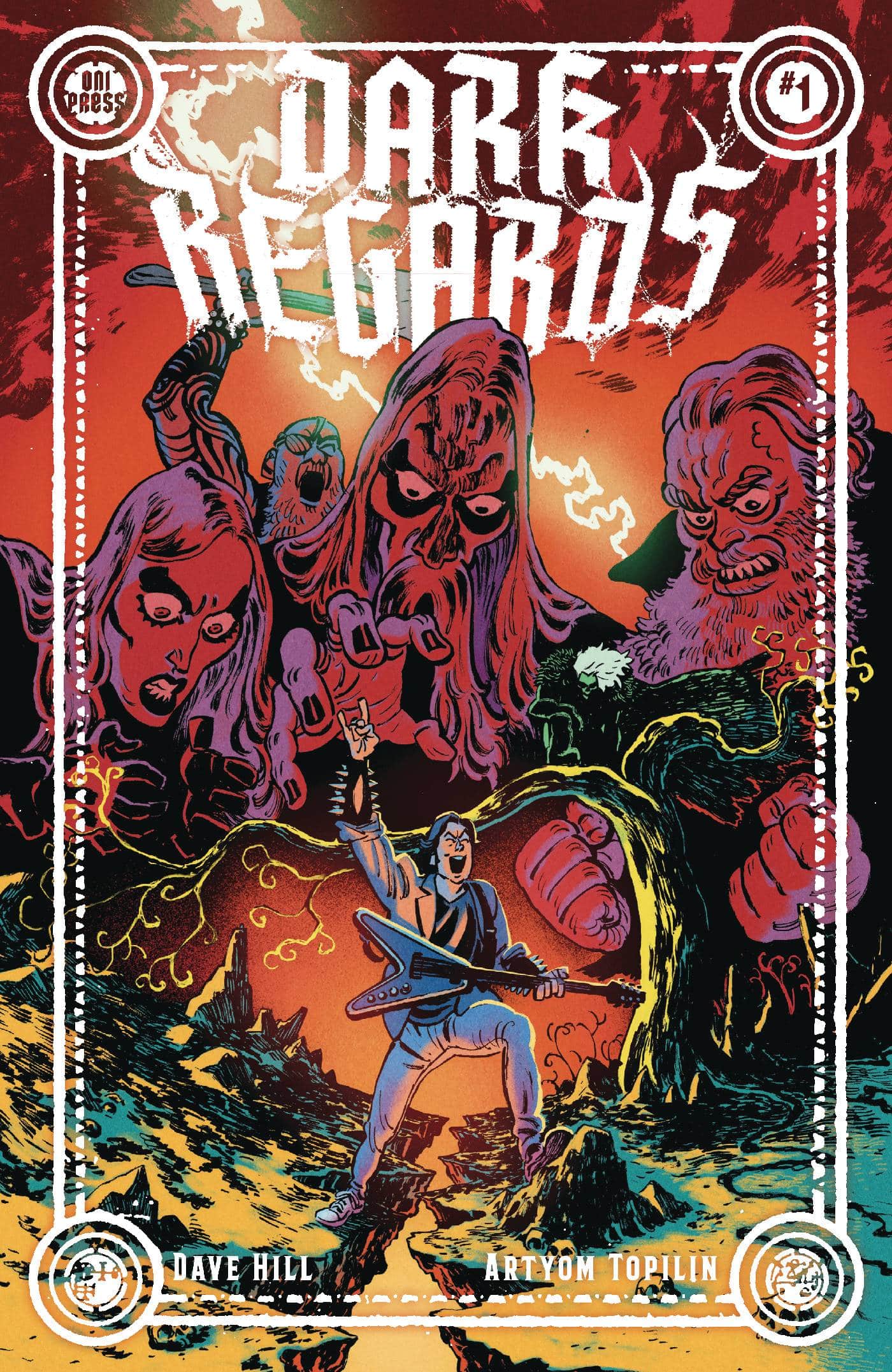
Sometimes, bad ideas are just too good to pass up. The moment they pop up, the clock starts running and things start getting itchy all over. The only thing that scratches that itch is going through with evil deed. This is how author Dave Hill frames his real-life Black Metal prank in his new comic Dark Regards, one that ran through way too many emails and riled up way too many metal heads. Of course, in good old comic book fashion, Hill was put upon this path of destruction via demonic influence. To be fair, corresponding with a Black Metal label with the express purpose of telling them his fake band Witch Taint was better than all the other weak ass bands they had signed does seem an idea authored by a particularly sinister agent of Hell.
The path to the Witch Taint prank is paved in brimstone in this comic. Dave starts as a more mainstream metal fan, with classic bands mentioned here and there, until he finds a record store that introduces him to Black Metal. He starts getting into this new sound until a demonic metal singer called Lord Abscess calls to him in a dream and urges him to unleash a very particular kind of hate upon the metal industry. Insults via email ensue, a Black Metal war brews.
Artist Artyom Topilin and Hill go for metal from the very first panel on. Every single aspect of Dave’s life is colored in one way or another with the different forms the genre has taken throughout the ages. It’s as if metal is so ingrained in his existence that it’s basically illegal not to have at least a hint of it in his immediate surroundings. An Iron Maiden shirt here, corpse paint there, and brooding metal fans sticking out from the crowd like singular social bruises make for a comic that does quick work to put you in that culture.
Topilin captures each of the music genre’s variants well here, and it helps create a very robust world where references and Easter eggs are easier to catch for like-minded readers. Characters are somewhat cartoony in their expressions, but they help get Hill’s humor across. While not every single joke lands, the good ones are memorable and quotable (especially when they come at the expense of some of the sillier aspects of Black Metal).
Dark Regards #1 kicks off a wild ride of a story. Satanism, angry music labels, and bad ideas all converge for a series full of possibilities. Fans of comedies like Heavy Trip and Lords of Chaos will find much to love here. Whether it has what it takes to burn the world down will depend on upcoming issues, but the opening issue does leave readers with a setup that’s well worth this outrageous descent into the darkest parts of metal.
Verdict: BUY
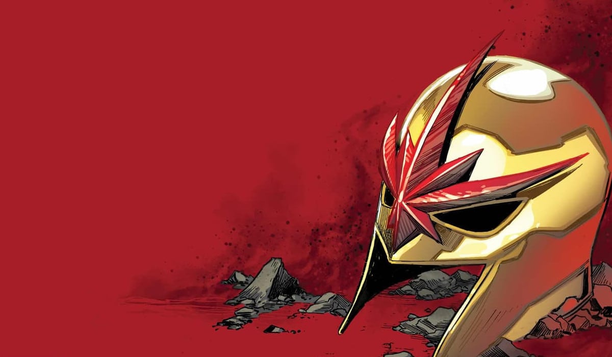
Vanishing Point #1
Writer: Mark Russell
Artist: Juan Doe
Letterer: Carlos M. Mangual
Publisher: Mad Cave Studios
Due Out: May 7, 2025
Review by Zack Quaintance
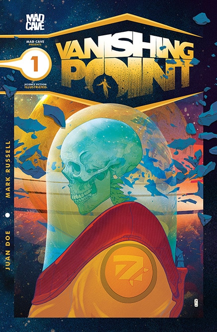
In a deep space dystopia, asteroids mine you (that’s a Yacko Smirnoff reference, because I’m nothing if not current…). Old-timey jokes aside, that really is a key part of the concept in Vanishing Point #1, the first issue of a new sci-fi anthology series written by Mark Russell, for which he is joined by artist Juan Doe and letterer Carlos M. Mangual. The concept is that our protagonist is alone in deep space. In this future, one of the few jobs remaining for humans (and not machines) is mining asteroids this way. Science is a little baffled, but there’s something about the human brain — and only the human brain — that can assess which asteroids will provide the minerals Earth needs.
If you read the Eisner-nominated Travelling to Mars, you know Russell is in familiar thematic territory here. He deploys a first-person narrative captioning for a protagonist who is alone in space doing work for an exploitative company. Travelling to Mars was heart-rending and personal, a really beautiful comic in which you could feel the desperate solitude of the narrator, who was also suffering from a terminal illness and going back through is memories of a life that wasn’t exactly well lived.
This first issue of Vanishing Point trades the hyper-personal reflection for a horror motif, with tinges of Moby Dick (this is even right there on the page, with the narrator referring to a psychological break in space as “Going Ahab”). The result is a really moody, sci-fi horror comic that will have you rapt from the first page. This is a very polished and precise book, with a one-shot structure that escalates and pays off perfectly.
It also looks fantastic. It’s been a while since I’ve read a Juan Doe comic, but Doe’s linework is clean and interesting, and his character designs are as good as they get. There’s a bit where our narrator wields a giant space axe, and it couldn’t look better. It’s a great pairing too for how precise Russell’s scripting here, with the two creators truly elevating each other, all set to the lettering of Carlos M. Mangual.
In the end, I found this first issue to be excellent. I also take it as an indicator of more great things to come. The one-shot comic format is not one that has traditionally been common in direct market periodical comics. But with new series like this — as well as stunning stories like last week’s Free For All — that might just be poised to change.
The Prog Report
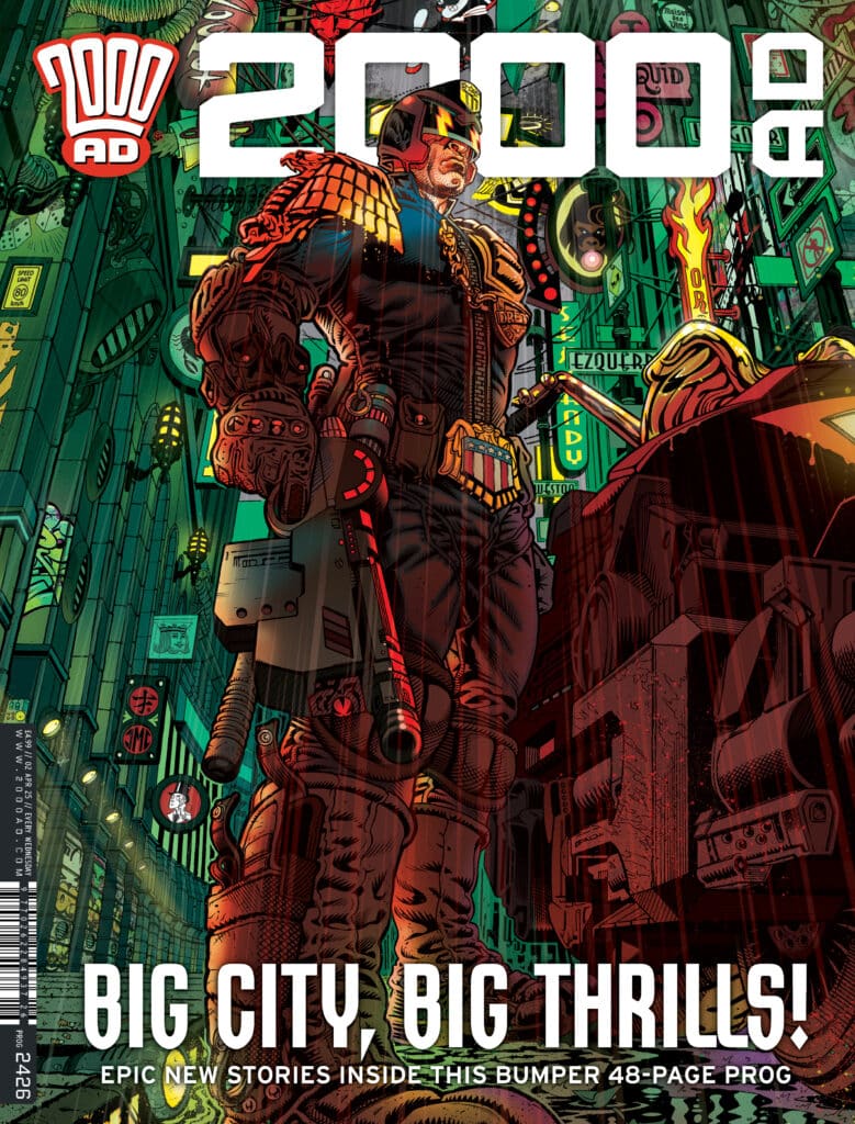
 2000AD 2426 (Rebellion Publishing): This week’s Prog brings us one of the magazine’s quarterly bumper issues, and it’s a doozy, essentially split into just four stories. The first is a two-parter, with the introductory Judge Dredd: The Truth Bomber leading us into Judge Dredd: The Truth Conundrum Part 1, both being by writer Ken Niemand, artist PJ Holden, colorist Jack Davies, and letterer Annie Parkhouse. This is one of my favorite type of 2000AD stories, the sort that has a deathly series thematic core about the nature of truth and how we live, played out beneath a veneer of wonderful comics nonsense. In this case that means we get a story that has Noam Chimpsky as its hero. Monkeys and comics just work, and I loved both parts of this one. It’s a nice palette cleanser too between more overtly serious Judge Dredd stories. While we get a new beginning there, elsewhere this week we get an ending with Portals & Black Goo: A Quorum of Fiends 14. I must admit, this maximalist strip overwhelmed me a bit in weekly installments, although I did get a kick out of it at times throughout. I’m interested now that it’s wrapped up to read it as a whole and see if that changes things for me. Portals & Black Goo was from writer John Tomlinson, artist Eoin Coveney, colorist Jim Boswell, and letterer Simon Bowland. This week’s cover (above) is by Tony Harris, with inks by Jeremy Clark. As always, you can pick up a digital copy of The Prog here. —Zack Quaintance
Read more entries in the weekly Wednesday Comics reviews series!
Next week, a couple of our favorite tv shows get new comics (and comics homages) with Adventure Time #1 and The Great British Bump-Off: Kill or Be Quilt #1!


 English (US) ·